Brand Identity · Art Direction · Visual Systems
Everstar
A full-spectrum identity for an energy-tech startup — an orbiting aperture mark built as a repeatable circuit-node system, and a gradient that runs from business card to billboard.
Context
Everstar (everstar.ai) is an energy-tech startup with an audacious promise: "Limitless Energy delivered." It needed a brand as advanced as the technology and as optimistic as the mission — credible to investors and engineers, magnetic to everyone else.
The trap in clean-energy branding is looking like every other blue-gradient pitch deck. Everstar wanted to look like the future, not like the category.
Approach
I art-directed the identity at WarpCraft around a phrase the founders kept circling back to — "Accelerated Abundance" — and built the whole system to behave like energy itself: in motion, full-spectrum, alive.
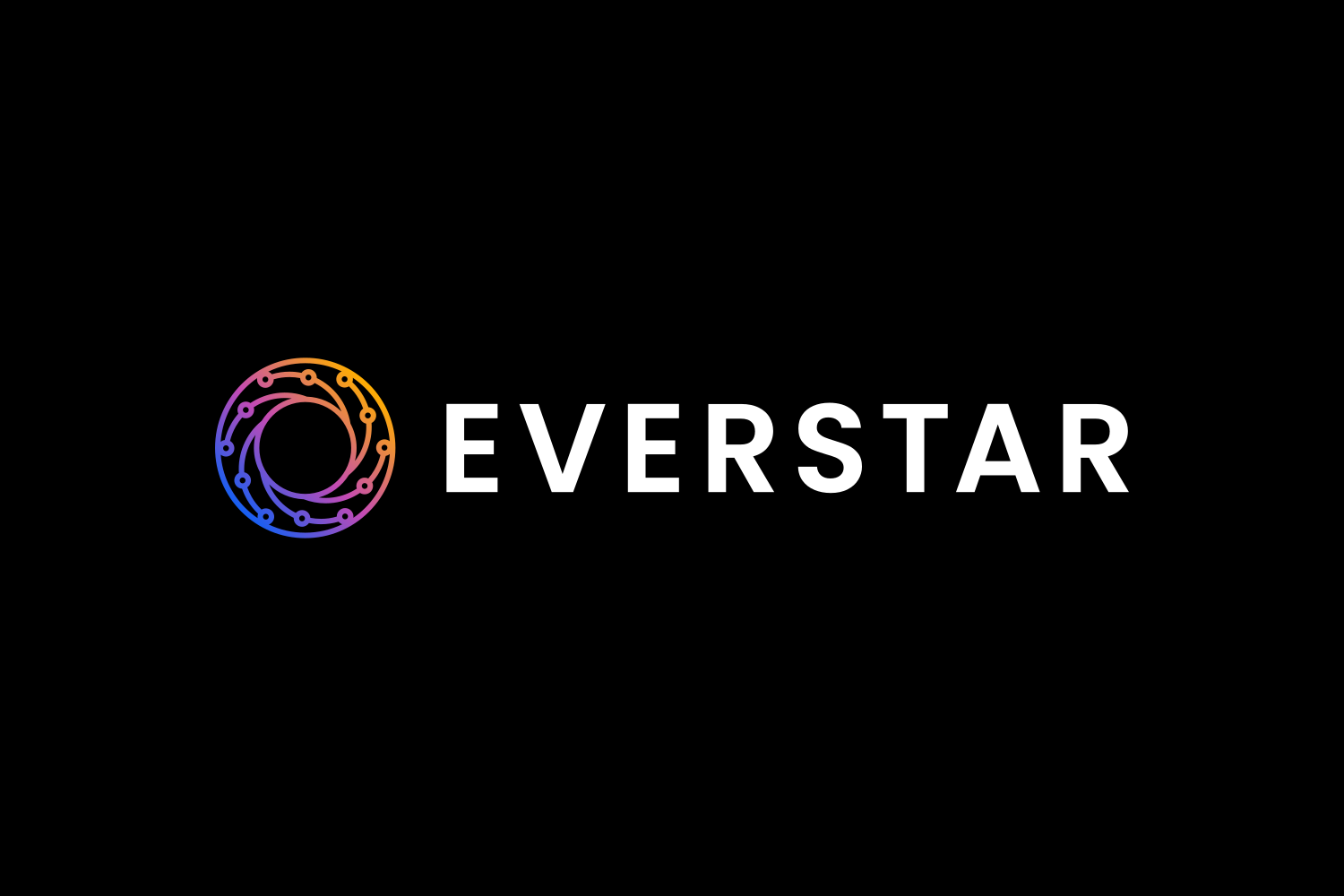
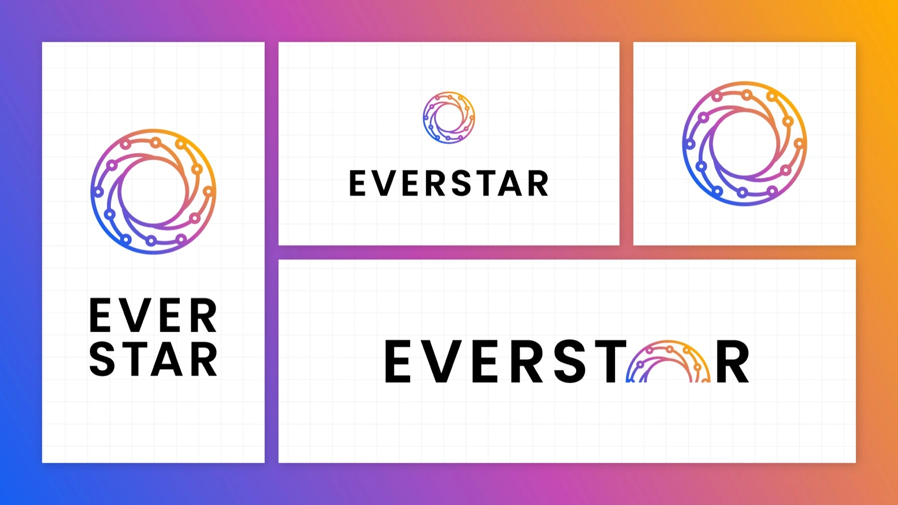
- A mark that reads as energy and intelligence. A circular aperture of orbiting nodes — part camera iris, part sun's corona, part network — turning in on itself. Precise enough for a data company, warm enough for a consumer one.
- The whole spectrum, on purpose. Instead of owning one color, Everstar owns the entire gradient — blue → violet → magenta → amber — the visible spectrum of light standing in for limitless energy. It's the most recognizable thing about the brand from across a room.
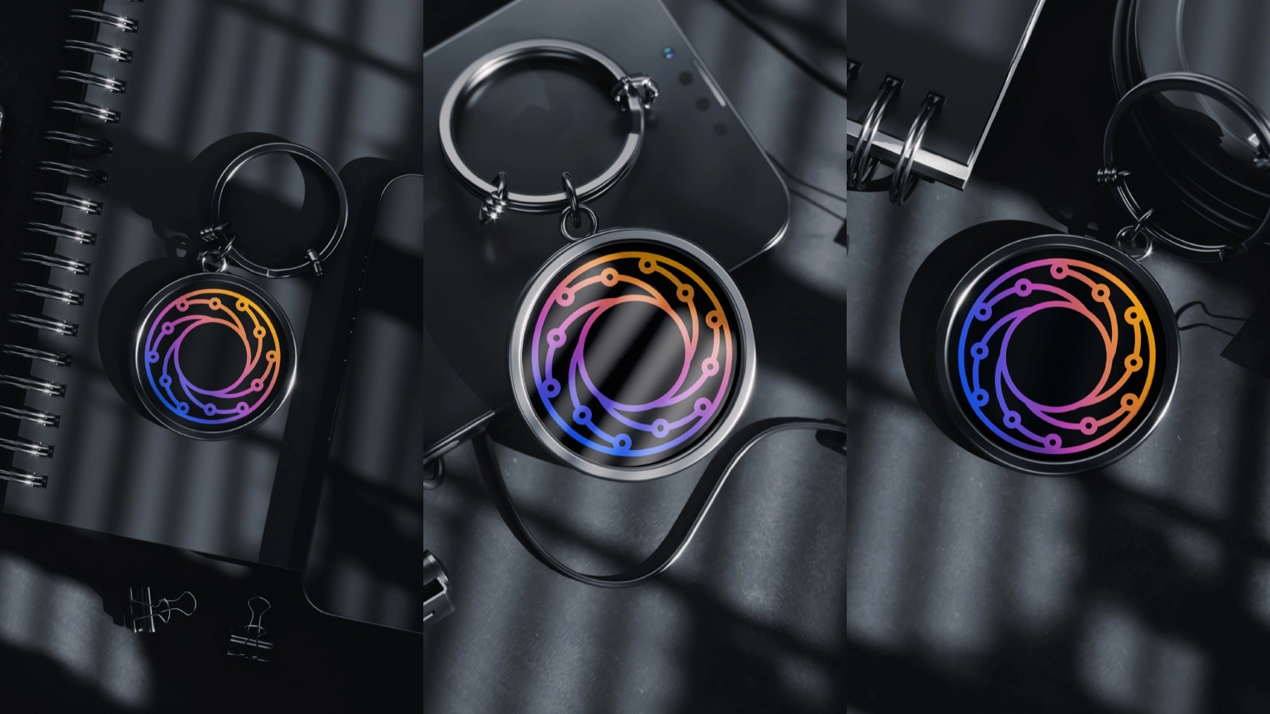
- A system, not just a mark. The same circuit-node arcs that trace the aperture recur at larger scale — across apparel, devices, even a keychain — so every application still reads as unmistakably Everstar.
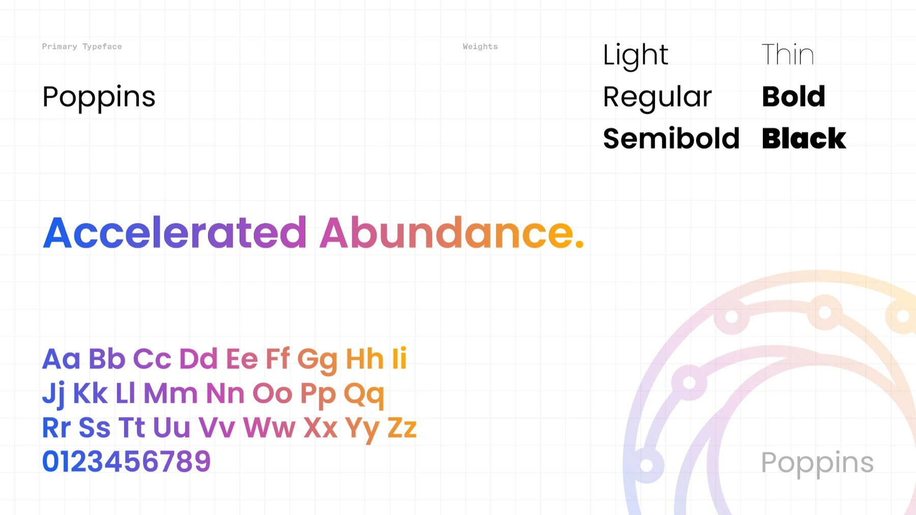
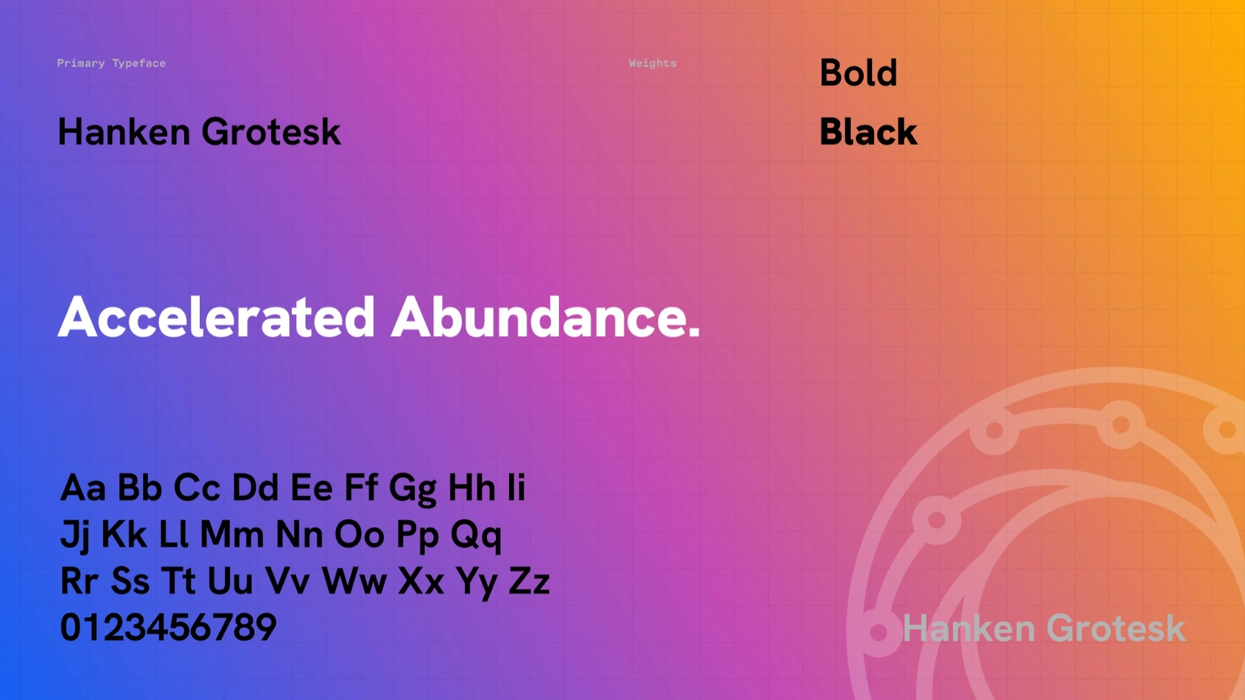
- Optimistic type. Poppins carries headlines — geometric and friendly — paired with Hanken Grotesk for supporting text; together they keep the system confident without going cold.


Solution
One system, every surface
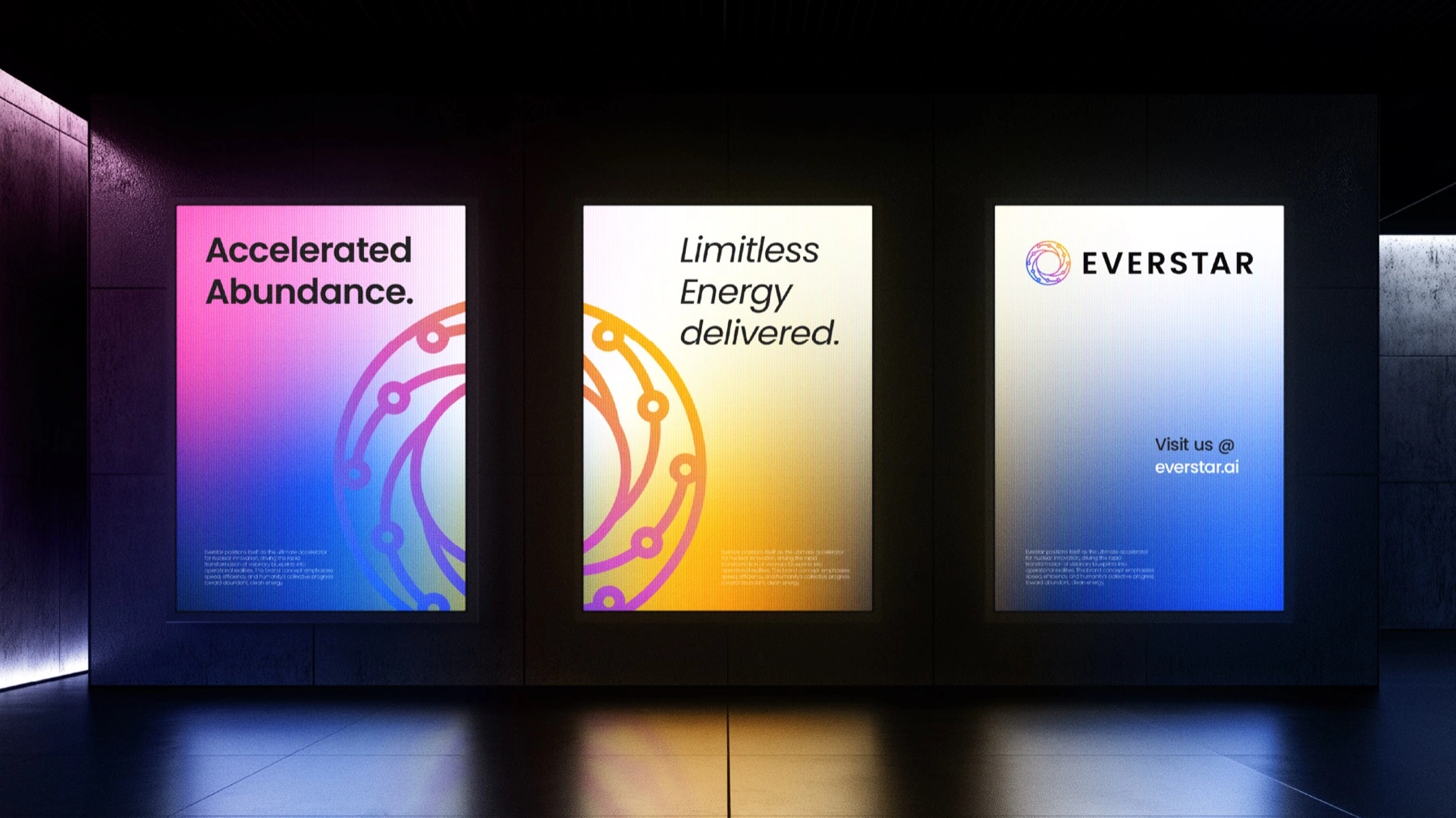
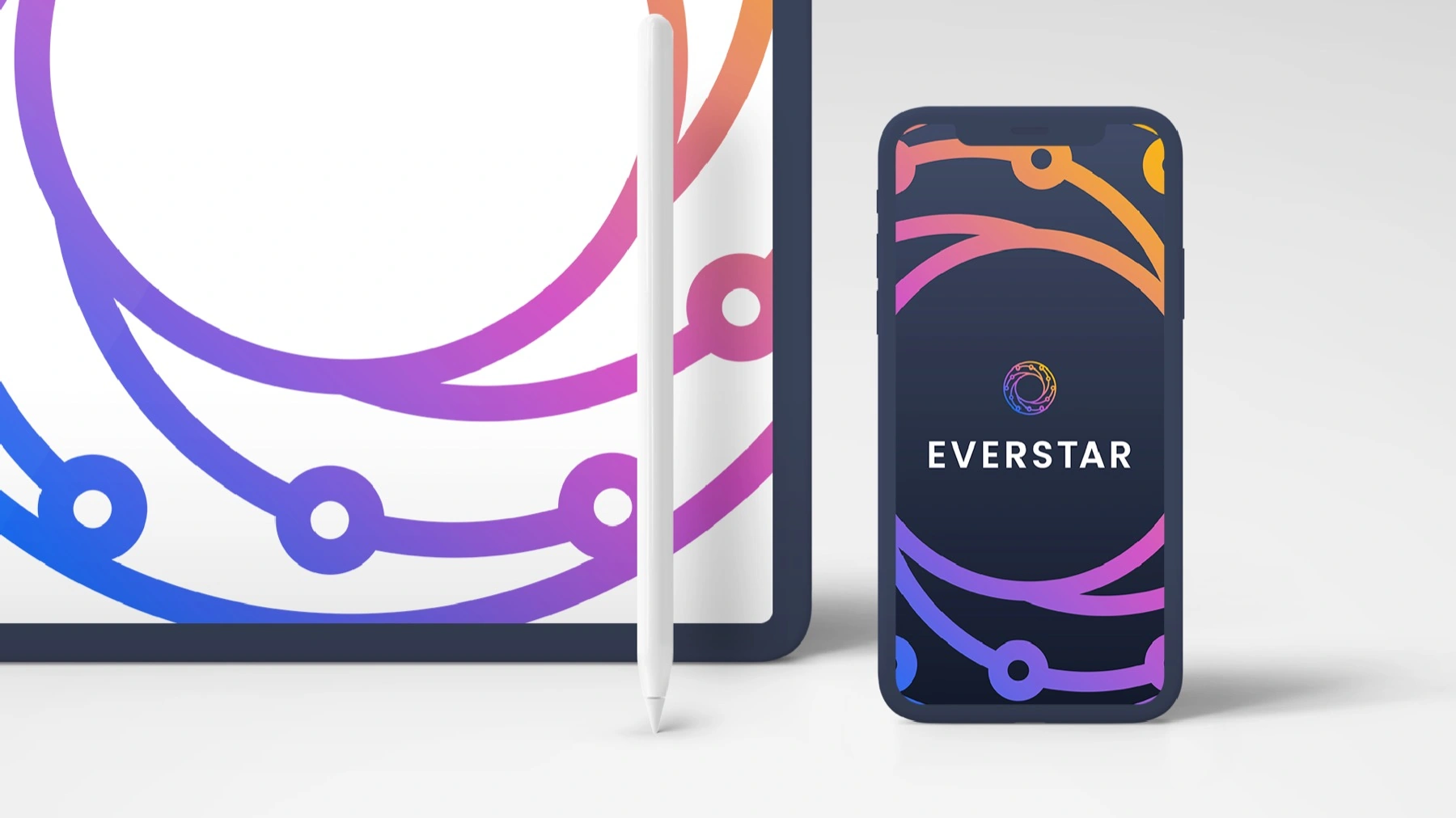
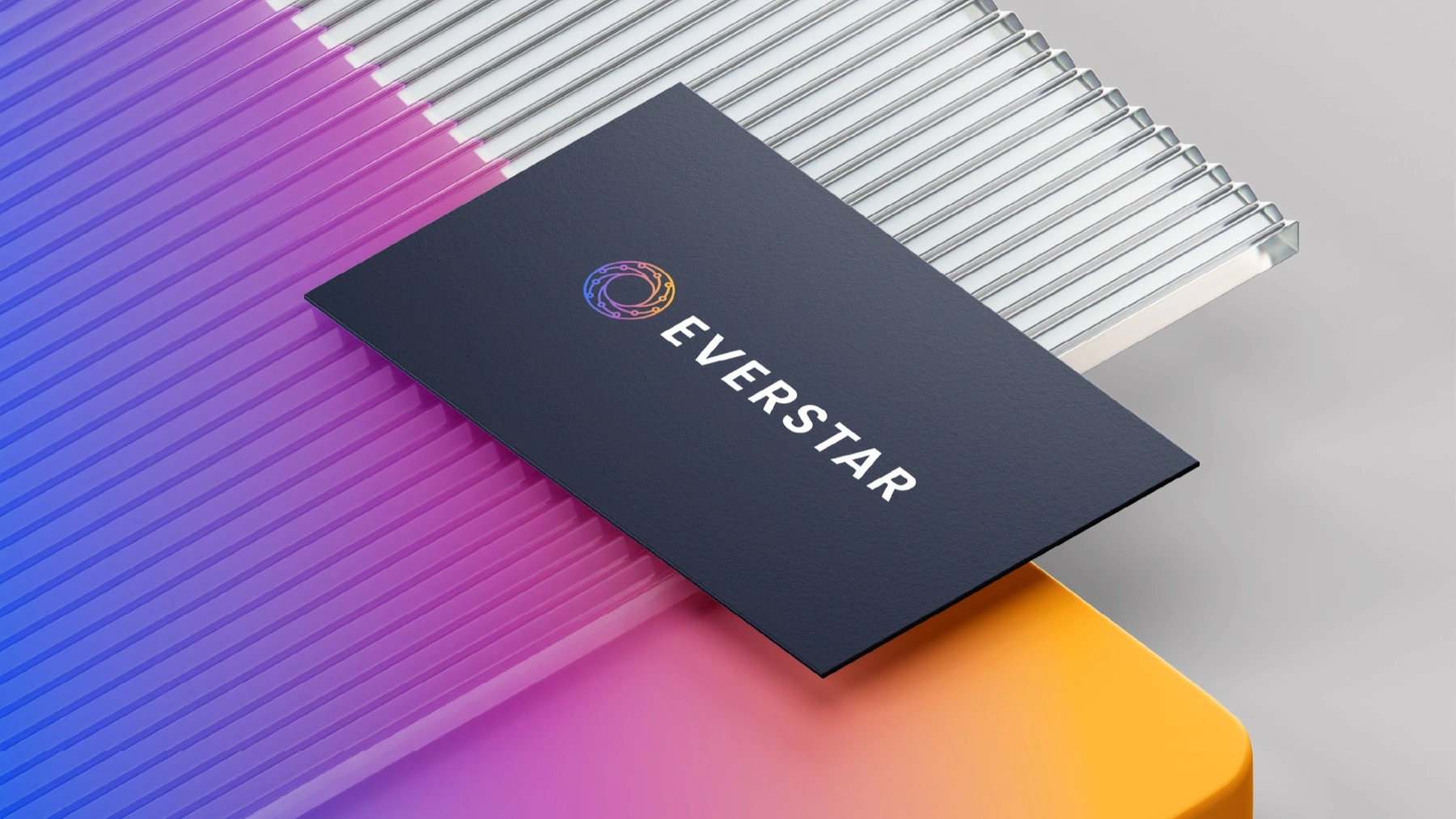
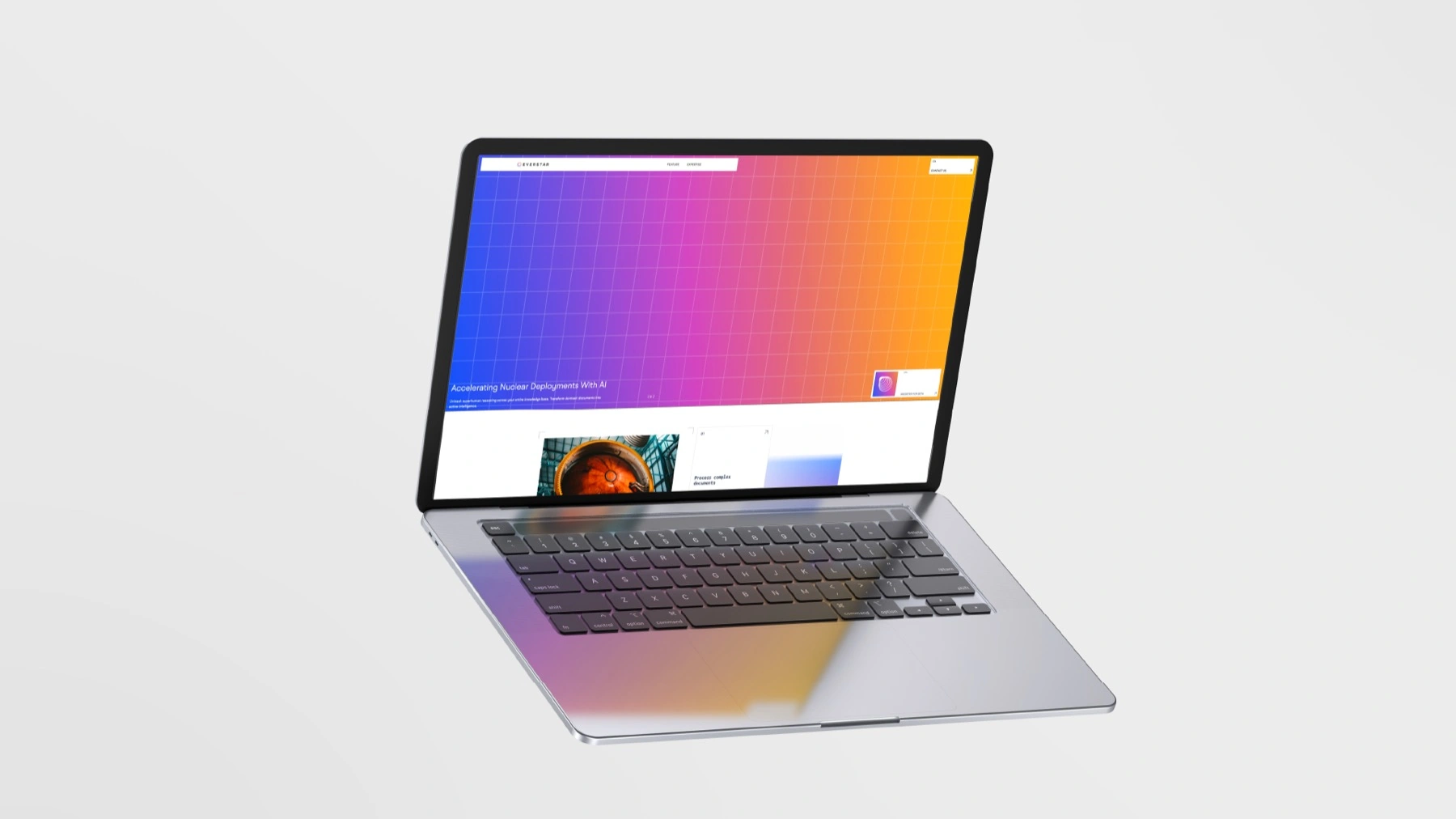
The gradient does the heavy lifting: on a black card it reads premium, on a screen it reads alive, on a wall it reads limitless. Same DNA, boardroom to street.
Out loud
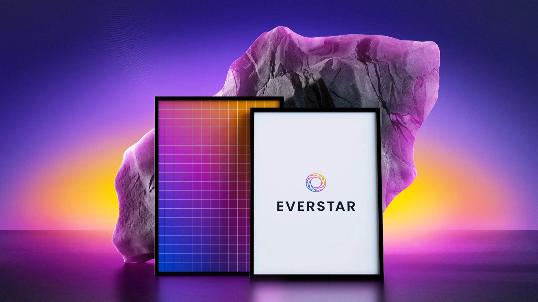
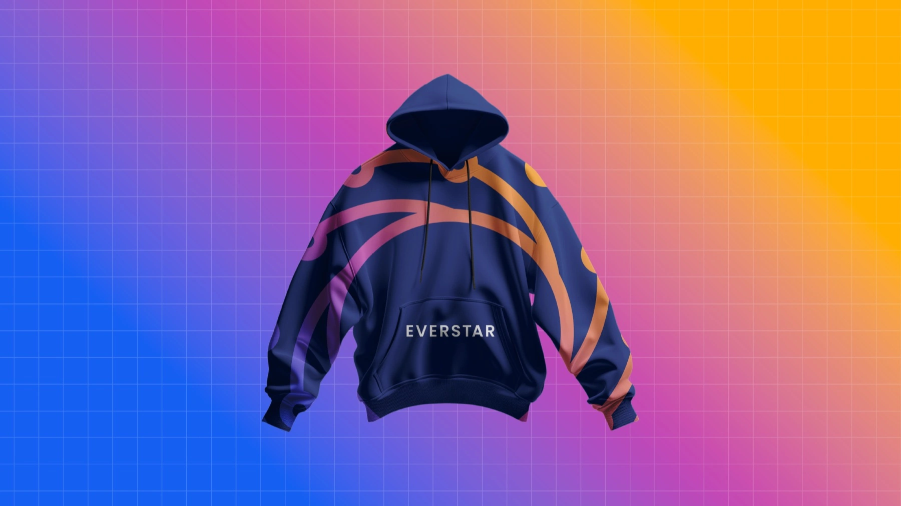
The poster system carried the message — Accelerated Abundance. Limitless Energy delivered. — set against a full-spectrum glow, and the brand stretched into merch the team would actually wear.
Outcome
Everstar launched with a complete identity: an aperture mark built as a repeatable circuit-node system, a signature full-spectrum gradient, type, and a kit of applications from business cards to billboards — a clean-energy brand that finally looks like the future it's selling.
Accelerated Abundance.← All work