
Brand Identity · Brand Strategy & Direction · Art Direction · Visual Systems · Motion
Synthetic Design Lab
A complete identity for a next-generation antibody-drug conjugate company — a synthetic, assembling 'S' mark and a full-spectrum warm palette that broke from pharma's interchangeable clinical blue, now live at syntheticdesignlab.com.

Context
Synthetic Design Lab is building next-generation antibody-drug conjugates — a new foundation for cancer biologics after fifty years of the same antibody technology. The category's visual language is a wall of near-identical sterile blues and clinical sans-serifs. A company built on a genuinely new scientific foundation needed a brand that looked like it, not like every other name on the pharma shelf.
Approach
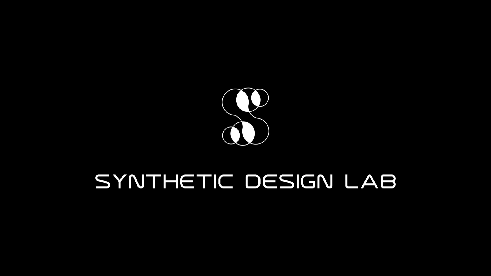
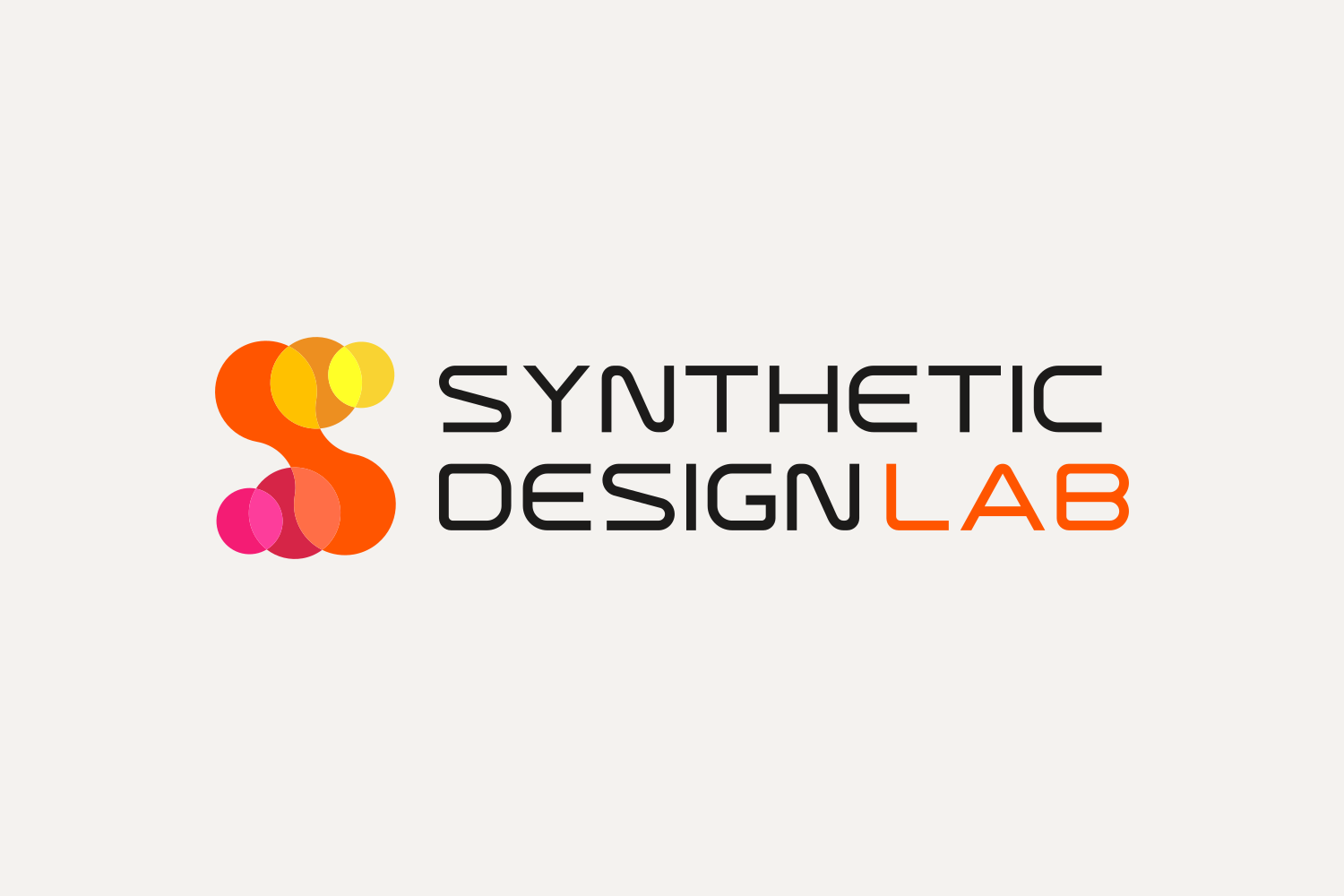
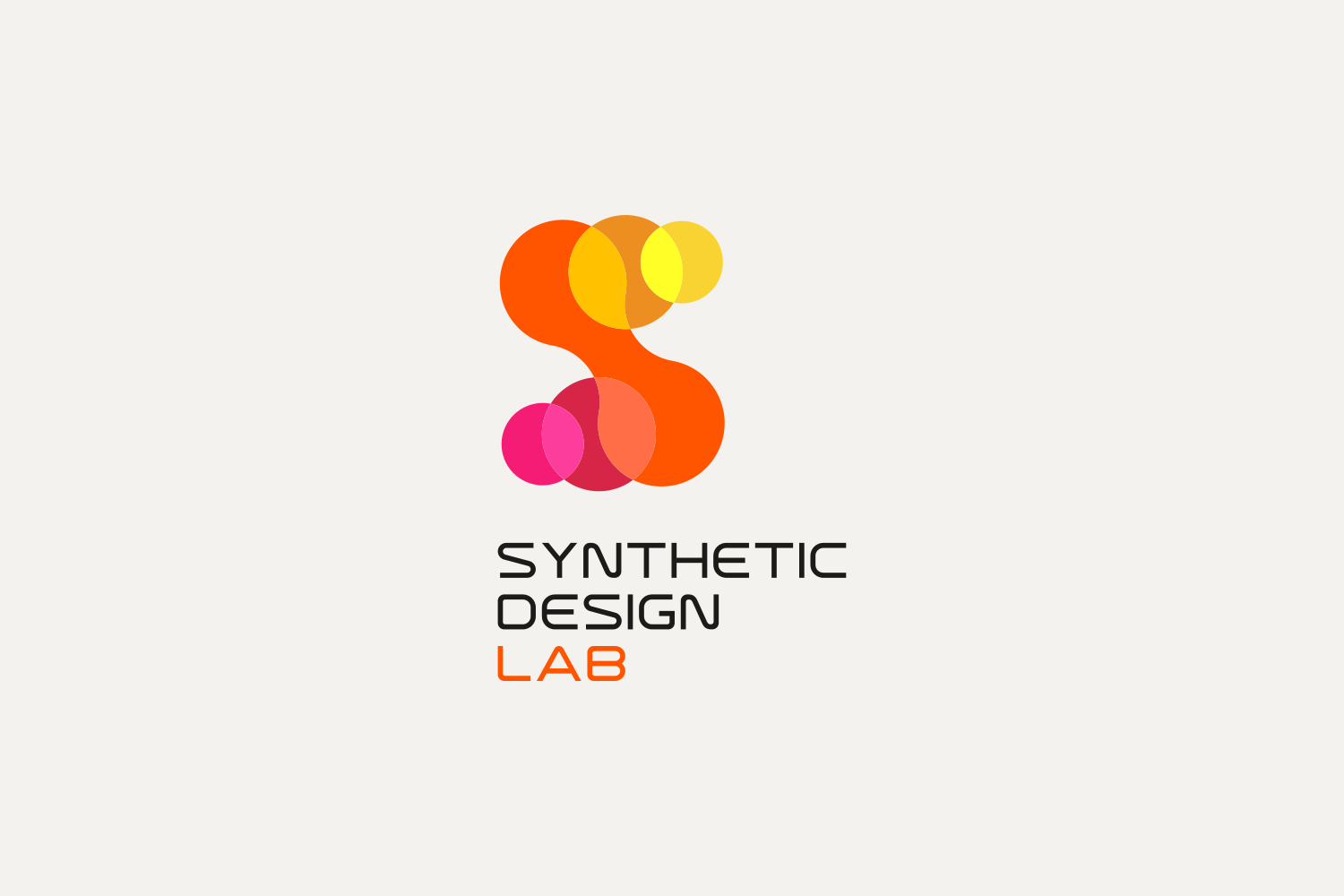
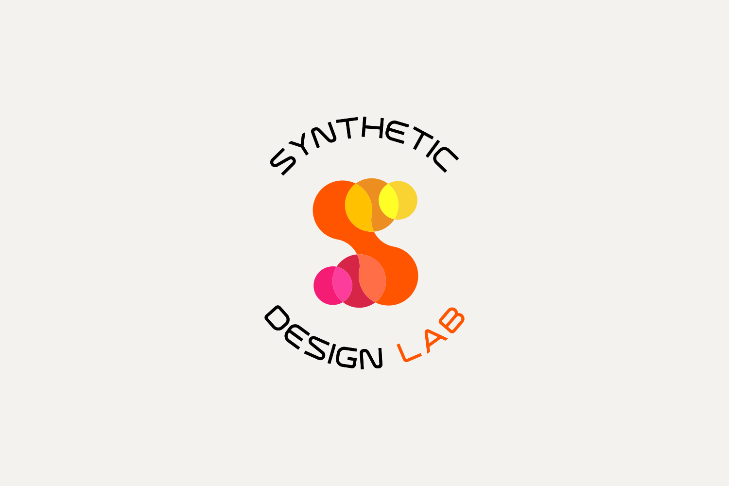
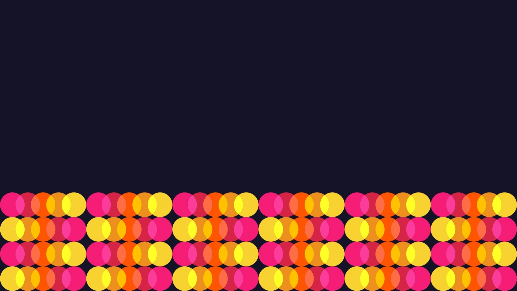
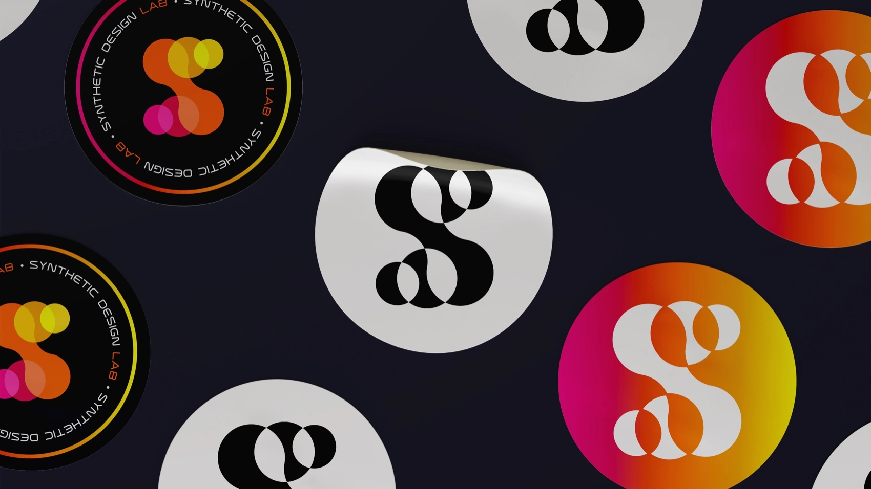
- A mark built the way the science works. The "S" is formed from individual circular components overlapping into one continuous form — synthetic parts assembling into a working whole, the same logic as the platform itself.
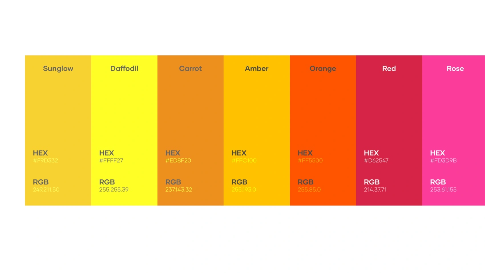
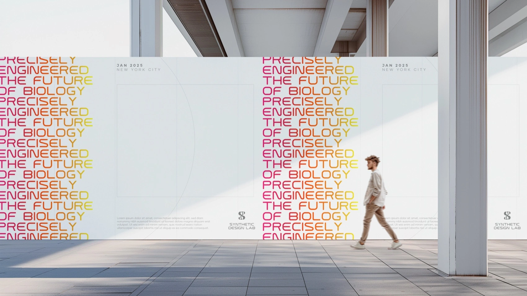
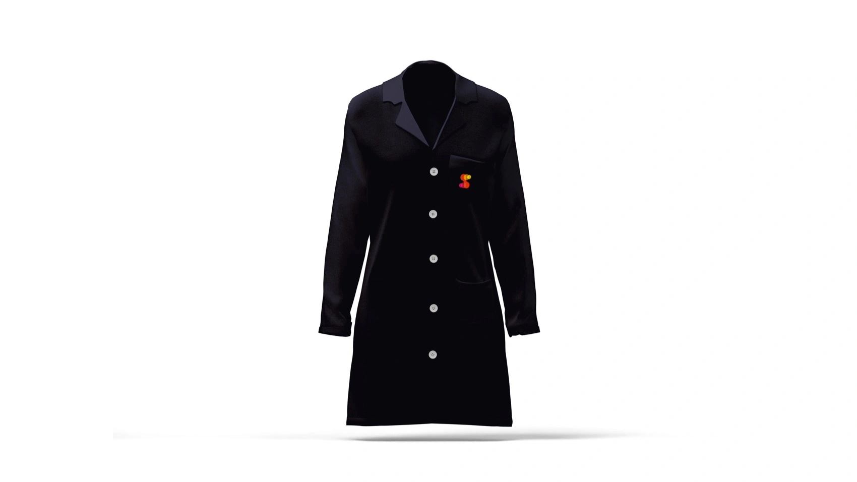
- Warmth instead of clinical cool. A full-spectrum palette — magenta through orange to yellow — deliberately rejects pharma's default blue-and-white. Precision doesn't have to read cold.
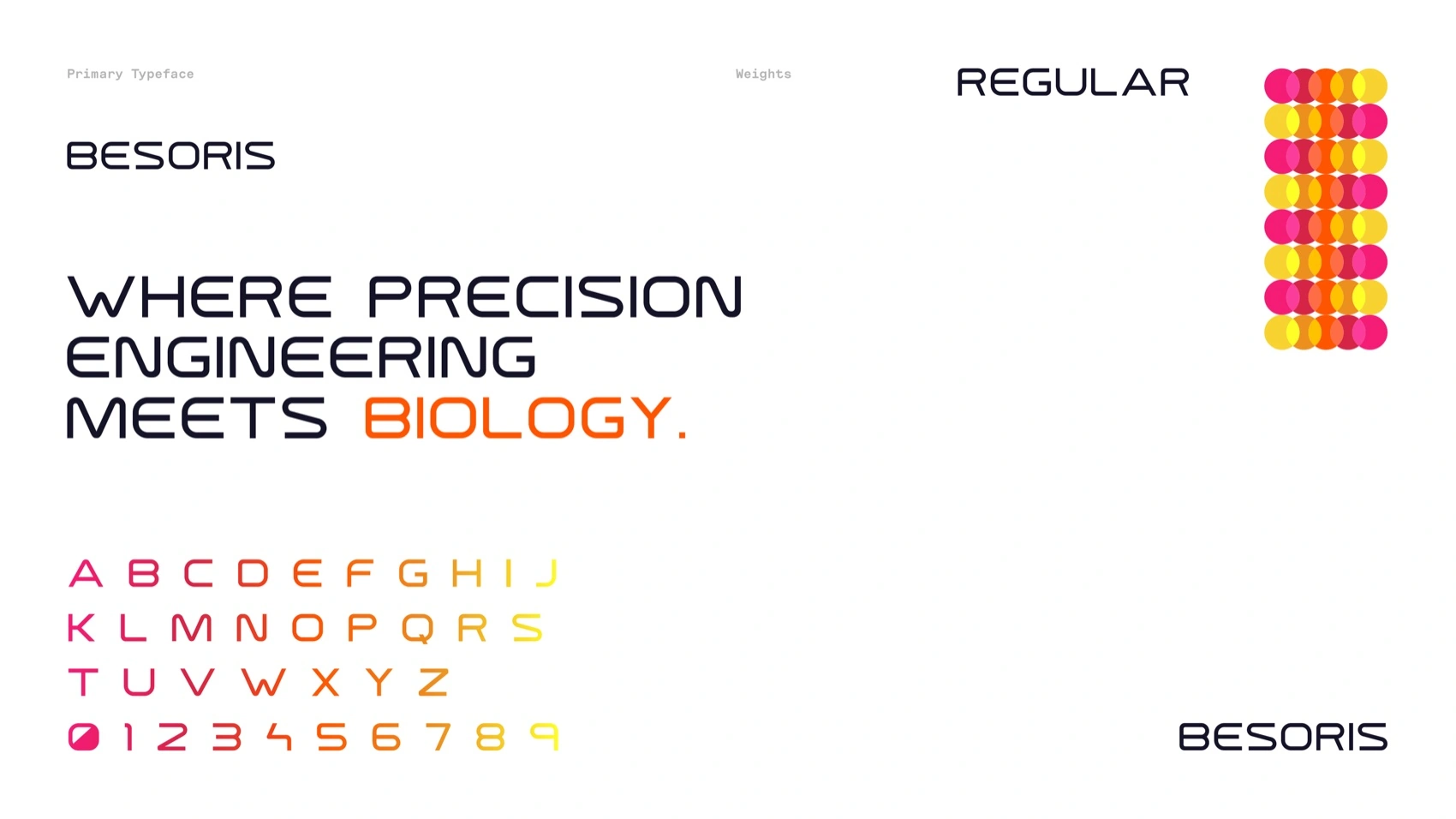
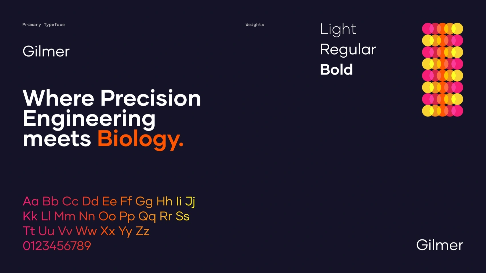
- Besoris and Gilmer, engineered and human. A squared, technical display face for structure, paired with a warmer grotesque for everything meant to be read at length — "where precision engineering meets biology" made typographic.
Solution
The mark


Type & color

Out in the world

Outcome
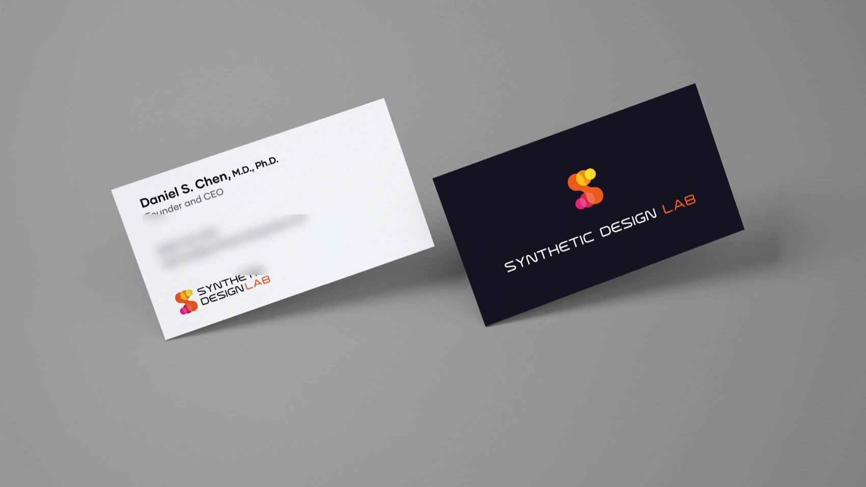
A complete identity system — mark, type, color, motion, and a full application suite — that gives a company built on new science a visual language nobody would mistake for the fifty-year-old category it's replacing. Live now at syntheticdesignlab.com.
Where precision engineering meets biology.← All work