
Brand Identity · Brand Strategy & Direction · Art Direction · Visual Systems
Gigacrop
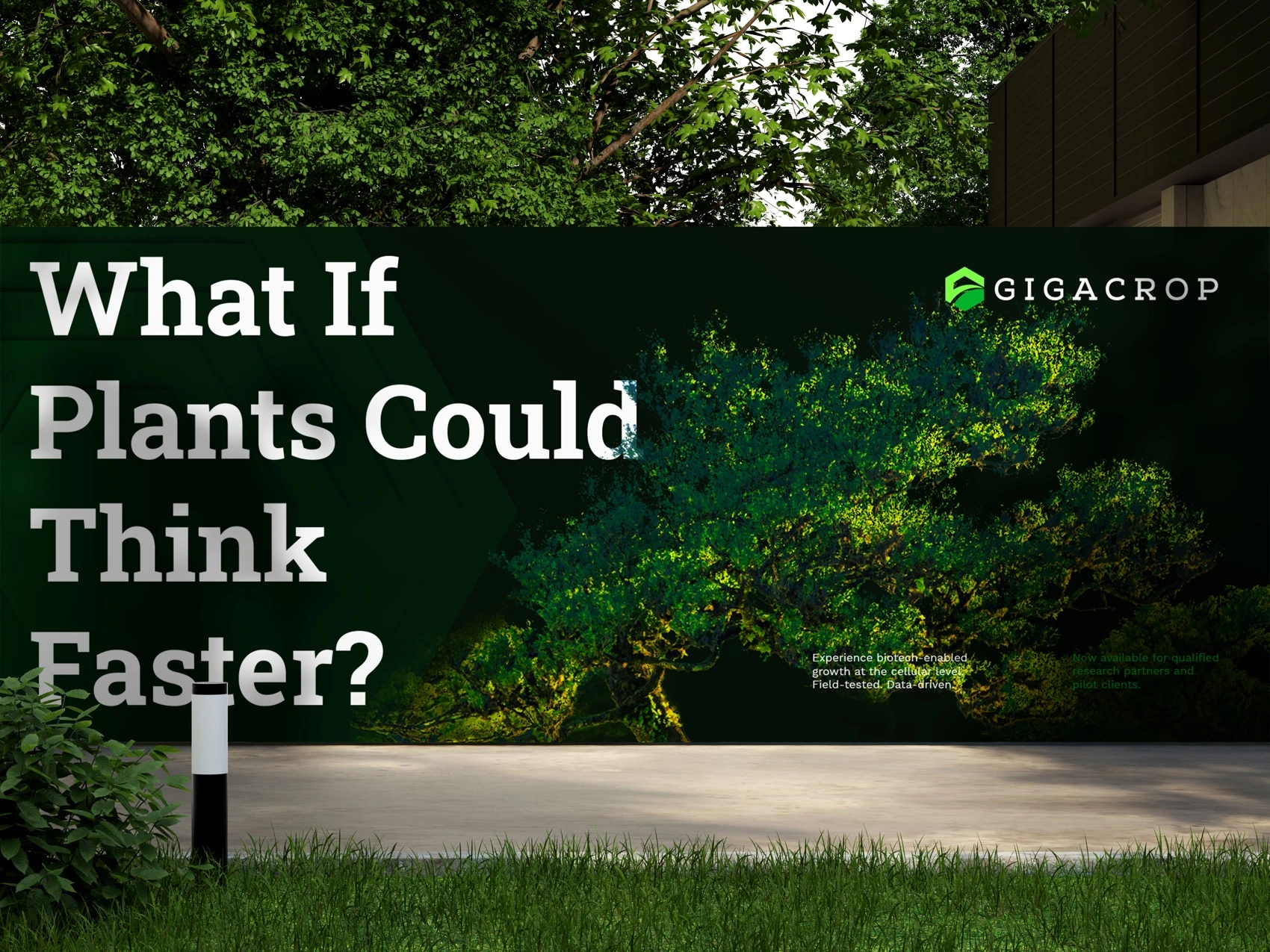
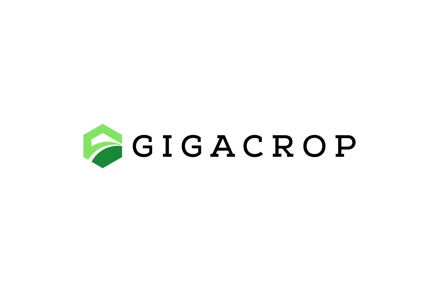
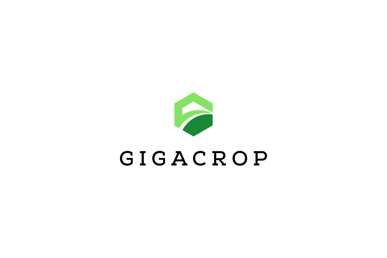
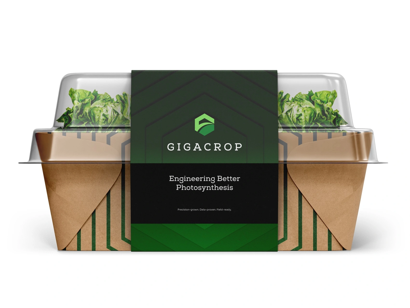
A complete identity for an ag-biotech startup rewiring photosynthesis itself — a hexagon mark built from a house, a field, and a path, carried from billboard to apparel to product packaging, now live at gigacrop.com.
Context
Crop yields have crept up roughly 1% a year for the last century — a slow grind set by a single rate-limiting enzyme in photosynthesis. Gigacrop is rewiring that bottleneck directly, engineering a step-change rather than another incremental season. The brand had to carry that kind of claim: precise enough for the science, warm enough for the farmers it's ultimately for.
Approach
- A mark that's a small landscape. The hexagon reads as a house roofline opening onto a field with a path running through it — home, land, and a way forward, built from three shapes instead of a literal plant icon.
- One confident green, not an eco-brand gradient. A single deep green anchors the system, with a lighter tone reserved for contrast and hierarchy — precision over decoration.
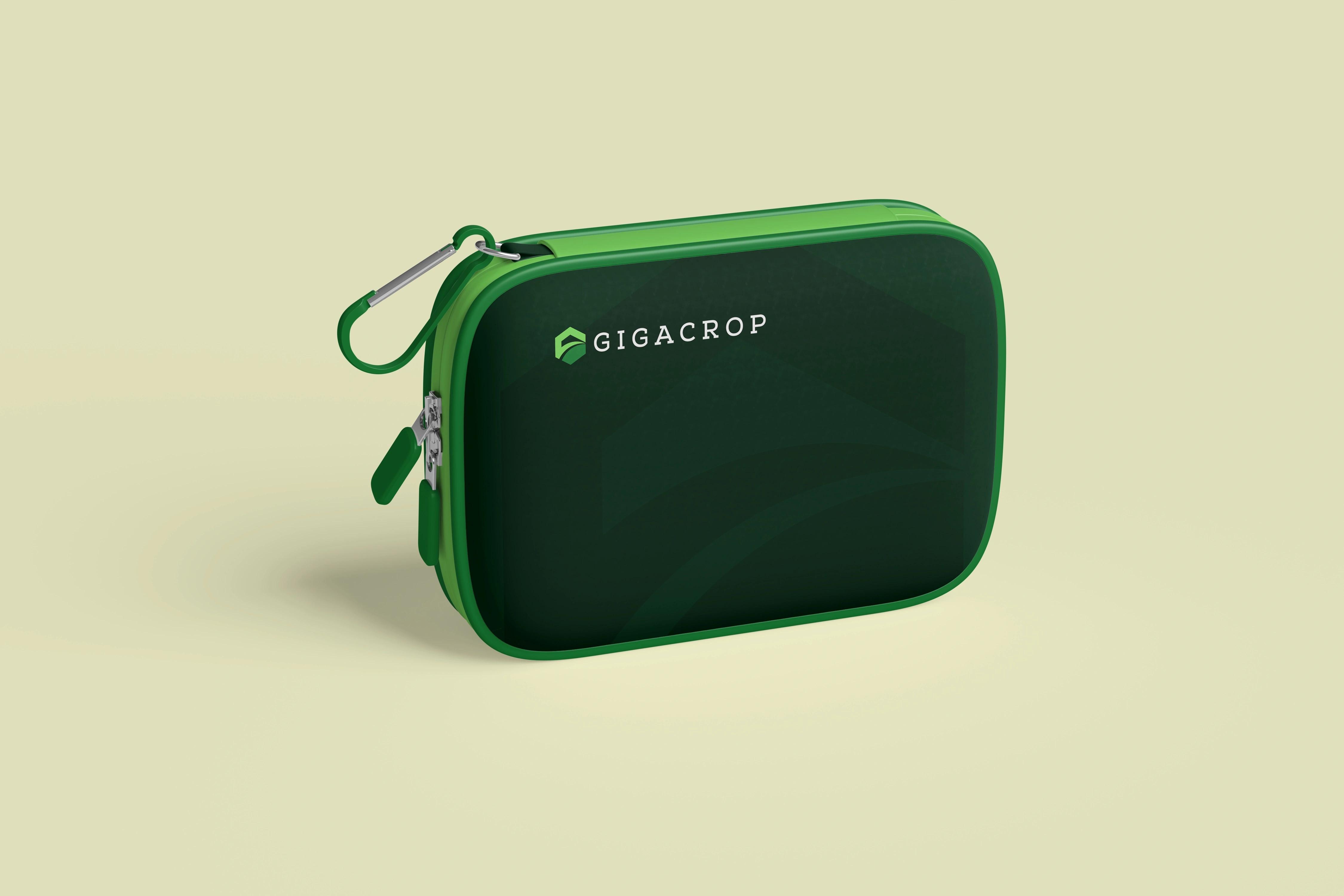
- Consistent from the ground up. The same mark and system carried identically across signage, apparel, and product packaging — nothing reads as a separate sub-brand.
Solution
The mark



Art direction





Out in the world




Outcome
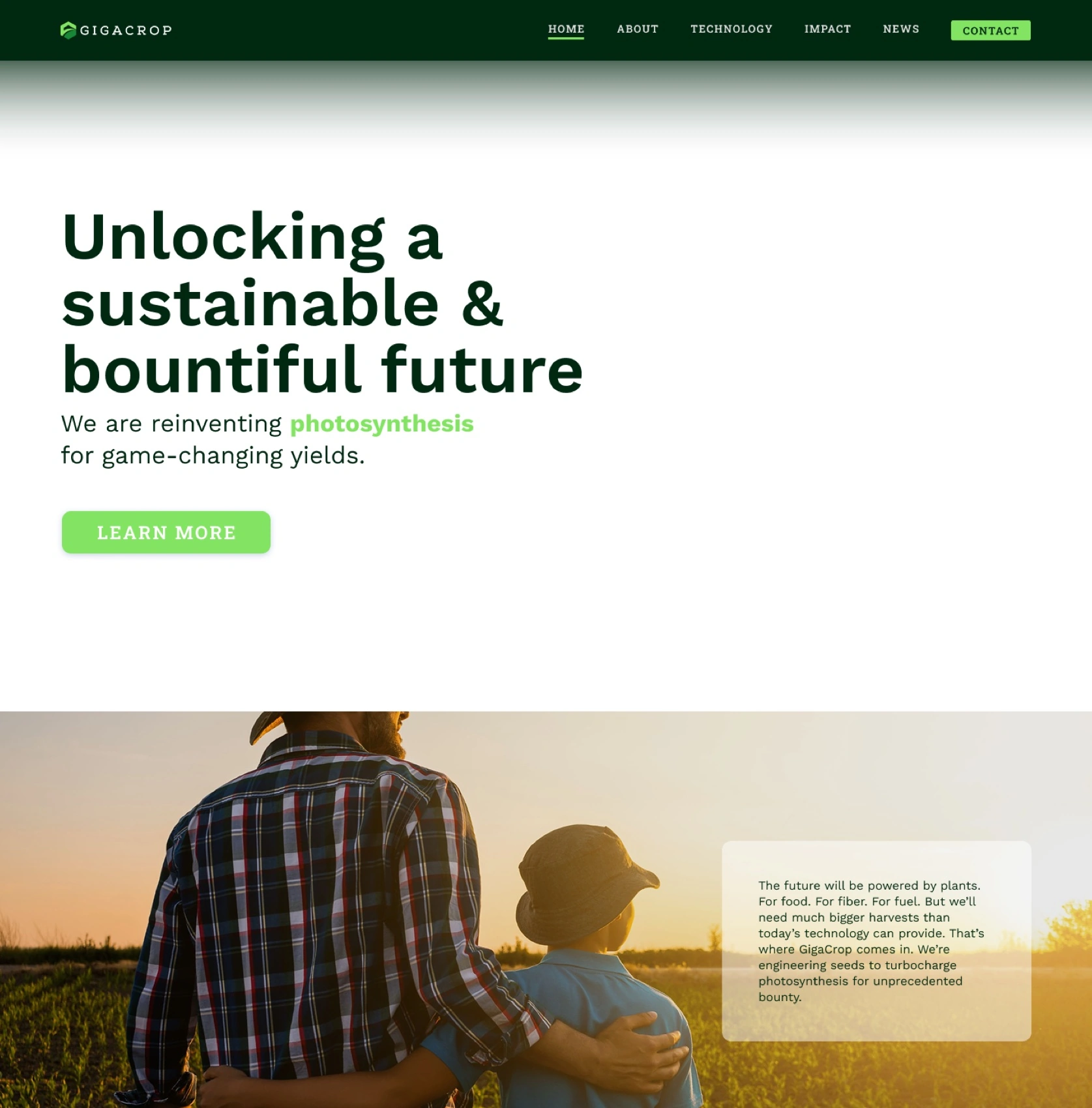
A complete identity system — mark, type, color, and a full application suite — built for a company asking a genuinely hard question and needing to look like it could answer it. Live now at gigacrop.com.
Unlocking a sustainable and bountiful future.← All work