
Brand Identity · Brand Strategy & Direction · Art Direction · Visual Systems
Deduction
A 'modern timeless' brand for an AI-native tax startup — a minted coin-seal monogram, an engraved wordmark, and a classical-meets-AI world built to sit beside Stripe and Ramp.
Context
Deduction is an AI-native tax and finance platform for HENRYs — High Earners, Not Rich Yet. The product is an AI accountant named Taylor you text like a friend, who files your taxes and, in time, runs your money. The founders had one question for the brand: what name — and look — feels like it could live with the greats? Stripe, Ramp, Mercury, Coinbase.
The brand had to earn that shelf: trustworthy without feeling institutional, human without feeling casual, intelligent, and premium enough to grow from tax filing into a whole bank.
Approach
I art-directed the brand at WarpCraft on one idea: mint it like money. If Deduction wants to live with the financial greats, it should look minted — timeless, valuable, a little mythic.
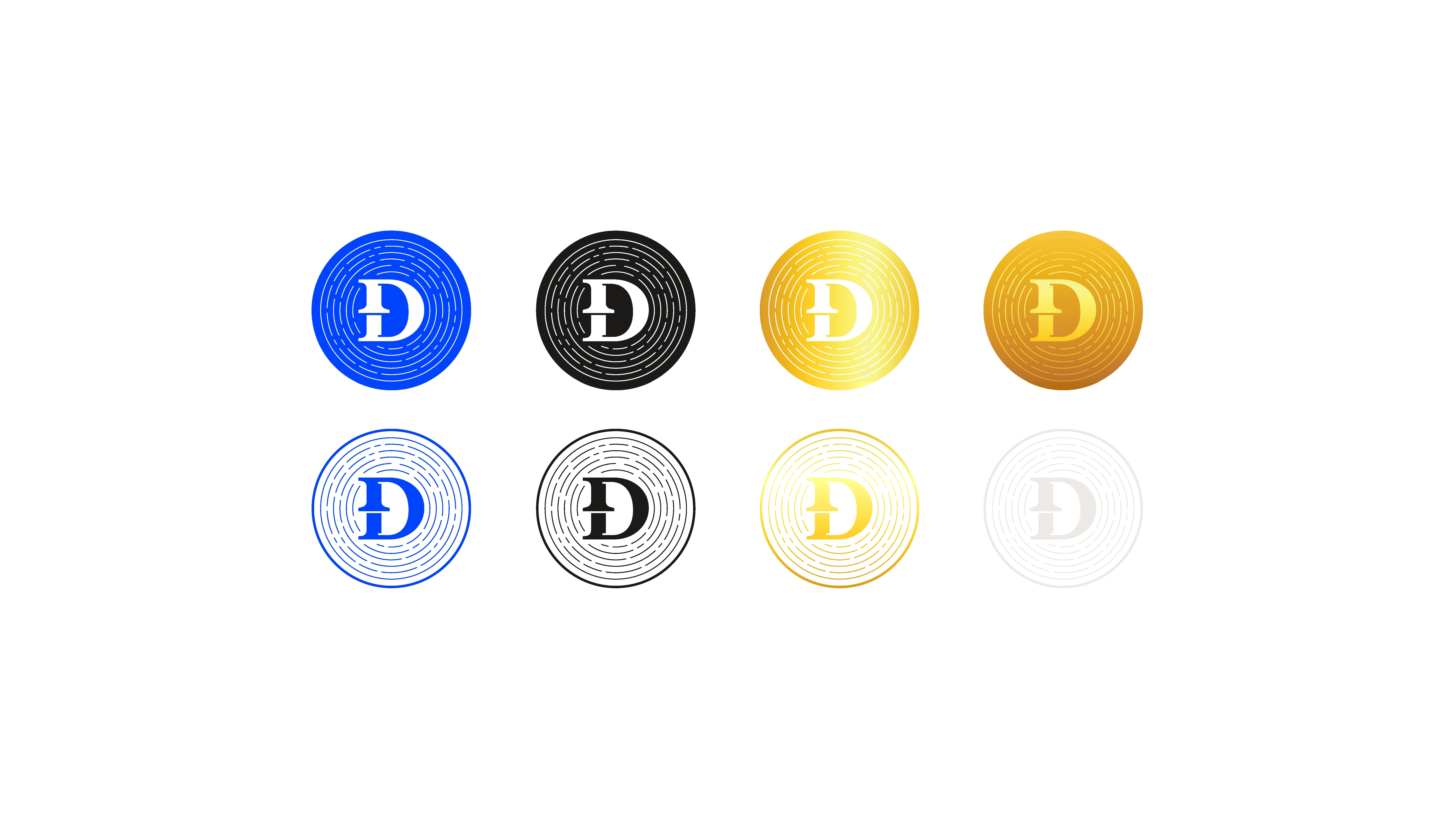
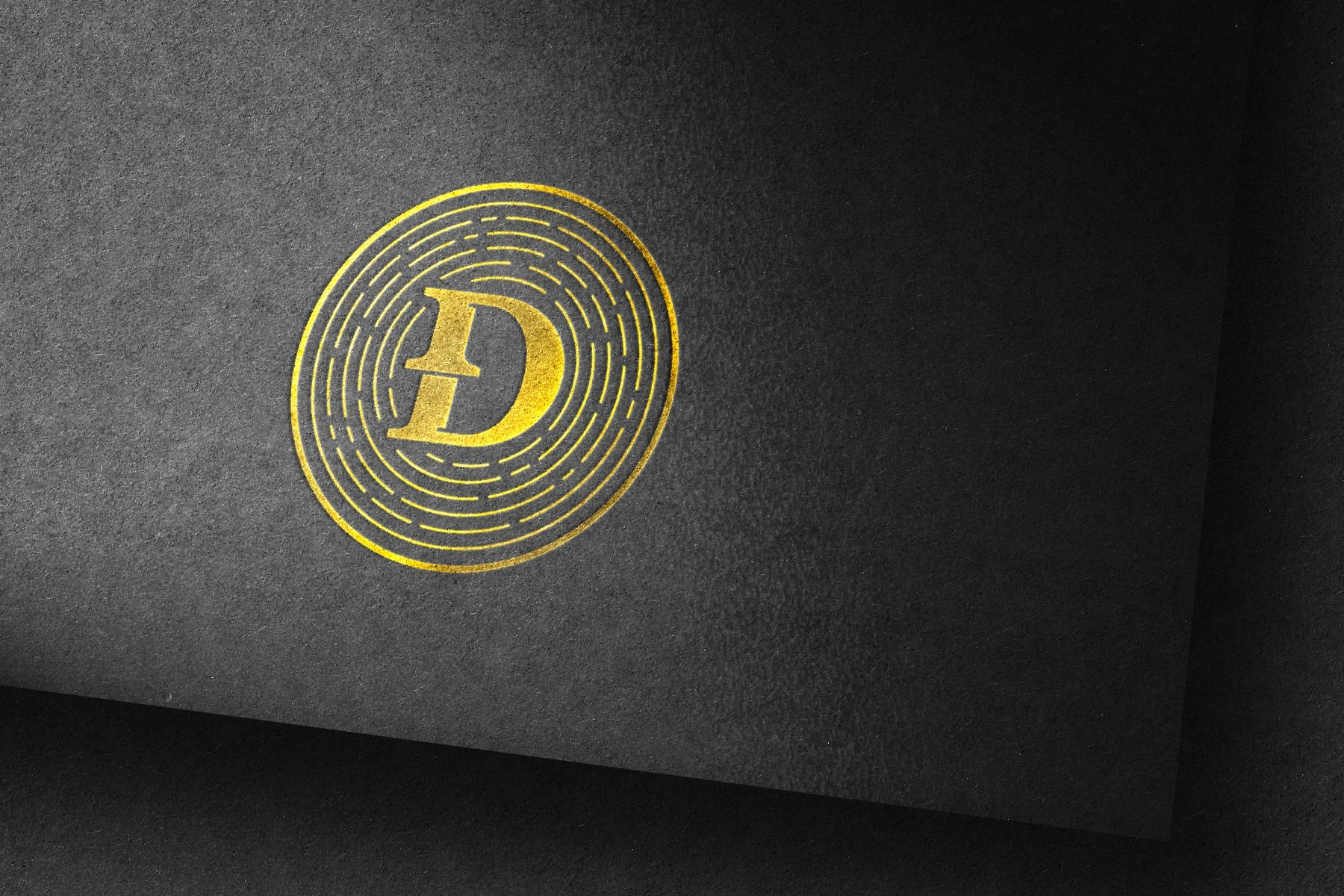
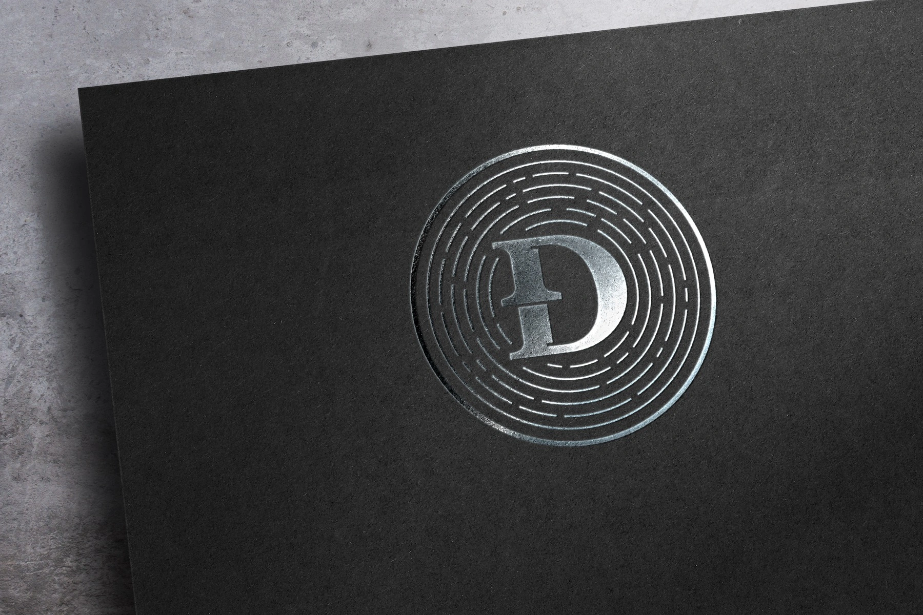
- A coin, a seal, a monogram. The mark is a Đ — Deduction, crossed like a currency symbol — struck inside an engraved seal, the way a coin or a banknote is. It reads as money before it reads as anything else.
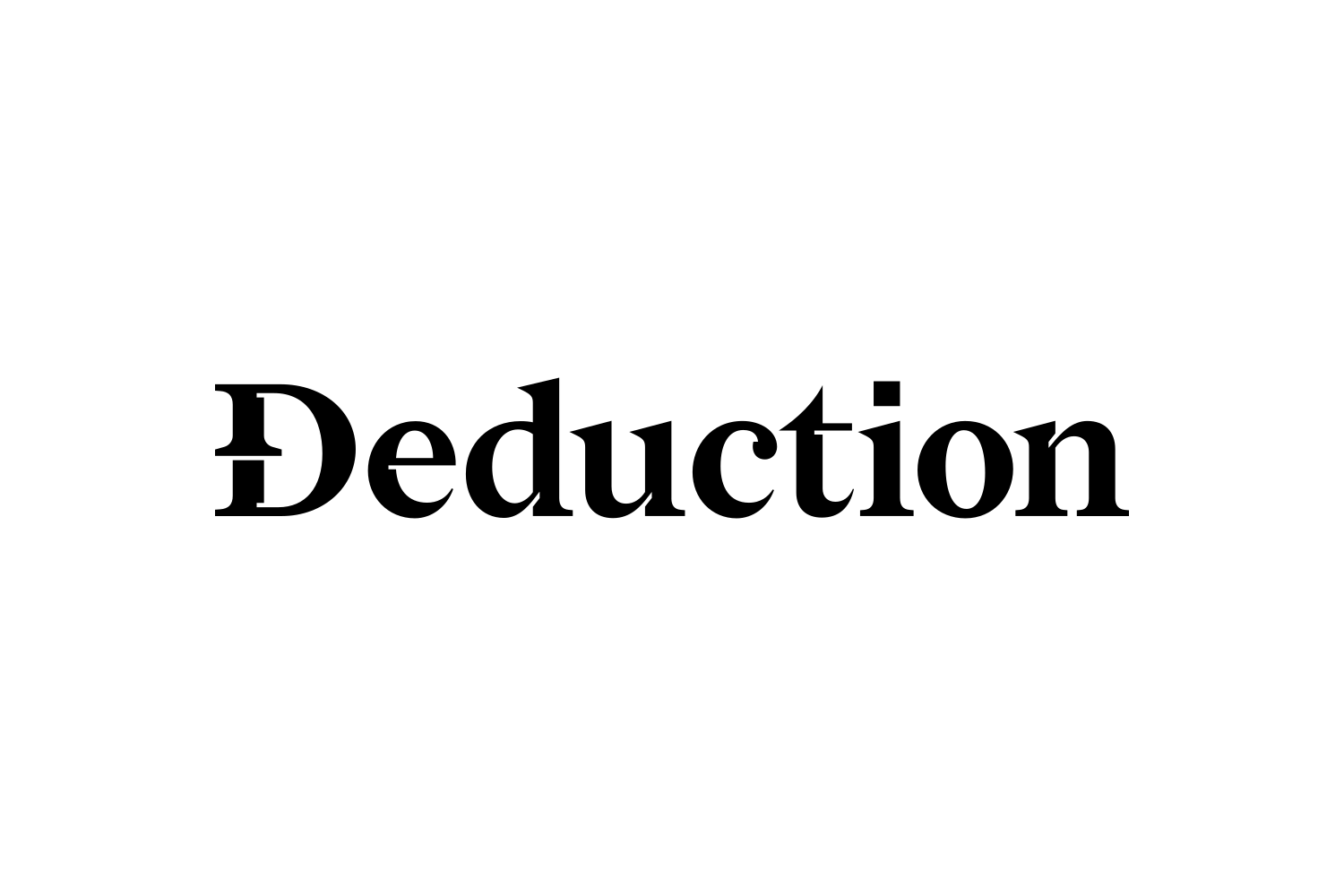
- Engraved, not typed. A classical engraved serif for the wordmark — the typography of currency and old institutions — against a clean modern sans for the product.
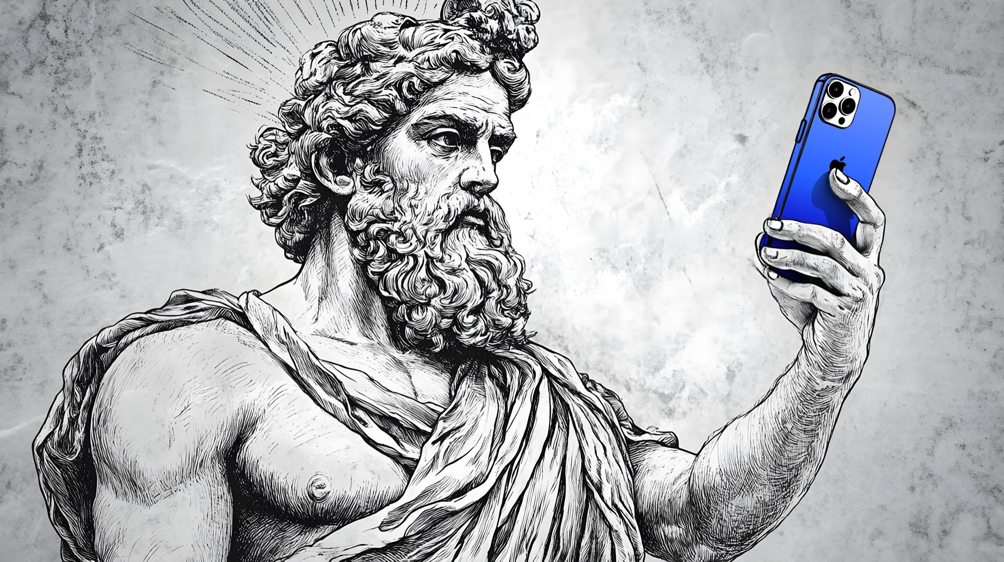
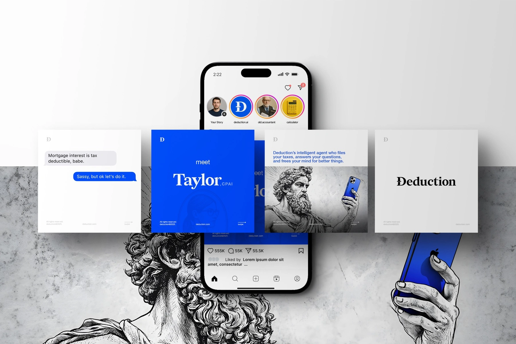
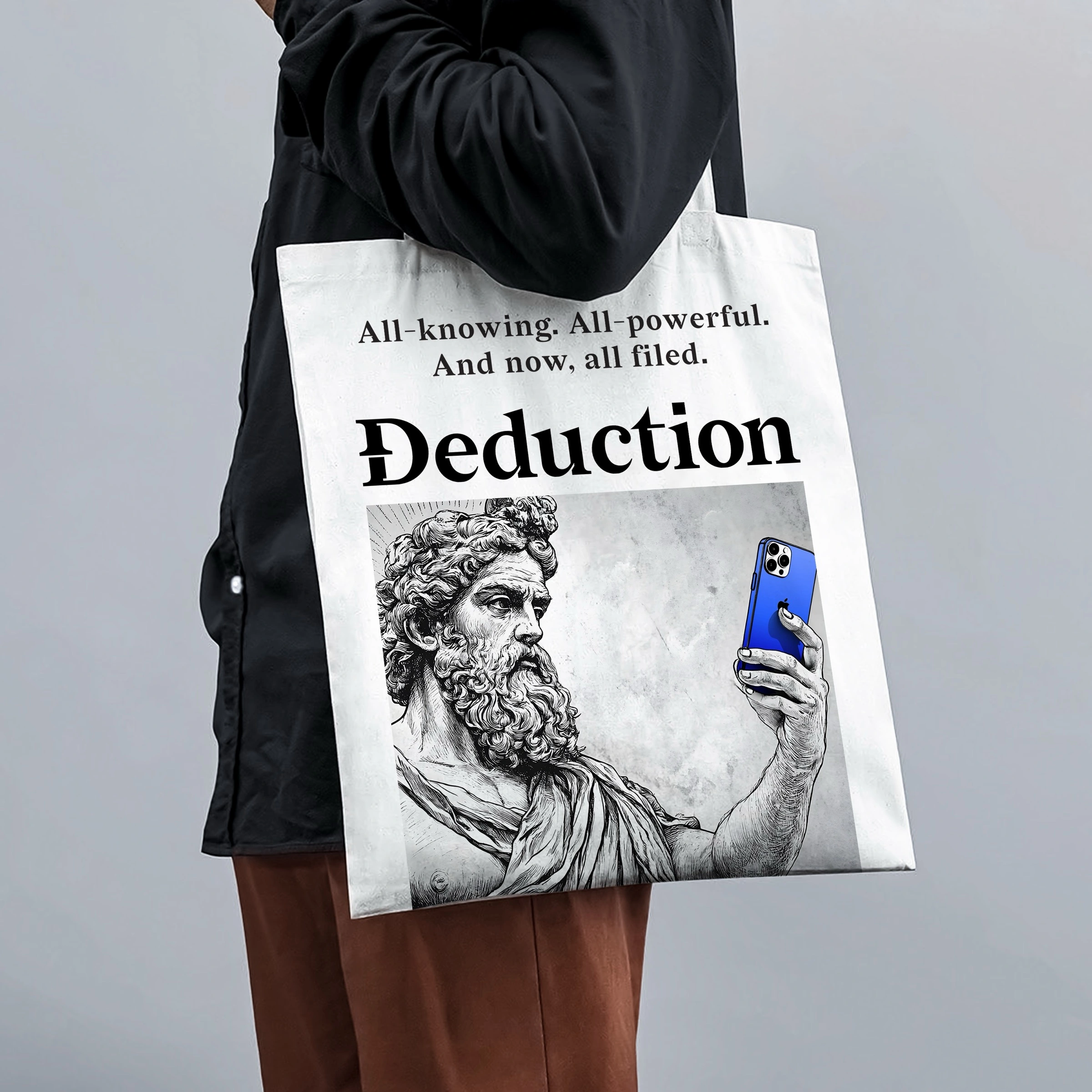
- Antiquity, online. The brand's world borrows from the classical — marble busts, Greek gods, gold — then winks: a god taking a selfie, a bust as your accountant's avatar. Wisdom and wealth, retold for people who text their taxes.
- Electric blue + minted gold. A confident fintech blue against gold — modern and timeless at once.

Solution
The seal
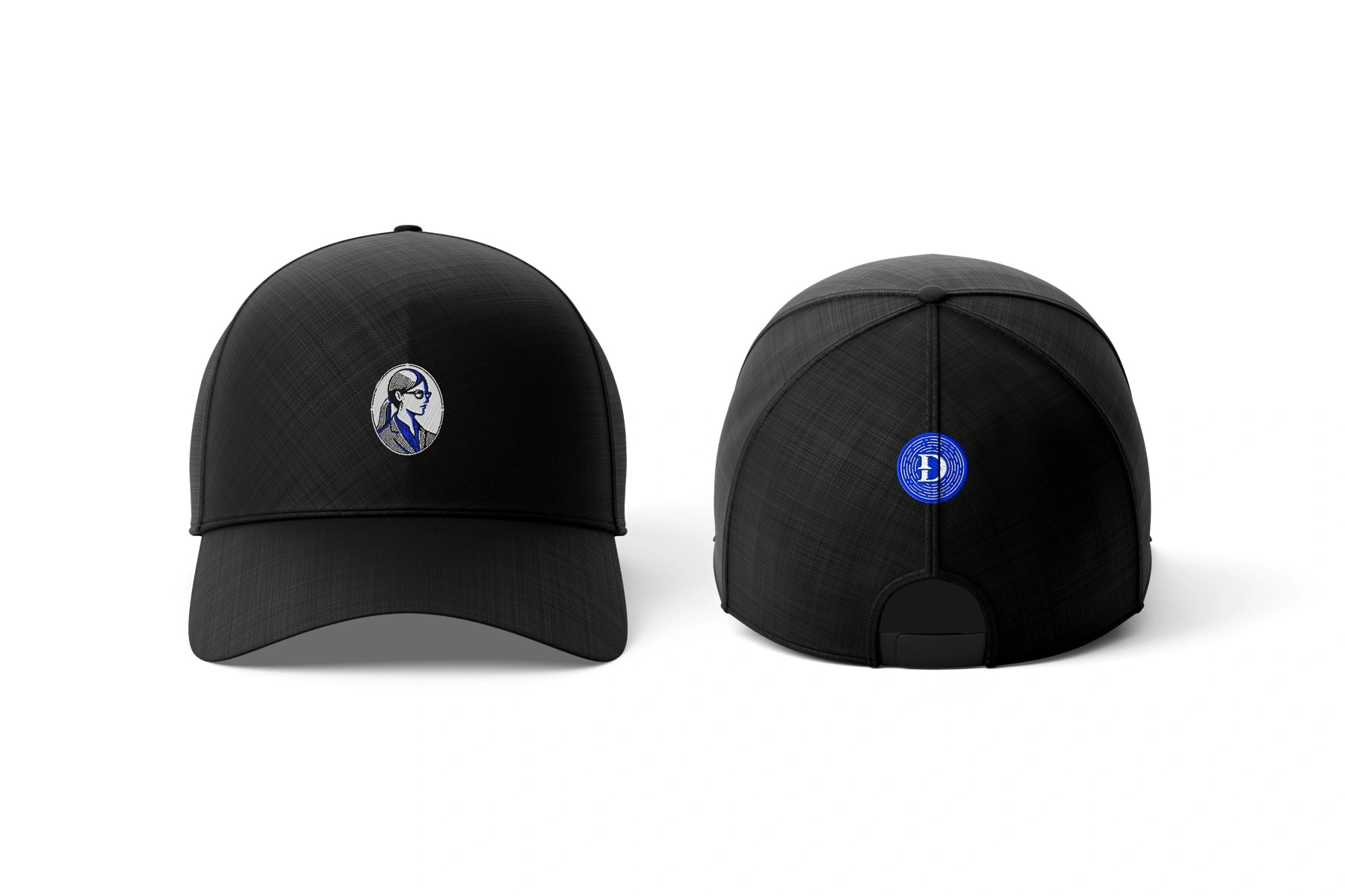
The monogram was built as a system of seals — a struck coin that holds up in blue, in ink, and in gold foil.


A minus, a pillar, a Greek letter
The hash serif inside the Đ was pulled out and made its own element: a minus sign that also reads as a classical pillar — deduction and institution in one shape. Rotated and doubled, it builds a small alphabet of Greek letters, each one carrying a piece of the argument.
Θ Theta
Limits and thresholds — the circle-and-slash reads as both a coin and a crossed-out expense.
Φ Phi
The golden ratio: balance and proportion, set against tax chaos.
Σ Sigma
Summation — the total of a set, the number you start from.
Δ Delta
Change itself — Deduction (Δ) from Total (Σ).
Antiquity, online
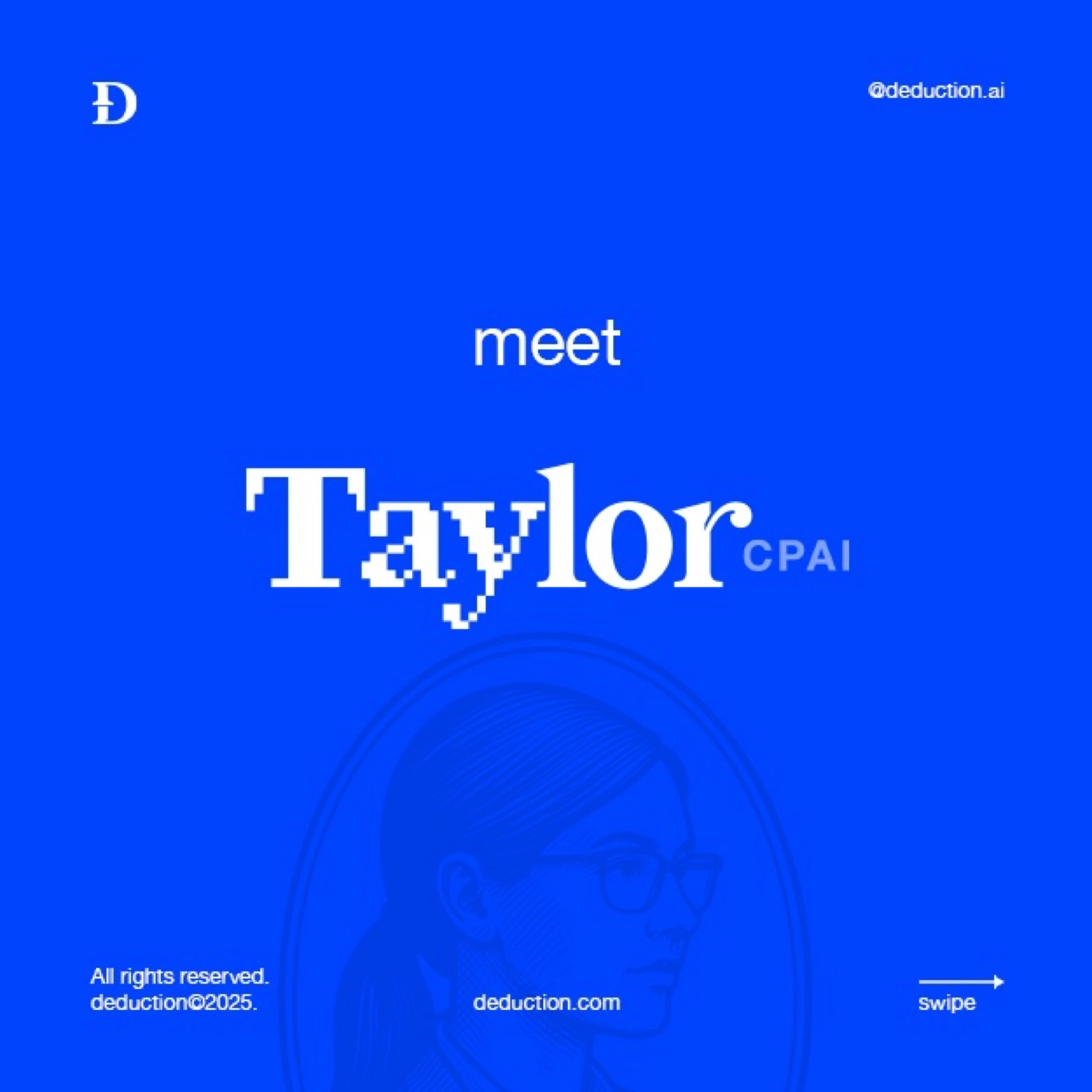
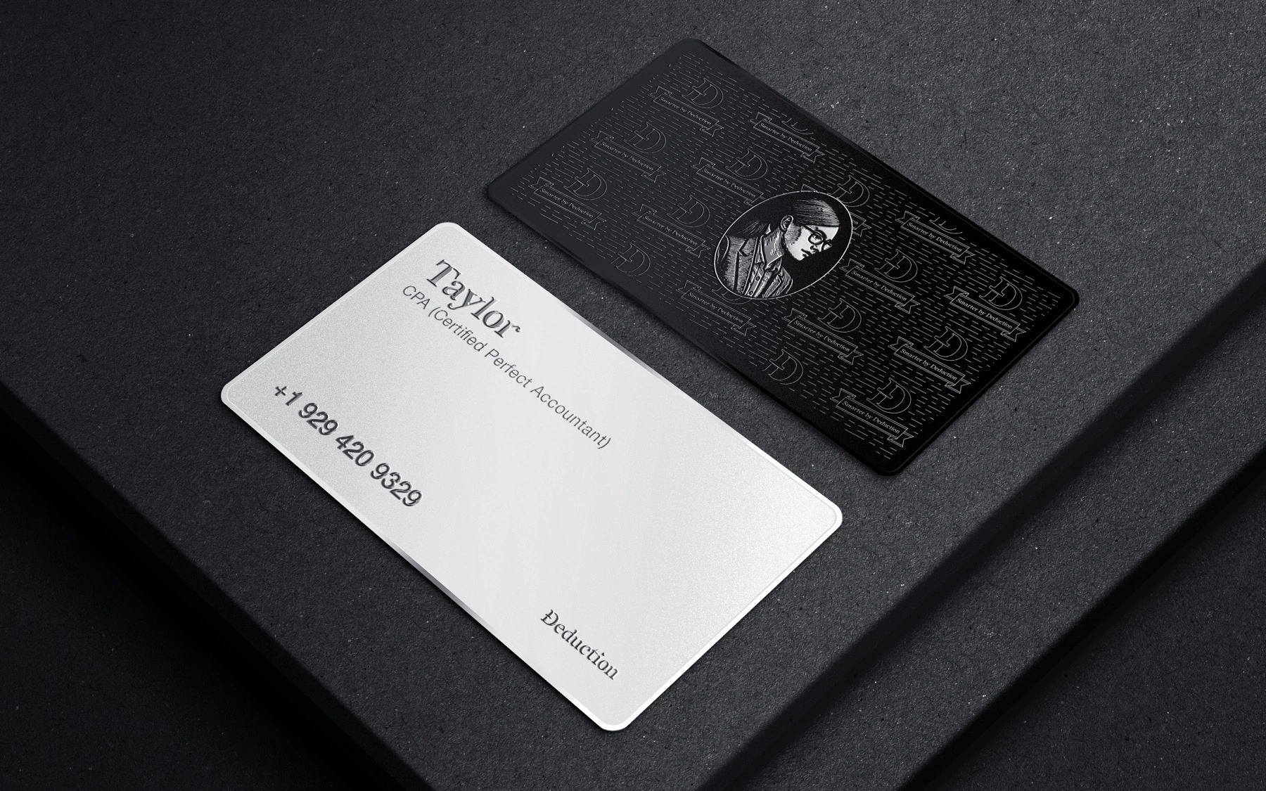
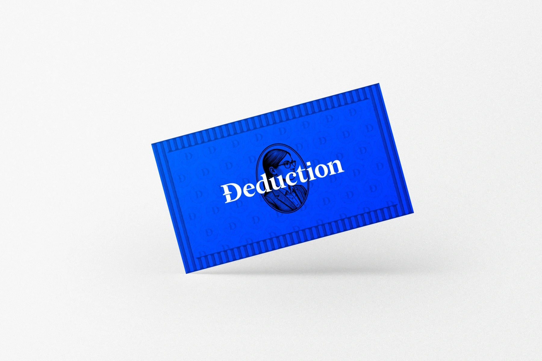
The imagery treats the classical with a straight face and a raised eyebrow — gods and marble doing very modern things. Greek busts as avatars, a pantheon on the feed, the monogram struck into enamel — and Taylor, engraved like a portrait on a banknote.



The product
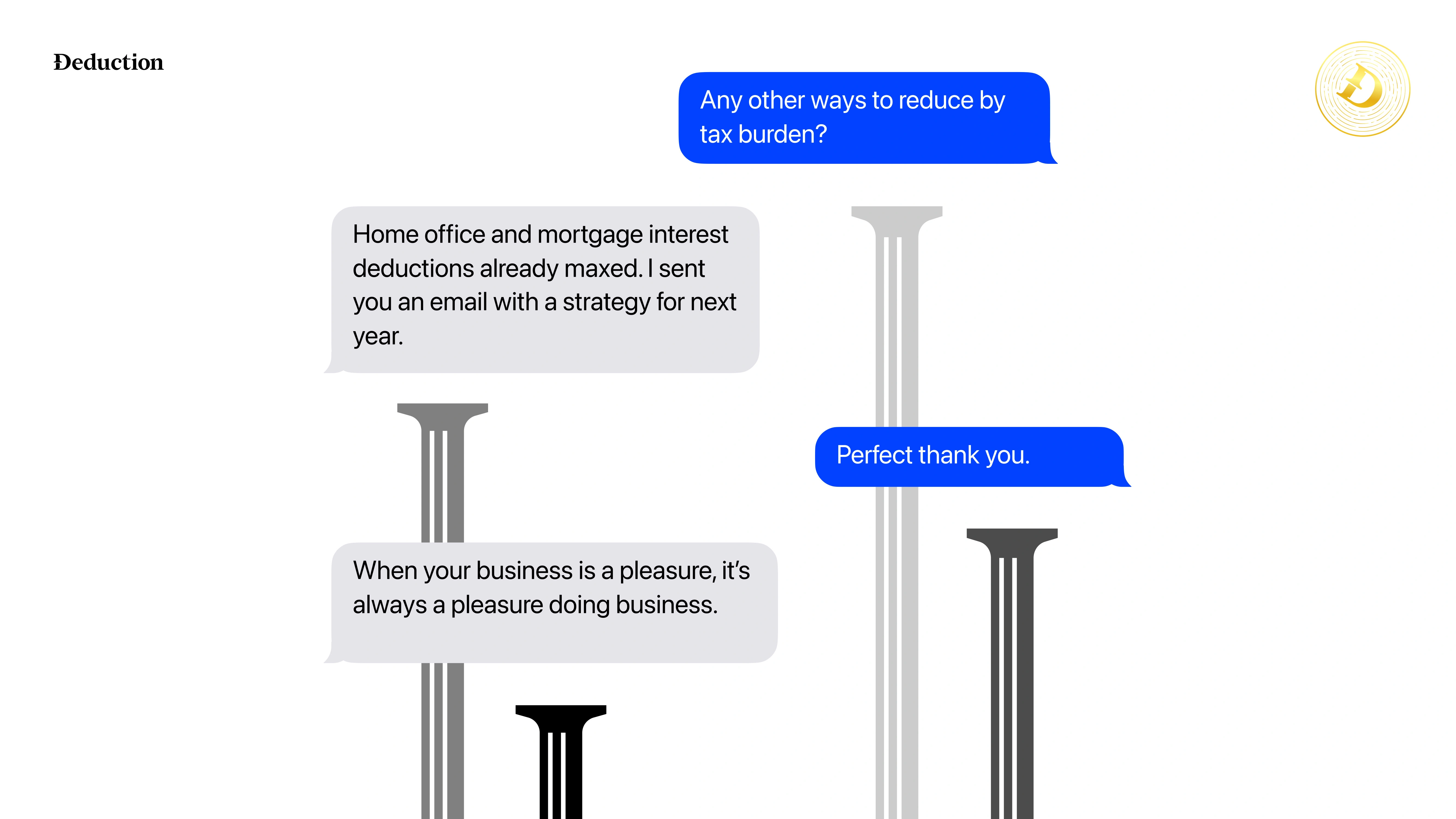
The whole company fits in a text thread: Taylor, the AI accountant, handling your taxes like a calm friend who happens to be brilliant. No more stress. Just clarity.

The campaign
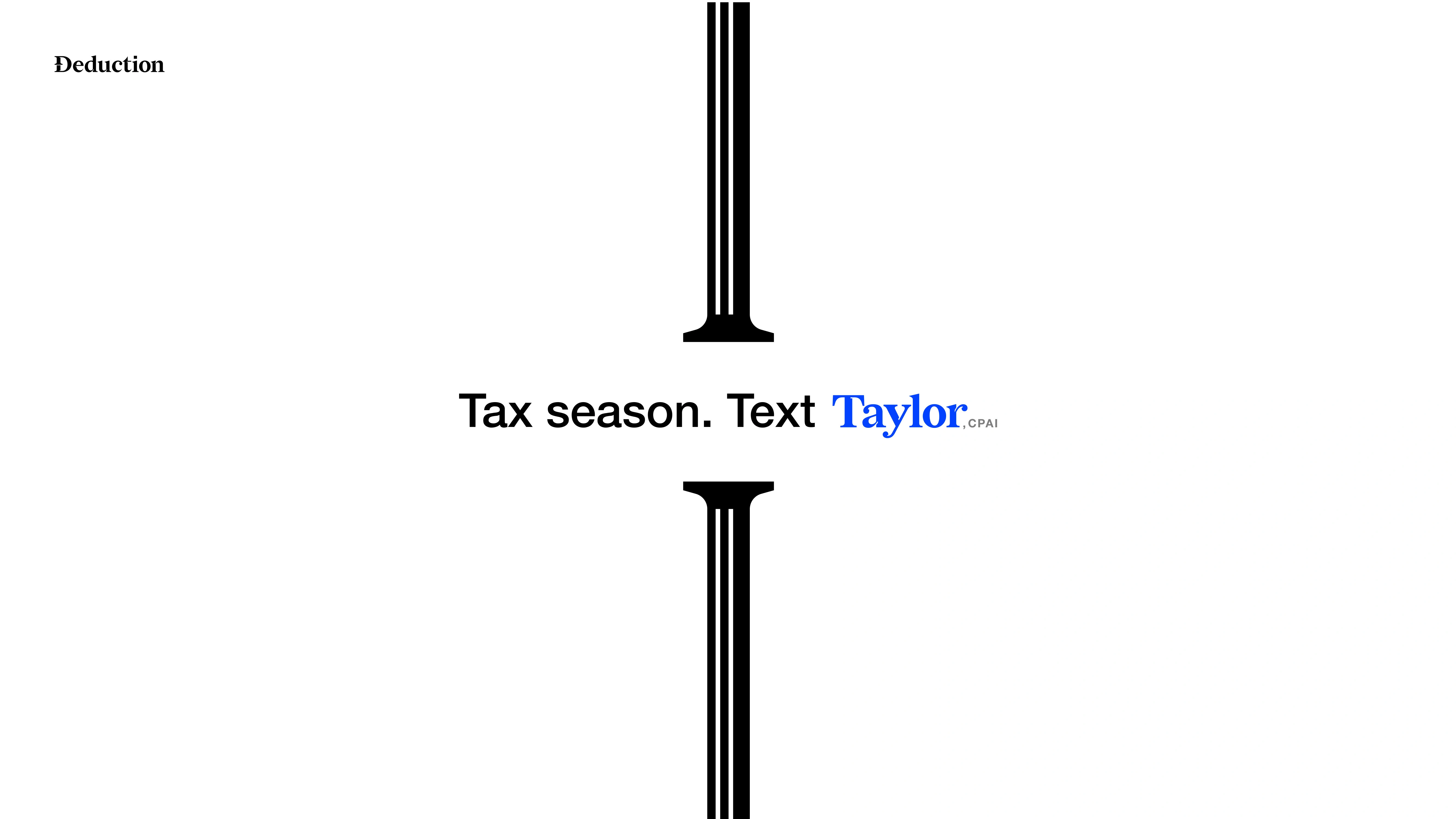
The pillar does the work in the advertising too — holding up the line, spacing the conversation, turning a text thread into architecture.
In the world
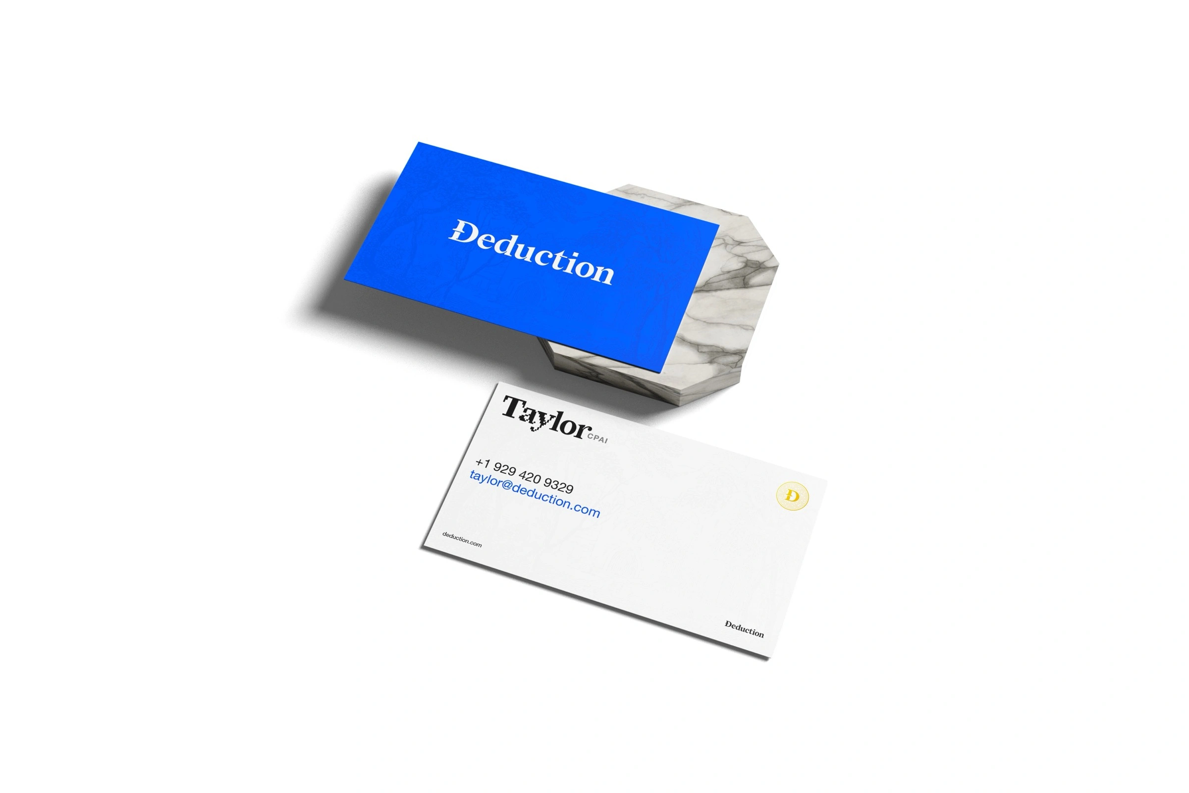
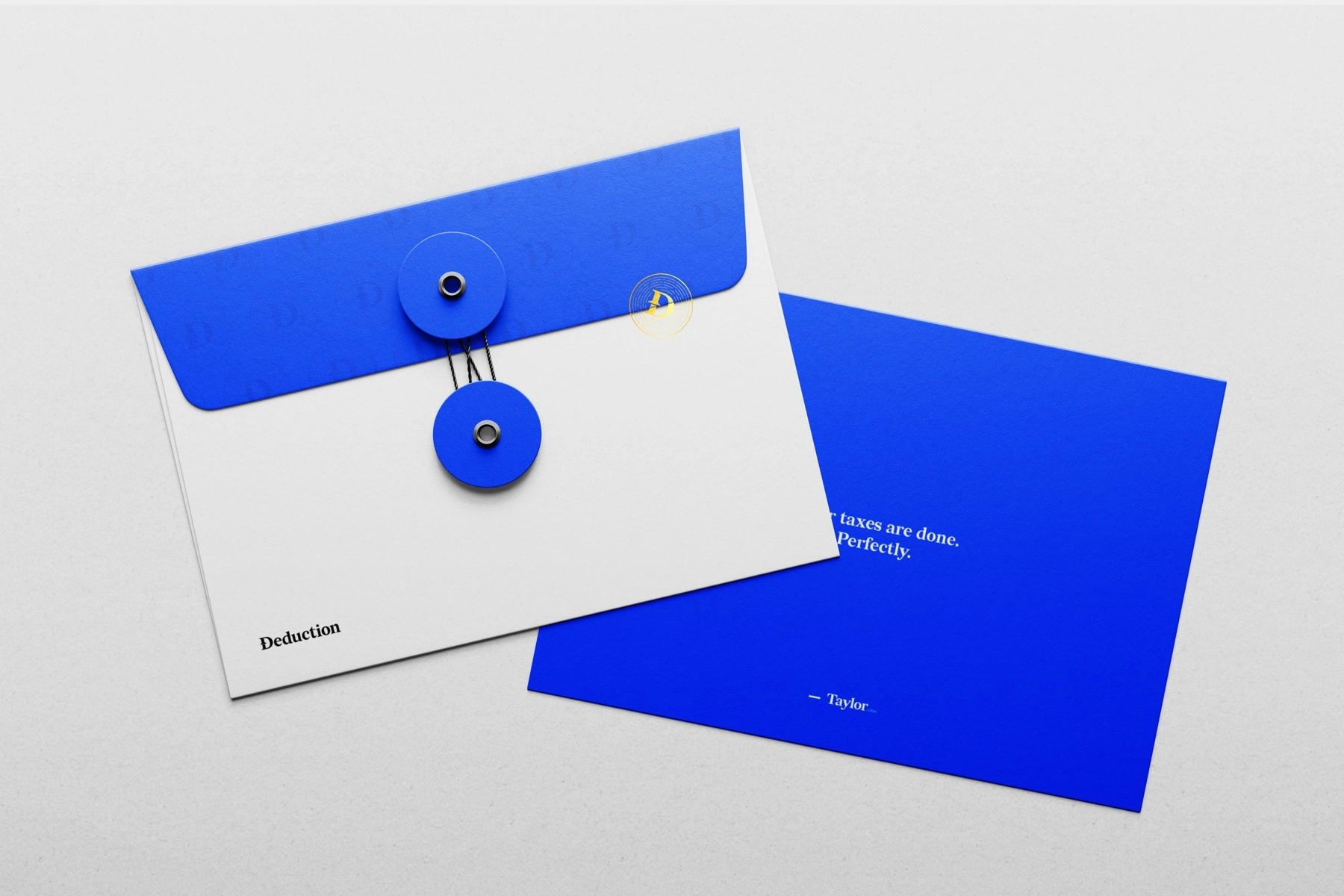
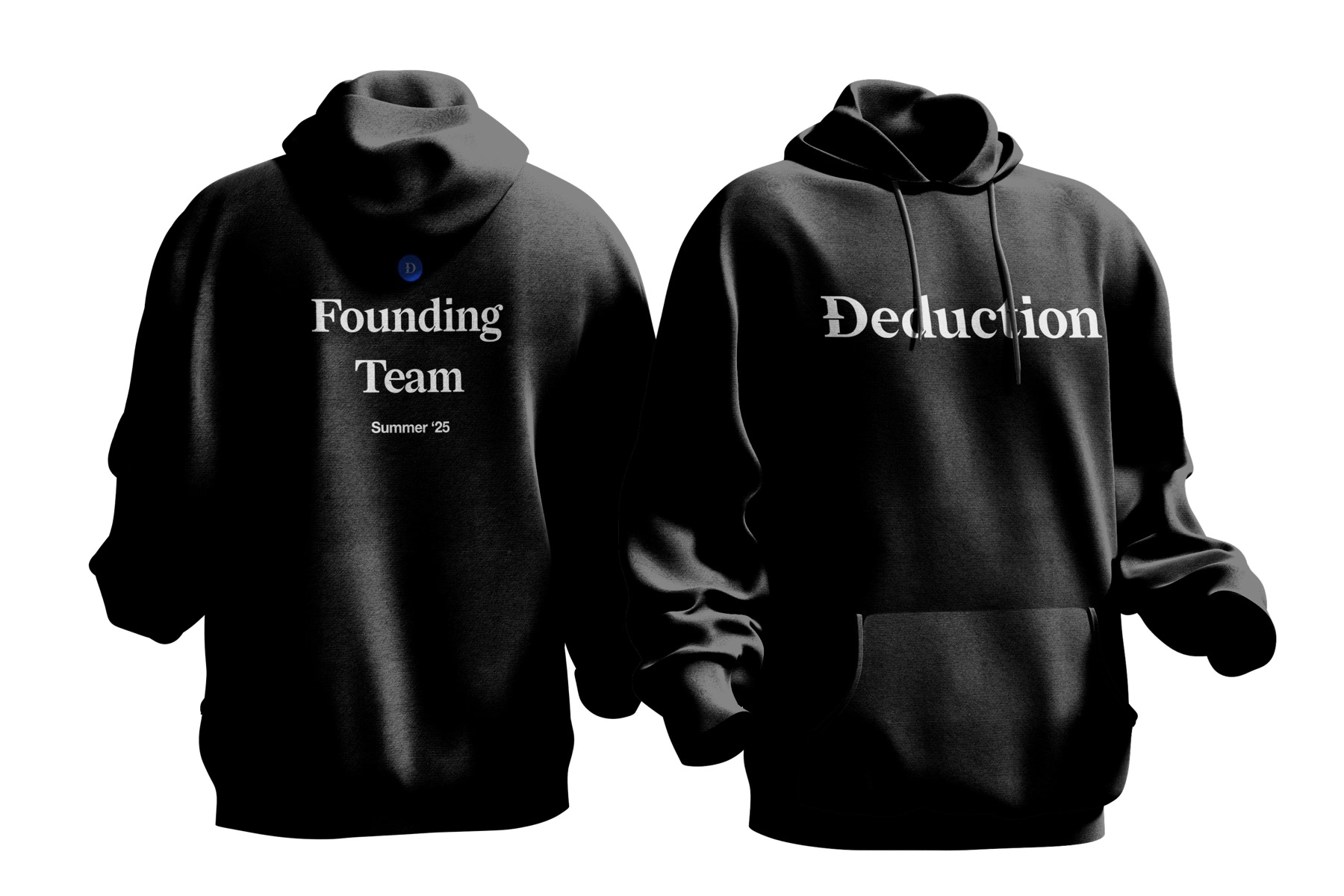
The system mints everything it touches — currency-grade cards, premium stationery, and swag worth keeping.




The totes run as a series — same layout, rotating line, so the joke keeps landing.


Outcome
Deduction went to market with a complete, premium identity: a minted coin-seal monogram and full logo system, an engraved-serif voice, a classical-meets-AI art direction, the product brought to life, and a kit from business cards to billboards — a tax startup that finally looks like it belongs next to Stripe and Ramp.
What name feels like it could live with the greats?← All work