Brand Identity · Brand Strategy & Direction
Strata Nest
A feather-and-skyline identity with a five-line sub-brand system for an Australian strata management company.
Context
Strata management is a trust business wearing a paperwork costume. Owners hand over their single largest asset — an apartment, a building, a body-corporate scheme — and what they actually buy is the confidence that someone competent is looking after it. Yet the category looks the part of the paperwork: interchangeable blues, clip-art skylines, names that blur together.
Strata Nest needed an identity that did the opposite — one that signalled care and order at a glance, and could stretch across several distinct service lines without splintering into four unrelated brands.
Approach
The name pointed the way. A nest is something you tend; a feather is what's left when it's been looked after well. The strategic idea: owners leave their "nest" — the property — and rest easy that it's properly kept. The feather became the carrier of that promise — lightness, care, nature against the hard edges of real estate. It started as a sketch next to the wordmark, and the rationale carried straight through to the final mark.
From there I set two rules the whole system had to obey:
- One mark, instantly legible as "property + care." Let a single feather carry it — ordered and upright, nature standing in for the built environment, not a mascot bolted to a building.
- A family, not a franchise. Each service line gets its own colour and descriptor, but shares one mark and one wordmark — so the parent brand compounds instead of fragmenting.
Solution
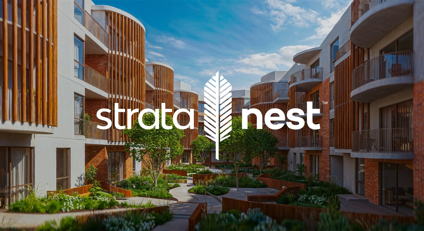
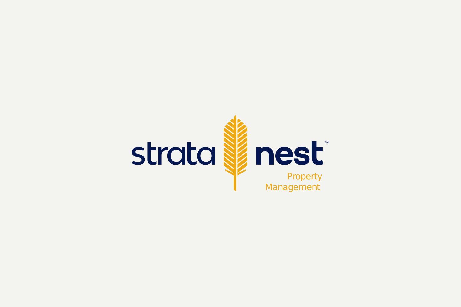
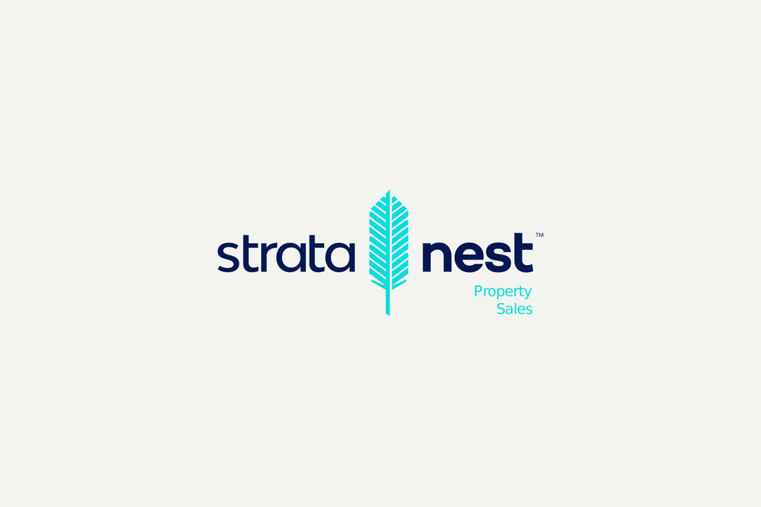
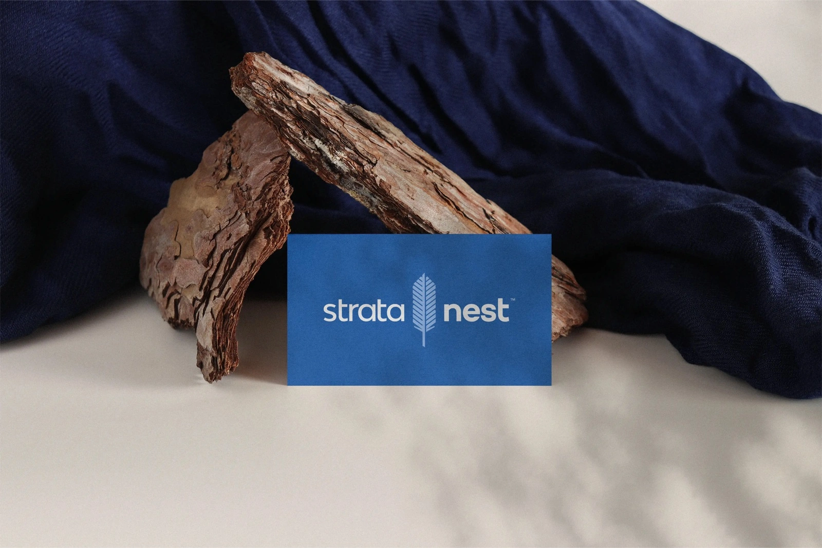
The result: a clean, upright feather — its barbs ordered like the floors of a tower — paired with a lower-case, approachable "strata nest" wordmark.
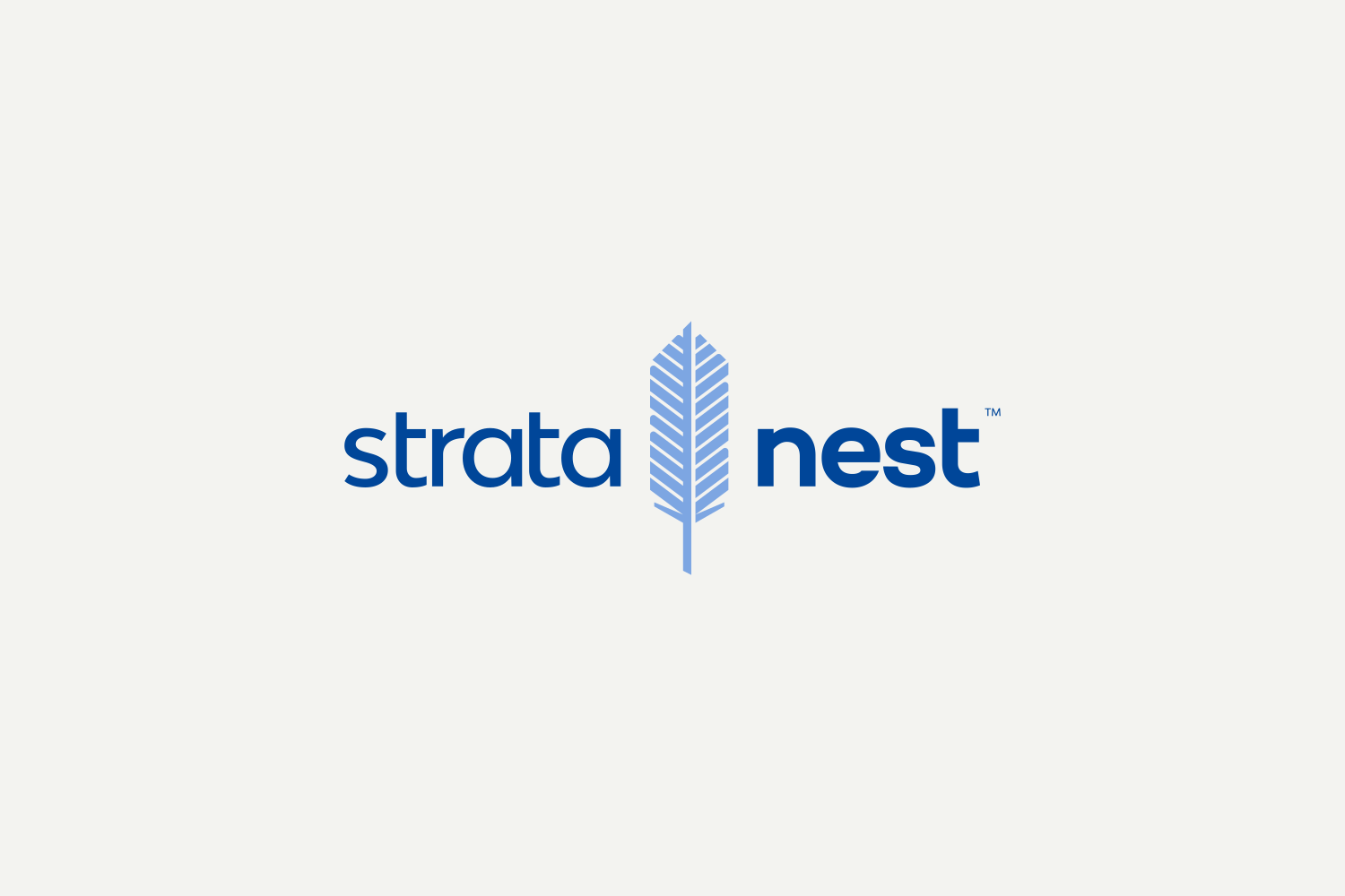

The mark was built to move as much as sit still — a logo animation for screen, social, and product.
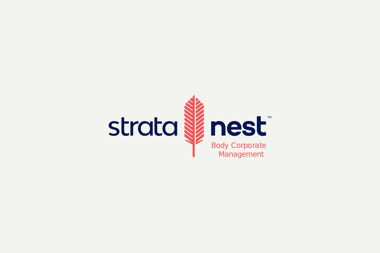
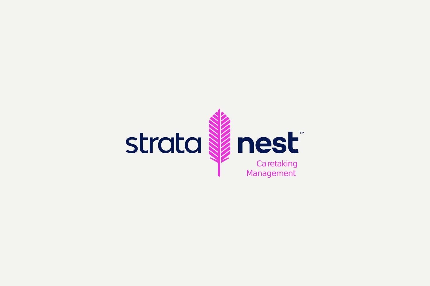
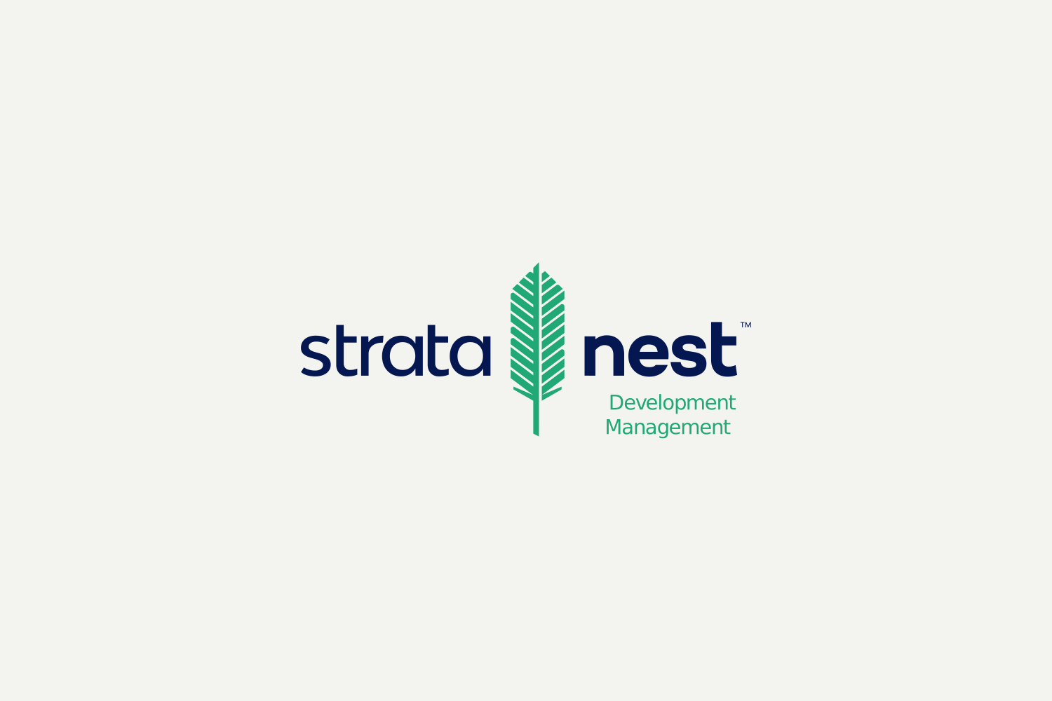
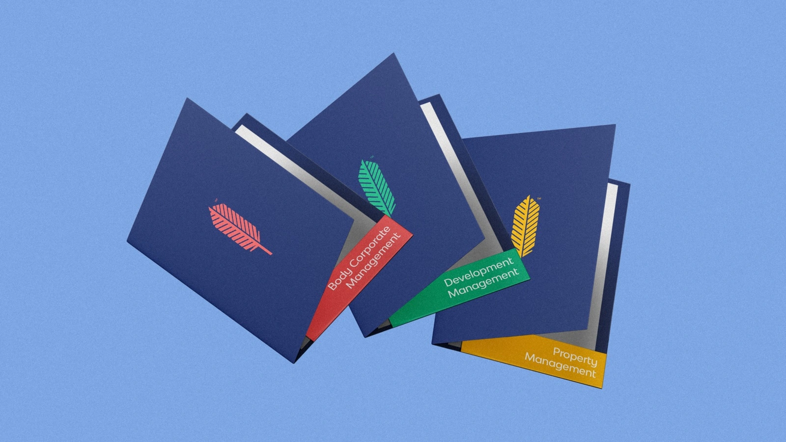
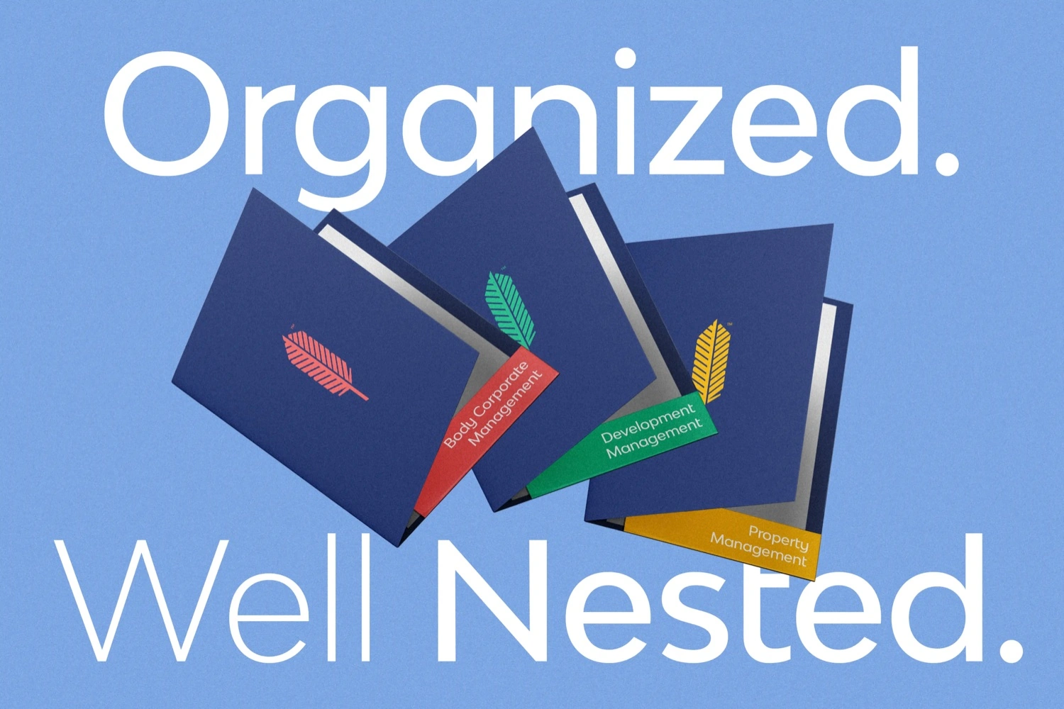
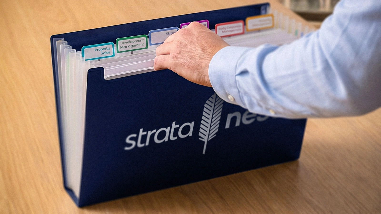
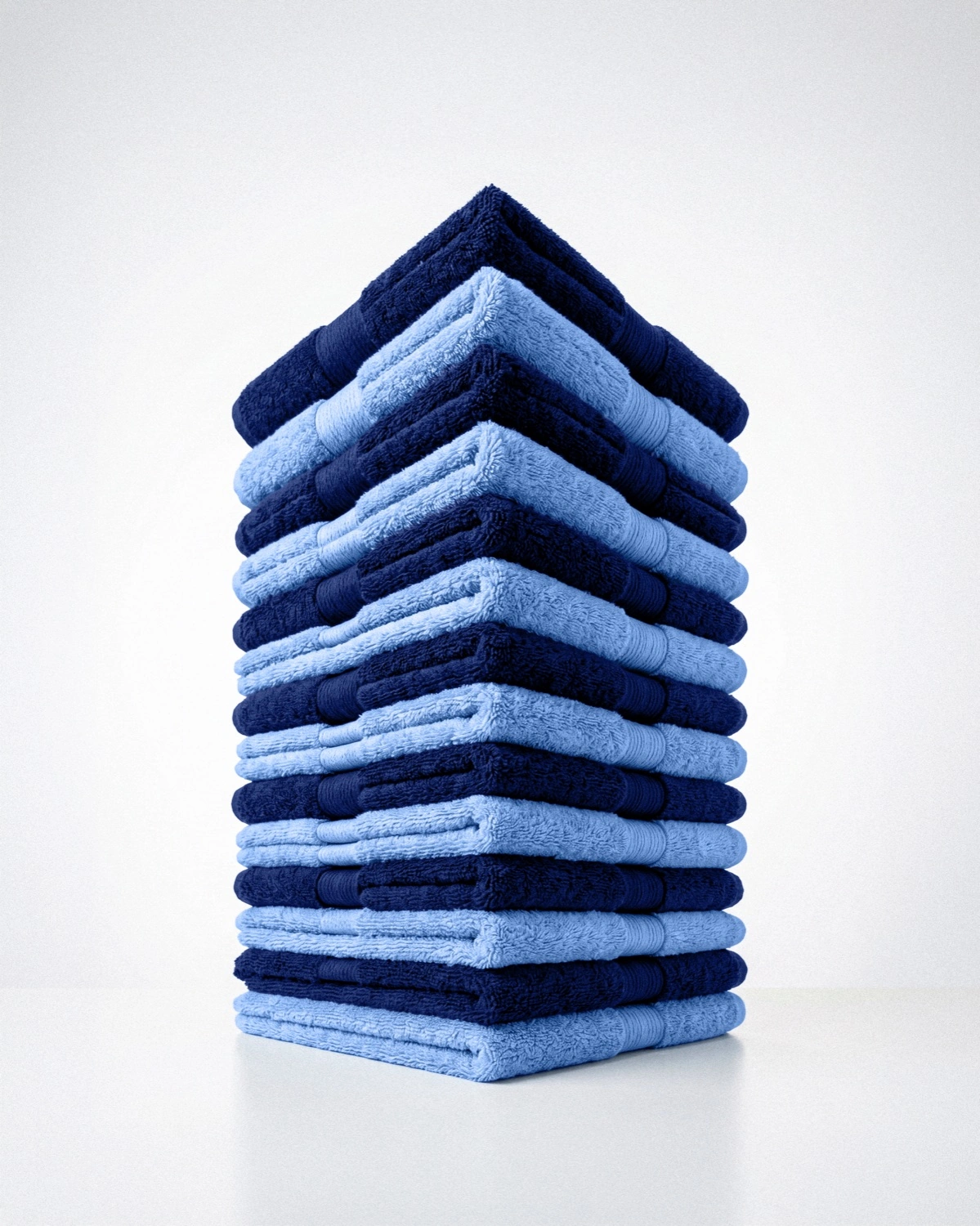
A single mark flexes across five service lines through a colour-coded sub-brand system — same feather, same wordmark, a distinct colour and descriptor for each business. A family, not a franchise. Those colours then carry through every touchpoint, right down to the filing.
In the world
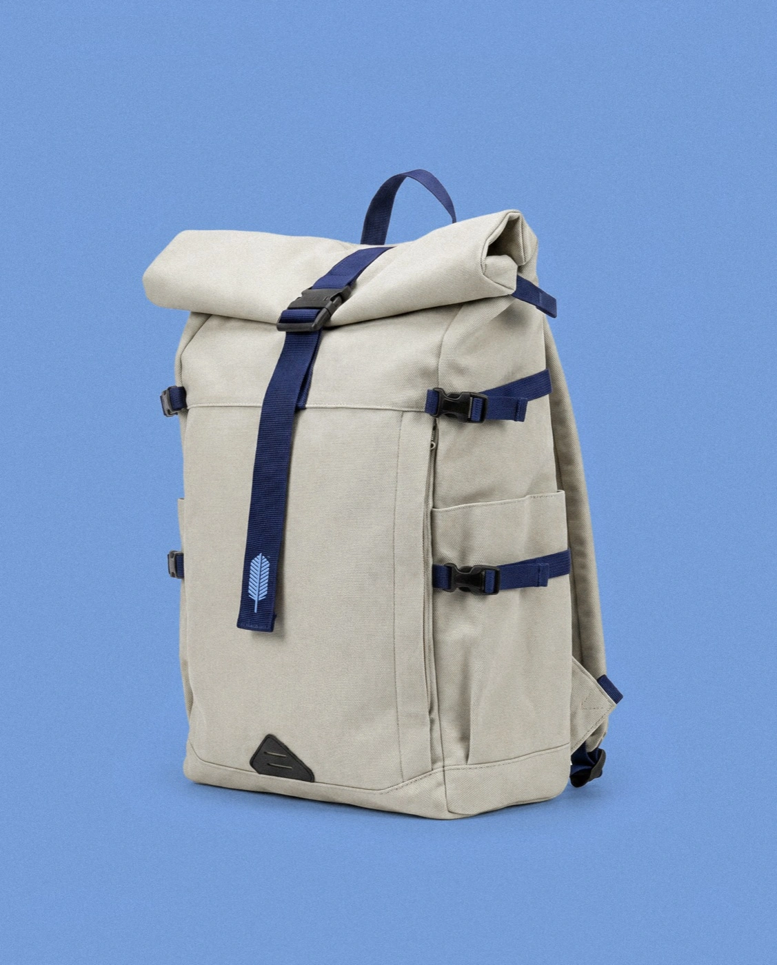
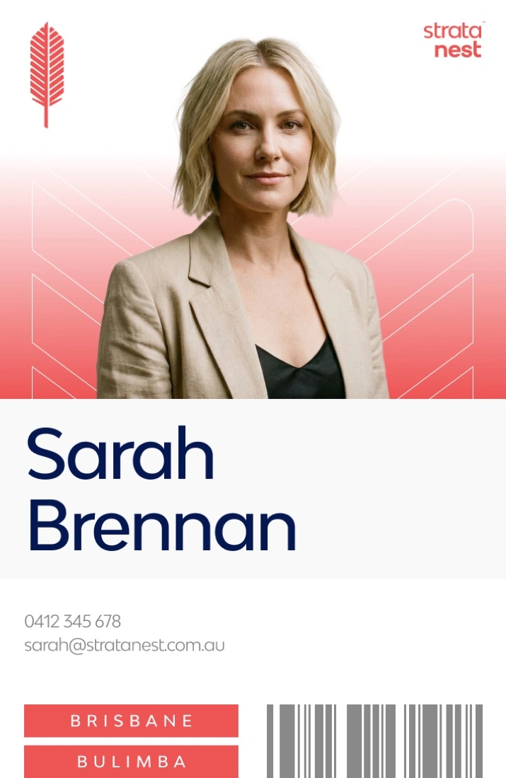
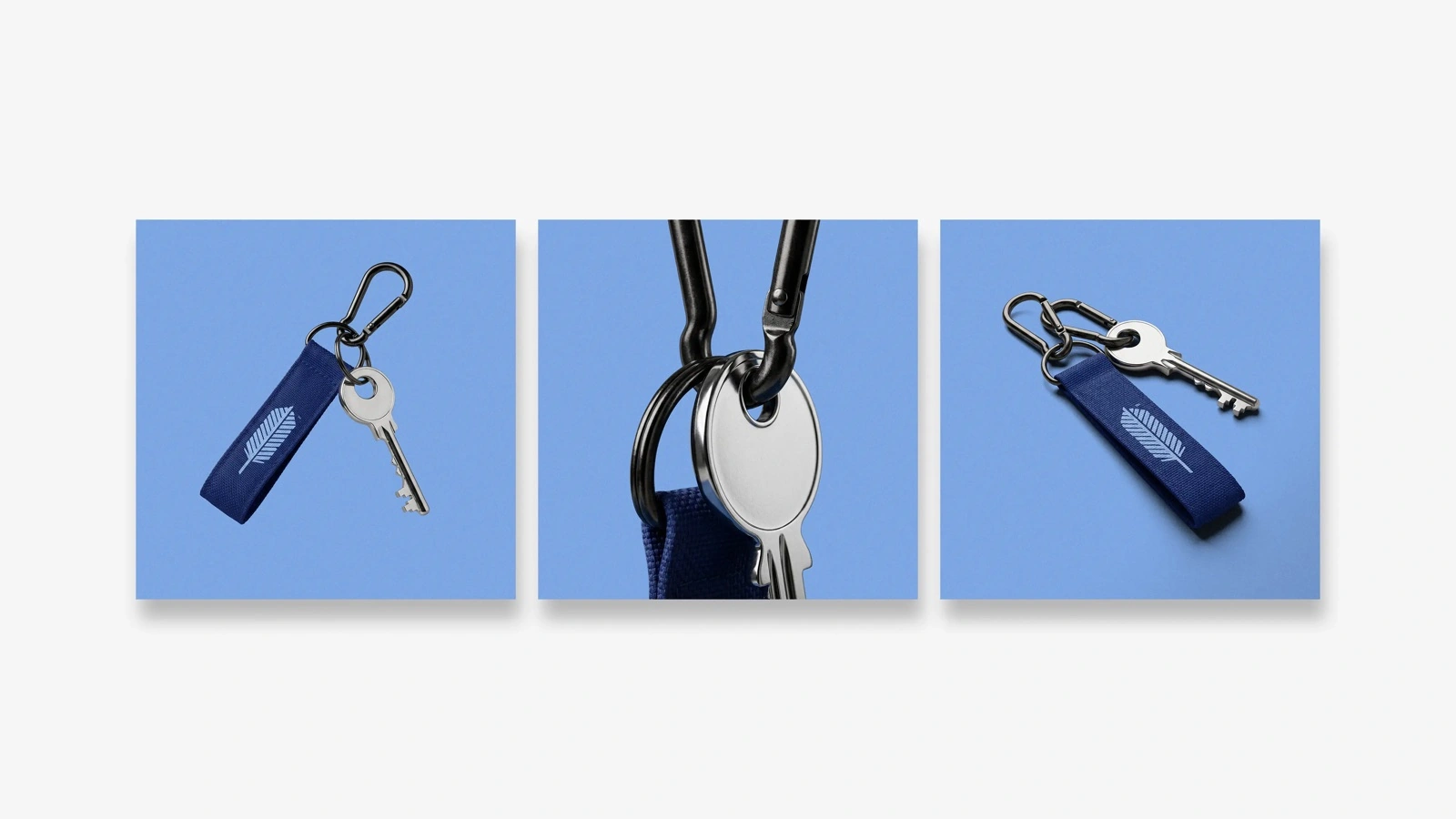
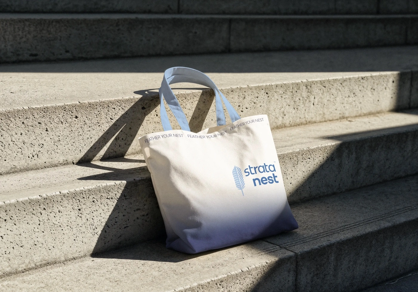
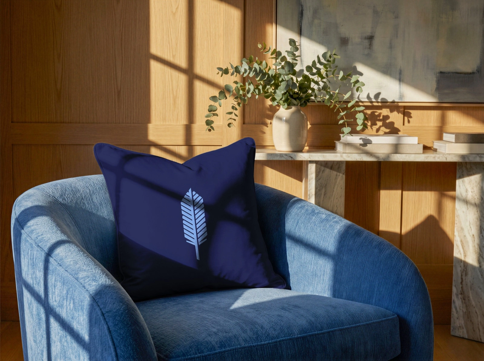
The identity was built to live in the physical world a property manager actually works in — stationery and ID, signage, merchandise, and everyday carry — so it shows up consistently from the front desk to the building site.



A voice to match
Plain-spoken, reassuring, owner-first — the words work as hard as the mark.
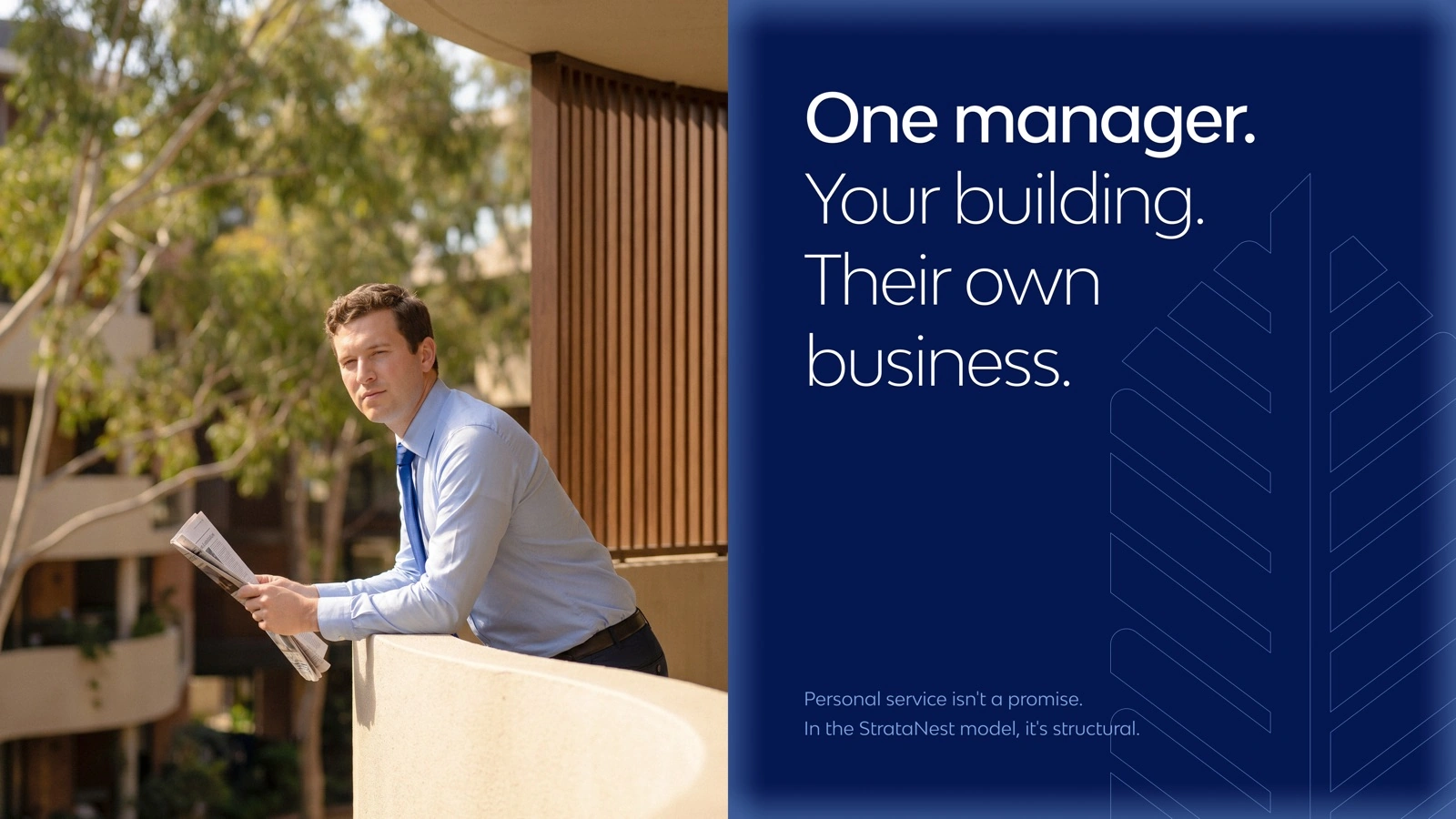
The brand world extends into photography — warm, candid, human.

At environmental scale
The mark holds its own against architecture — as a wordmark across the development, and as signage on the building itself.

Outcome
Strata Nest left with a complete identity system: a primary mark and wordmark, a five-line sub-brand colour architecture, a full applications kit, and motion for the logo — coherent enough to scale, distinct enough to remember. It shipped as part of my brand and identity work for SME clients across the Australia/New Zealand portfolio at Brandstrong.
Organized. Well nested.← All work