Brand Identity · Brand Strategy & Direction · Visual Systems
Space VC
A precision brand identity for a space-tech venture fund — a signal-mark built from an orbital dot grid, an ember-orange system on black, and a full field kit from hardware to apparel to digital.
Context
Space VC backs the founders building humanity's next frontier — orbital infrastructure, propulsion, deep-tech hardware. A fund like that has to look the part in two rooms at once: the LPs who need to trust the discipline behind the capital, and the founders who need to believe this fund actually gets what they're building.
Most VC branding defaults to generic fintech-blue confidence. Space VC needed something with more gravity — a mark that reads as signal and precision, not stock-photo optimism.
Approach
I art-directed the identity around a single idea: the fund as a locator, not a logo.
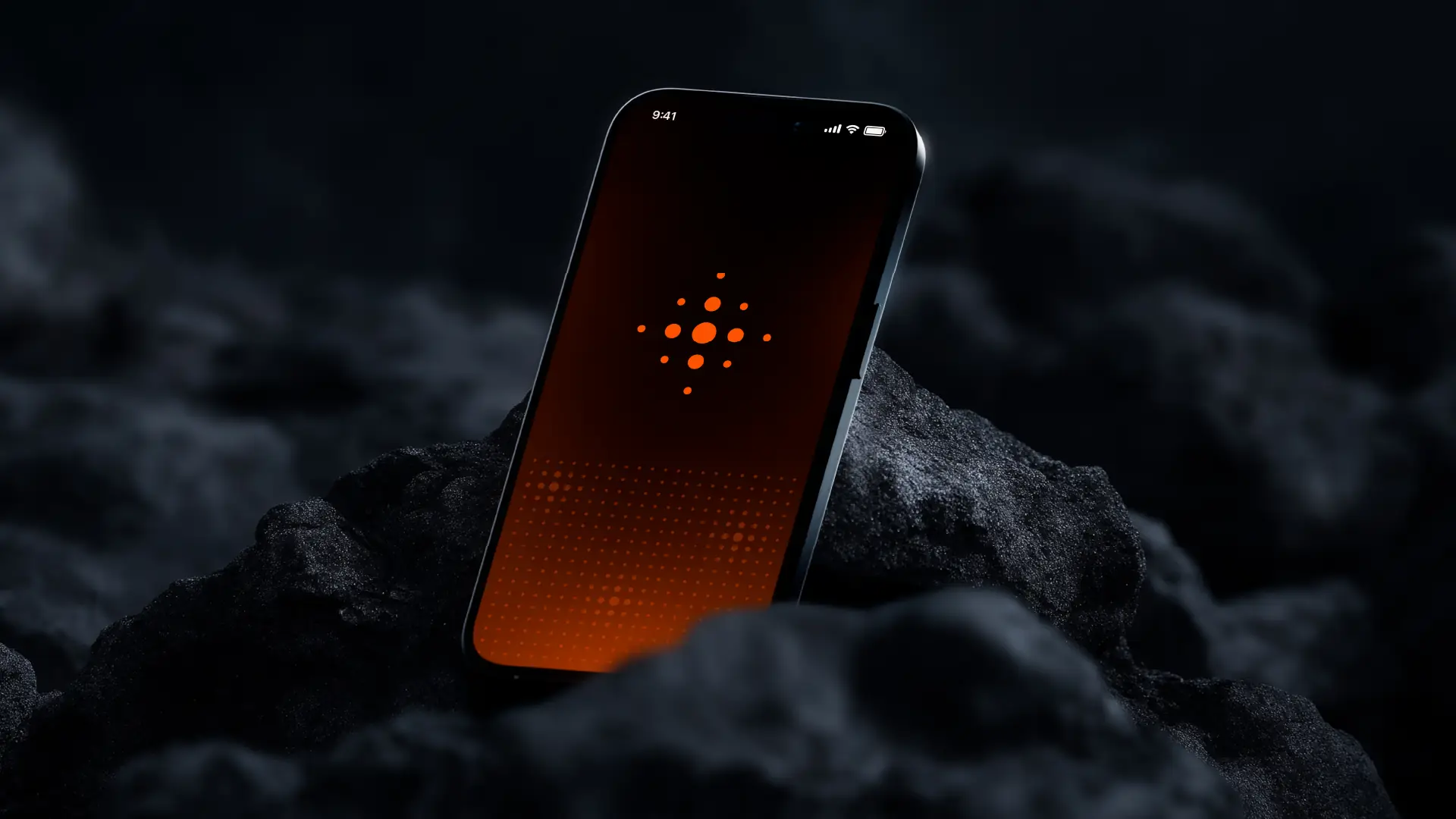
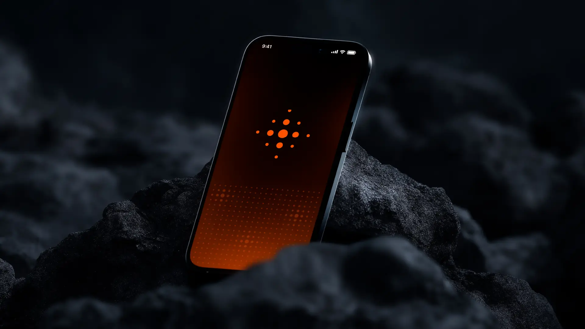
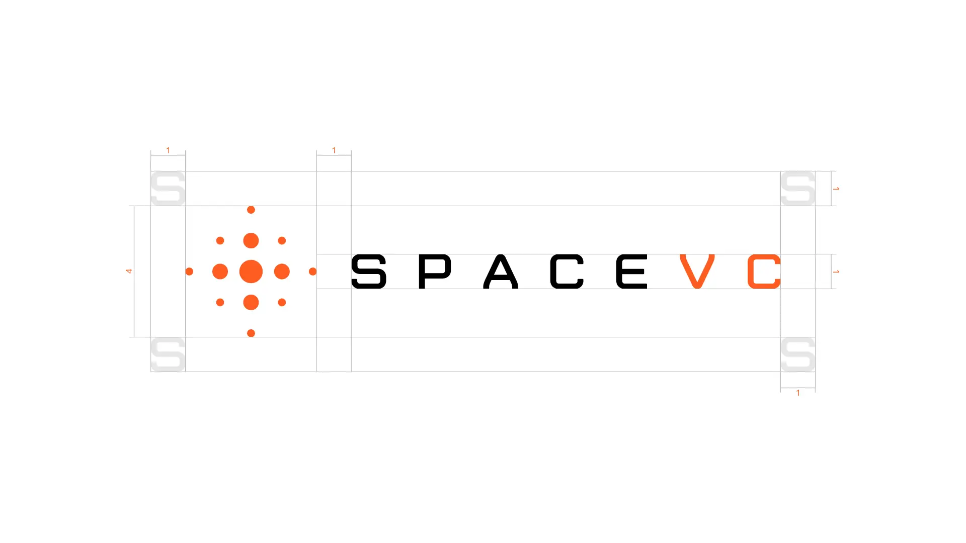
- An orbital dot-grid mark. A cross of nine dots, weighted toward the center — half signal-pulse, half targeting reticle. It reads as "found" — the exact coordinate a founder needs to be seen at.
- Ember orange on deep black. The one saturated color against near-void black — space, but the moment something ignites. Confident without being loud.
- A tight technical wordmark. SPACE in the primary ink, VC in orange — the fund's initials doing double duty as the accent-color callout.
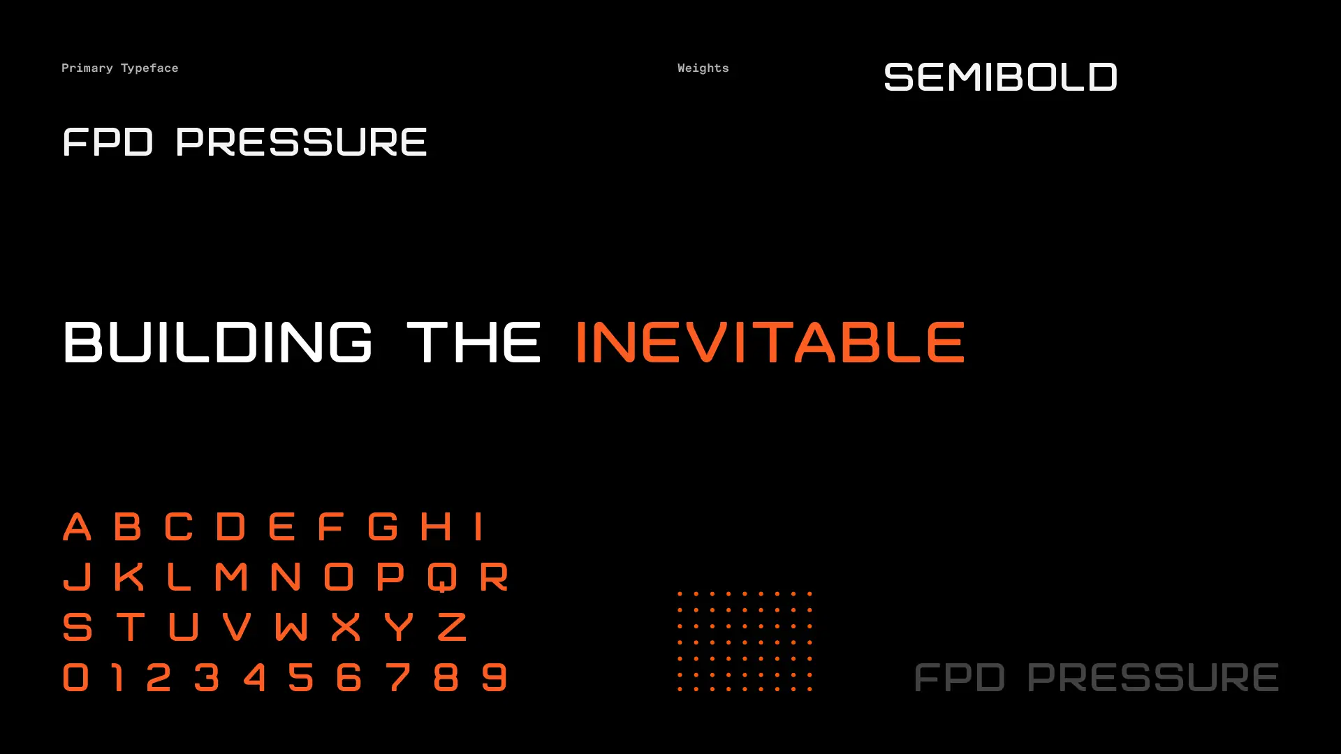
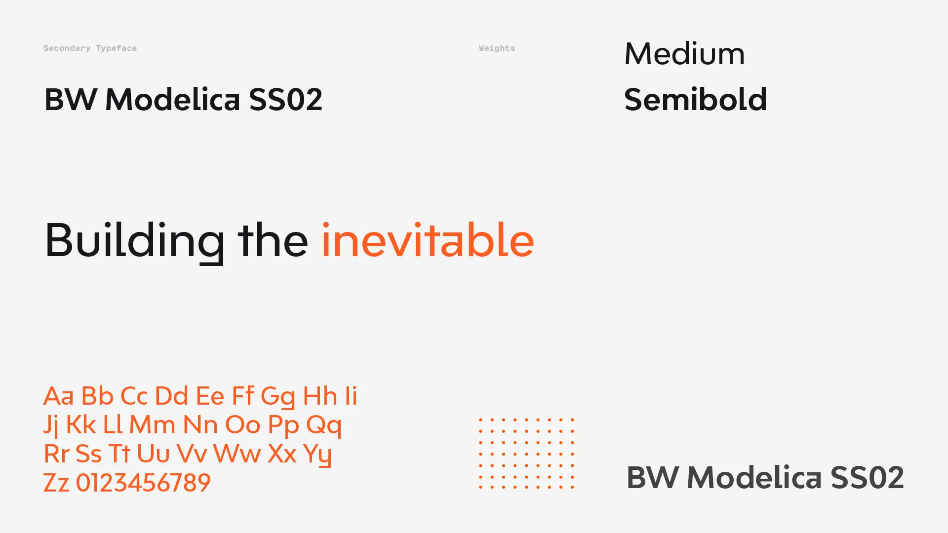
- FPD Pressure + BW Modelica. A technical display face for the mark's language, paired with a clean grotesk for reading — the same primary/secondary split that carries the tagline: Building the inevitable.
Solution
The mark
Built to hold up standalone — as a favicon, a social avatar, an embossed detail — before it ever meets the wordmark.



The identity system
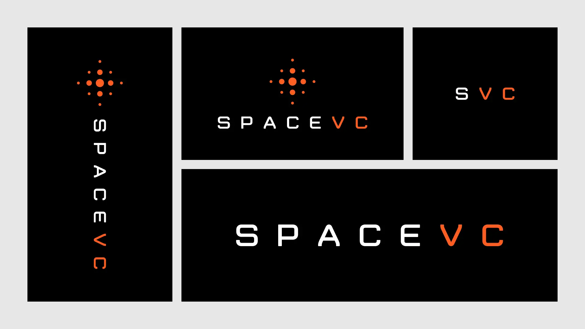
Lockups across every ground: light, dark, full orange, and the full variant set — horizontal, stacked, vertical, and the SVC monogram for tight spaces.



Type & voice
In the field
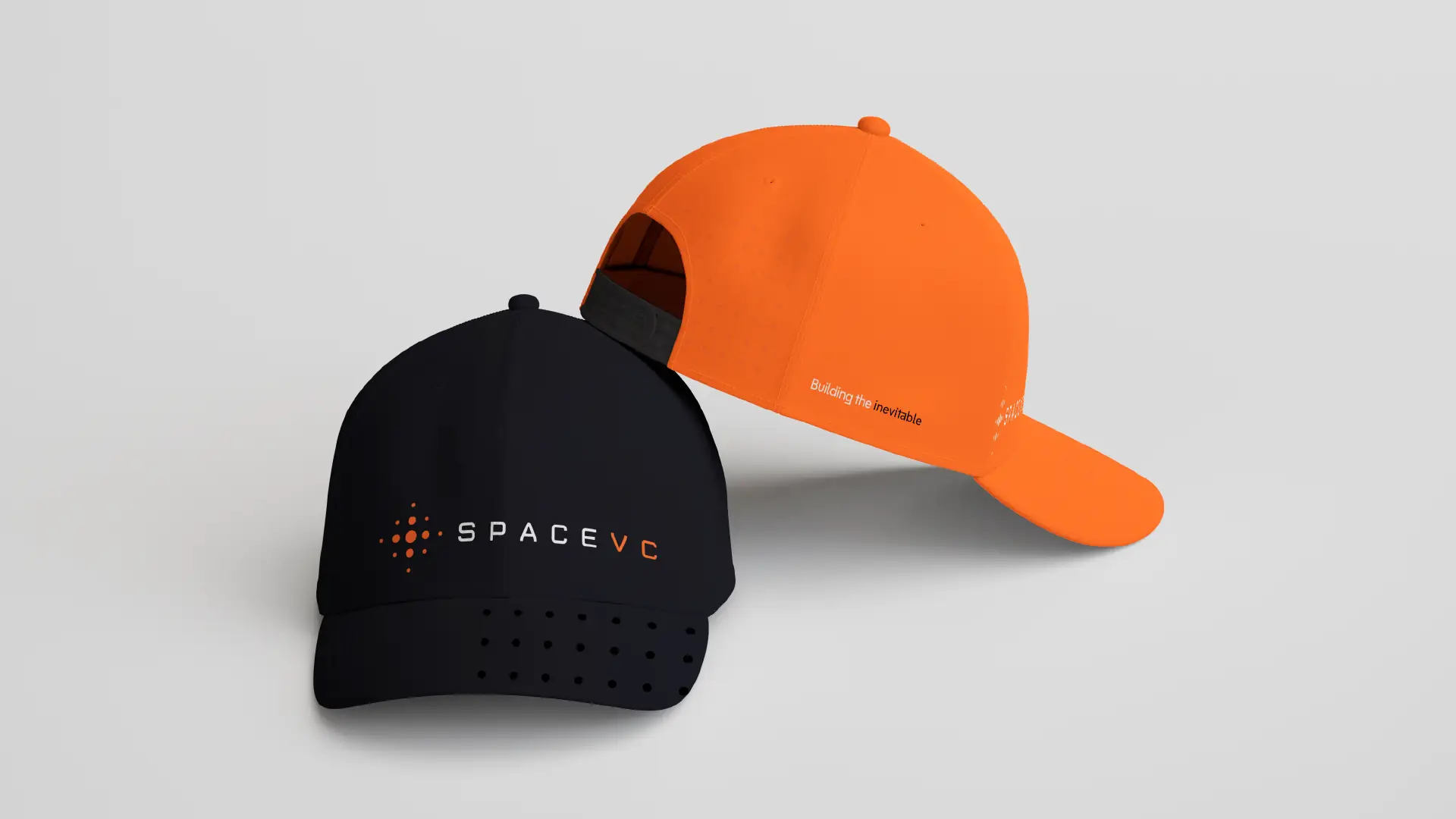
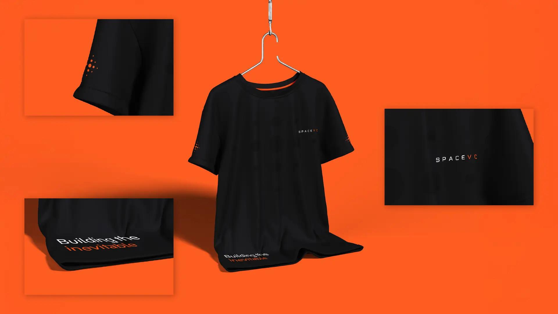
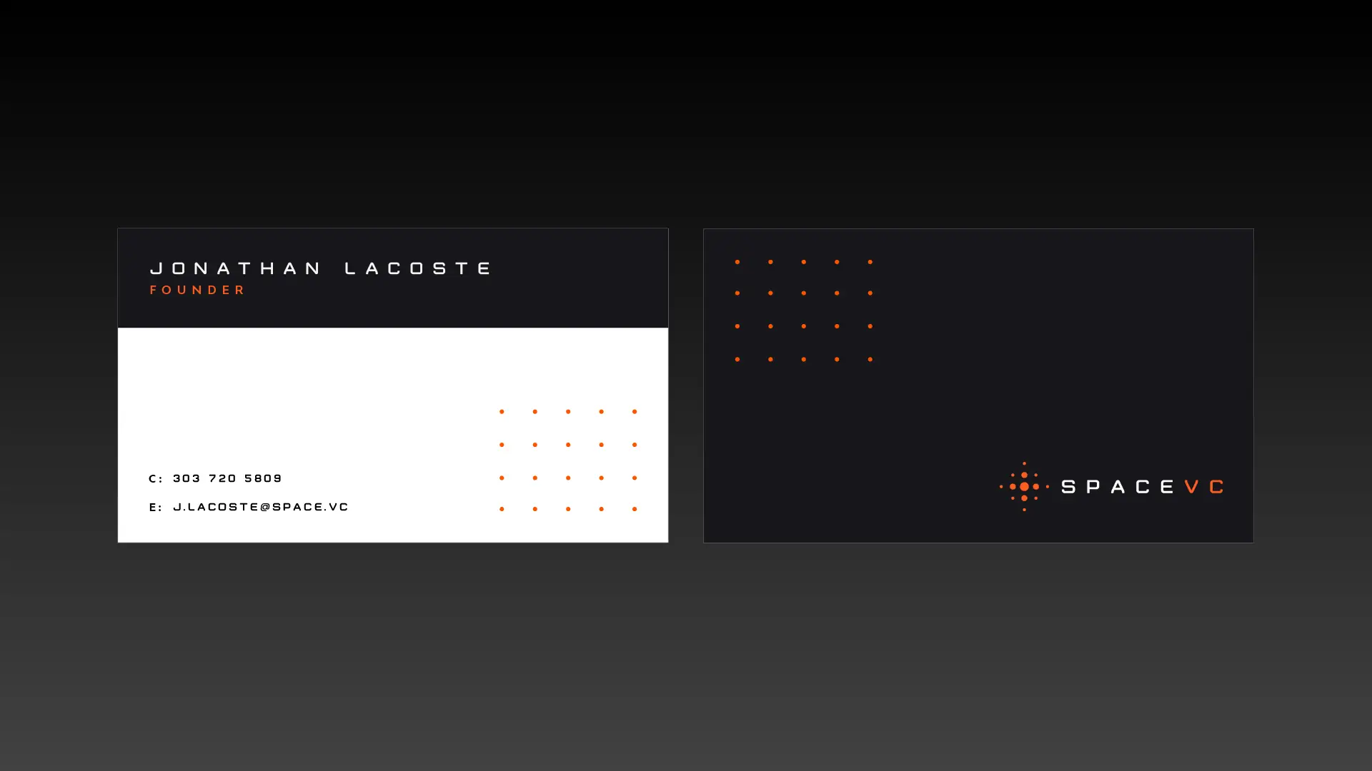
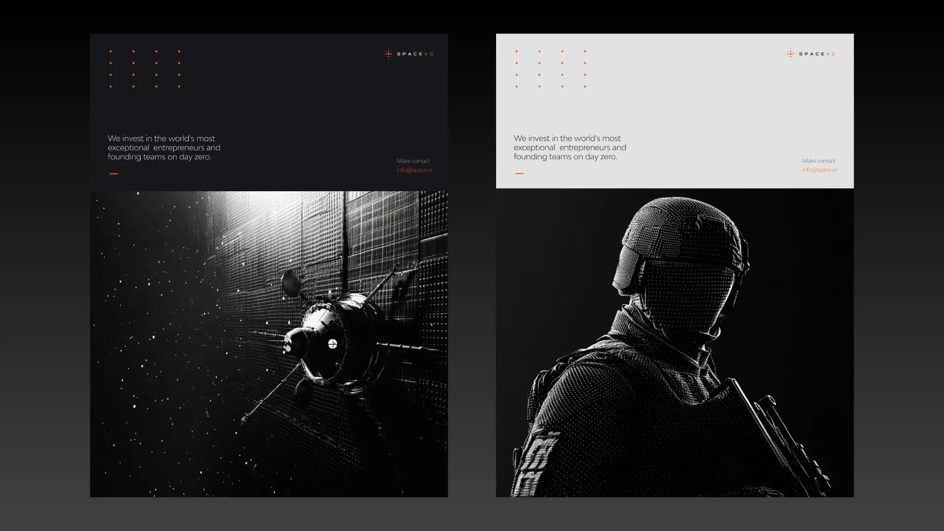
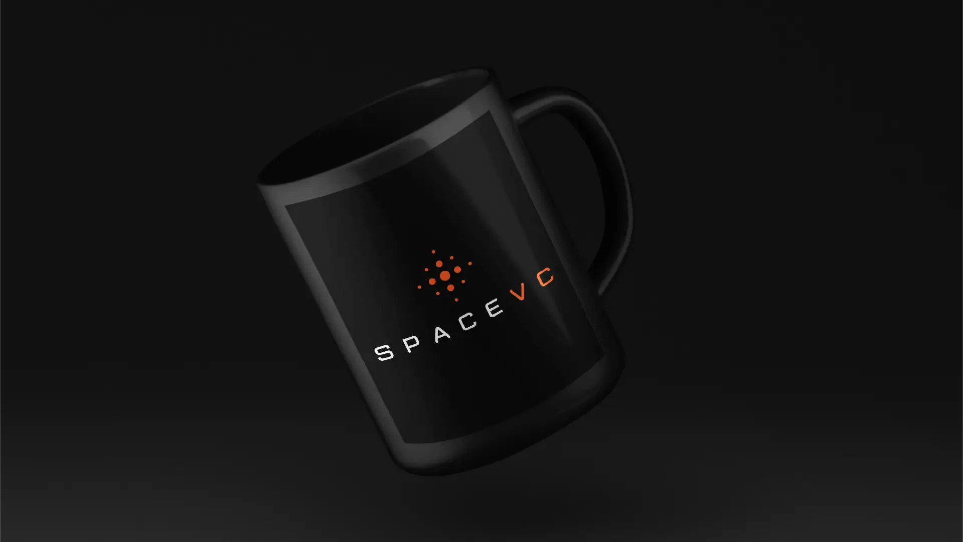
The system extended into a full kit — branded hardware, technical outerwear, apparel, and stationery — each piece carrying the dot-grid mark and the ember-on-black language.




Digital


Outcome
Space VC launched with a complete, disciplined identity: an orbital signal-mark, an ember-on-black system, a full type and lockup family, and a field kit spanning hardware, apparel, stationery, and digital — a fund brand built to read as precise as the technology it backs.
Building the inevitable.← All work