Brand Identity · Brand Strategy & Direction · Art Direction · Visual Systems
Eternal Hill Hospice Care
A complete hospice brand built on one idea — Natural Strength — that holds grief and hope in the same frame, from a sunrise-over-the-hill mark to stationery, signage, apparel, and an editorial photography system.
Context
Hospice is the category most brands get wrong. Families arrive at the hardest moment of their lives and are met with clinical white, fear-coded language, and a logo that feels like a hospital invoice. Eternal Hill Hospice Care — serving families across Atlanta — wanted the opposite: to feel like a neighbor you can lean on, backed by the skill of seasoned caregivers.
The brand had to do something genuinely hard — carry grief and hope in the same frame — and earn trust on sight. No one choosing hospice has the patience to be convinced.
Approach
I led the brand as Creative Director at FourStage, and started with the feeling, not the logo.
The strategy settled on one idea — Natural Strength — and one line that decided everything after it: "Your neighbor in life's hardest moments." Warm, present, unhurried. Every choice had to read like a hand to hold, not a procedure.
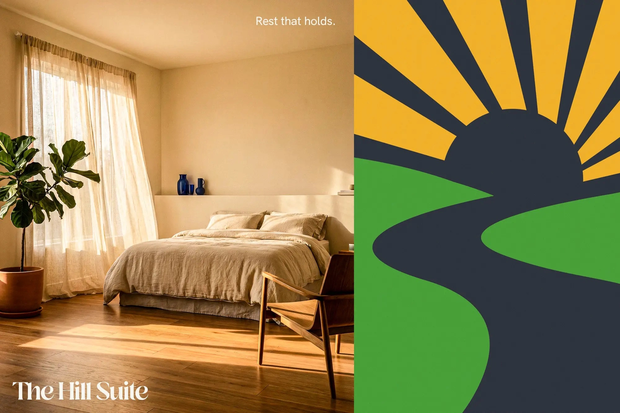
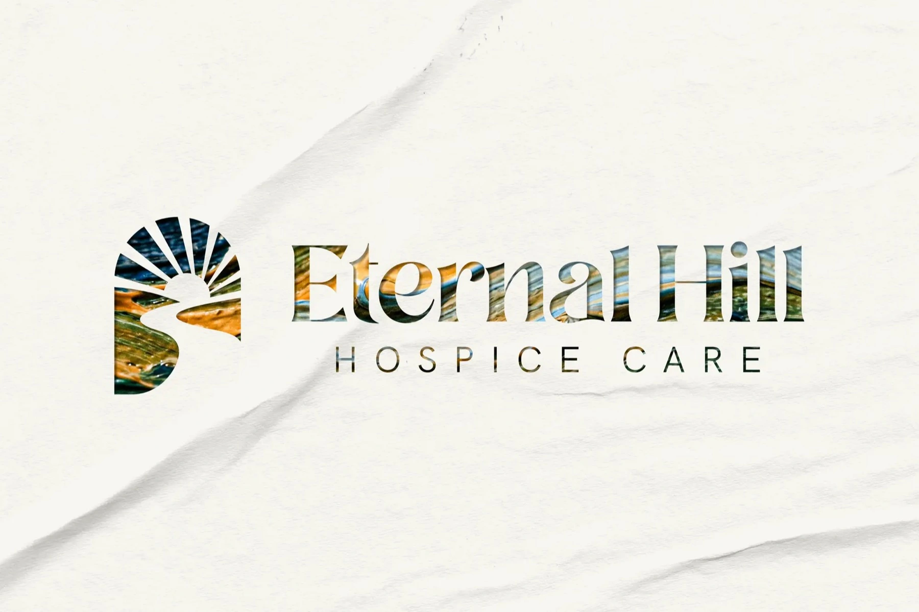
- A symbol of dawn. The mark is a sunrise cresting a green hill, a path winding up through it — morning after the longest night, a journey walked together. The path quietly doubles as an "EH." Drawn on golden-ratio proportions so it reads as calm, not clever.
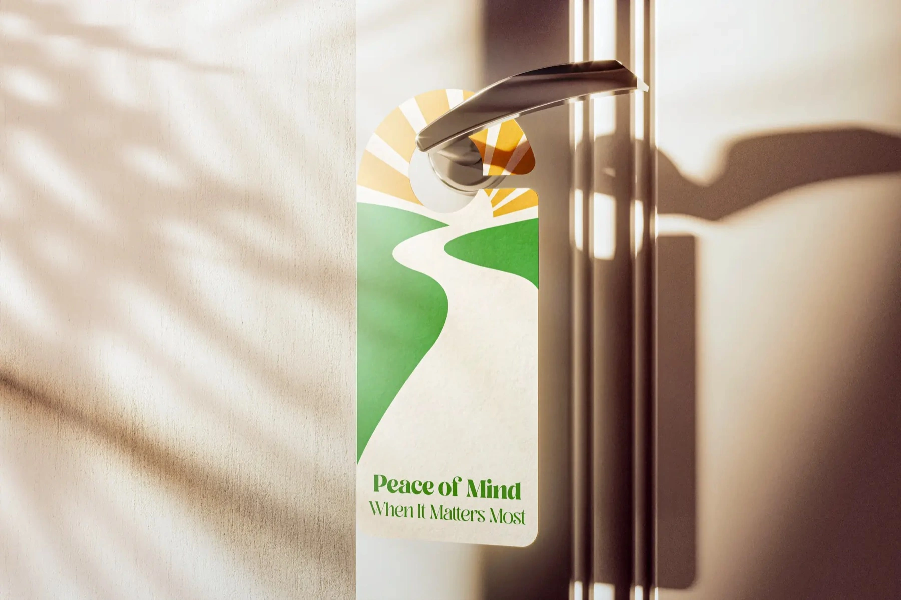
- A voice that sits beside you. Plain and steady — "Peace of mind, when it matters most," "Where the hill holds you steady." The promises the team actually keeps — a one-hour response, daily family check-ins — said like a neighbor, not a contract.
- Warmth over clinic. Deep navy for trust, sunrise gold for hope, living green for the hill — grounded in natural textures of moss, water, and bamboo instead of hospital white.
Solution
The mark, in place
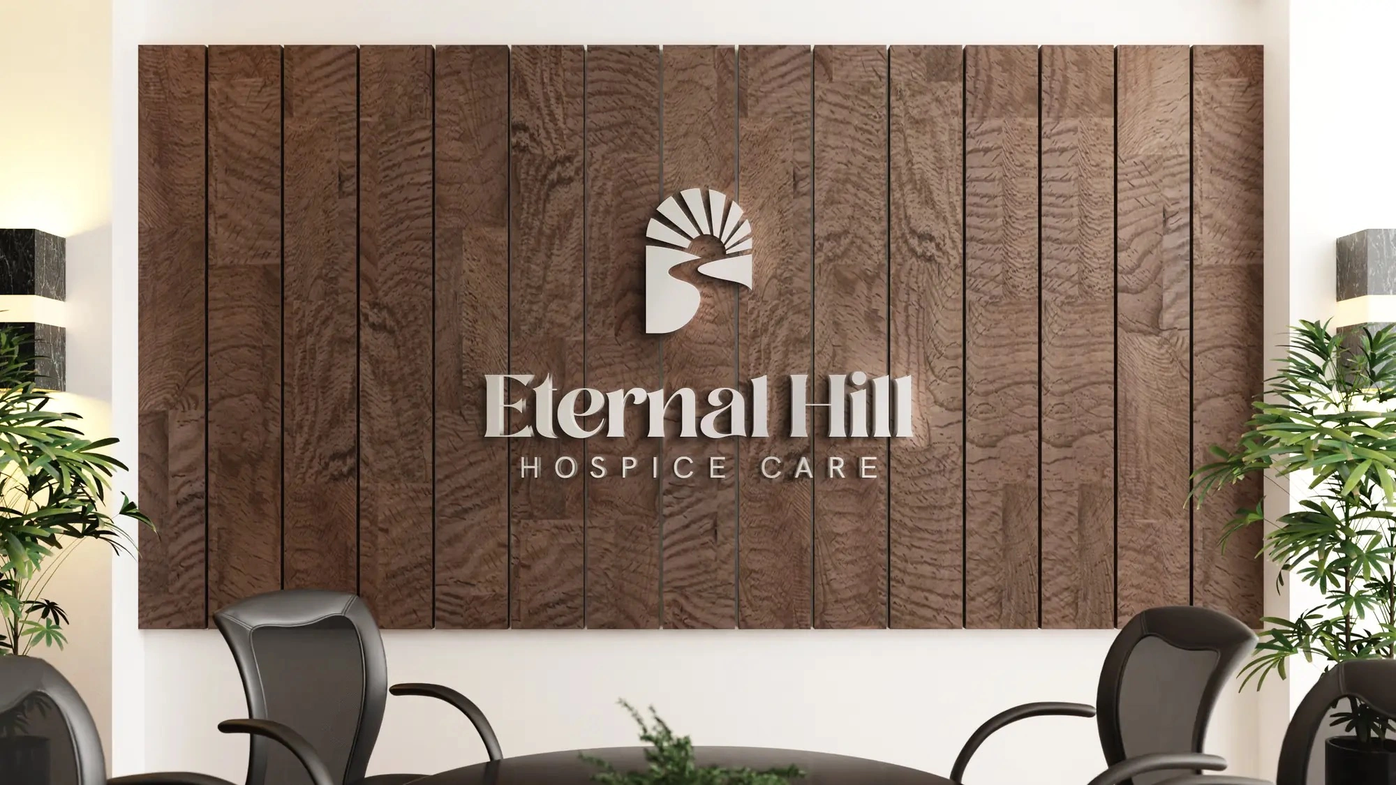
Set in a softly modern serif over a clean sans, the identity holds up from a reception wall to a door handle — shifting its tone of voice without ever losing its face.
The everyday touchpoints
The pieces a grieving family actually holds — a letter, an envelope — carry the same calm. Navy, sand, and the sunrise mark; nothing raises its voice.
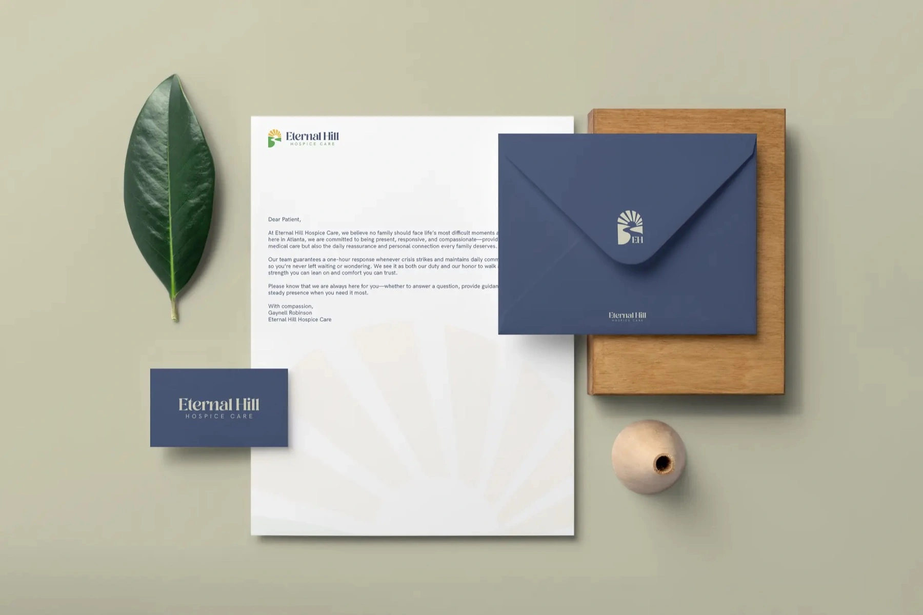
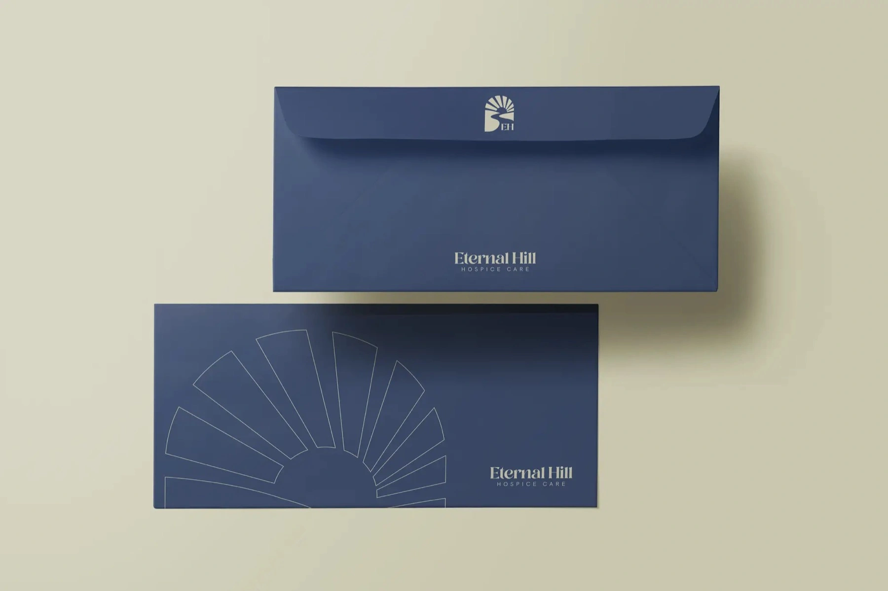
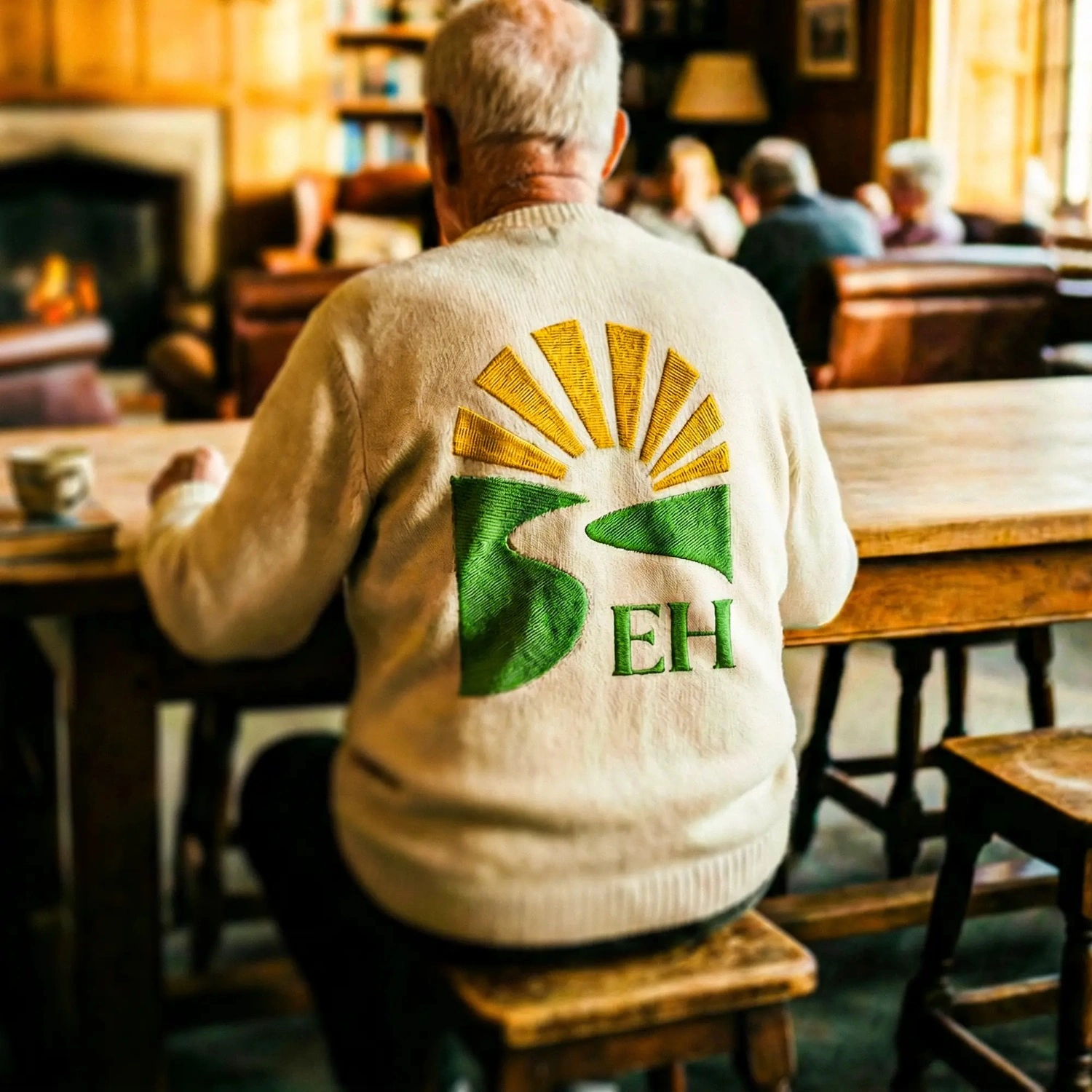
The mark was built to stretch. It fills with the brand's own natural textures, and it's stitched — worn by the care team as an embroidered patch, so the brand shows up the way the people do: in person.
Where a hospice brand is won — the photography
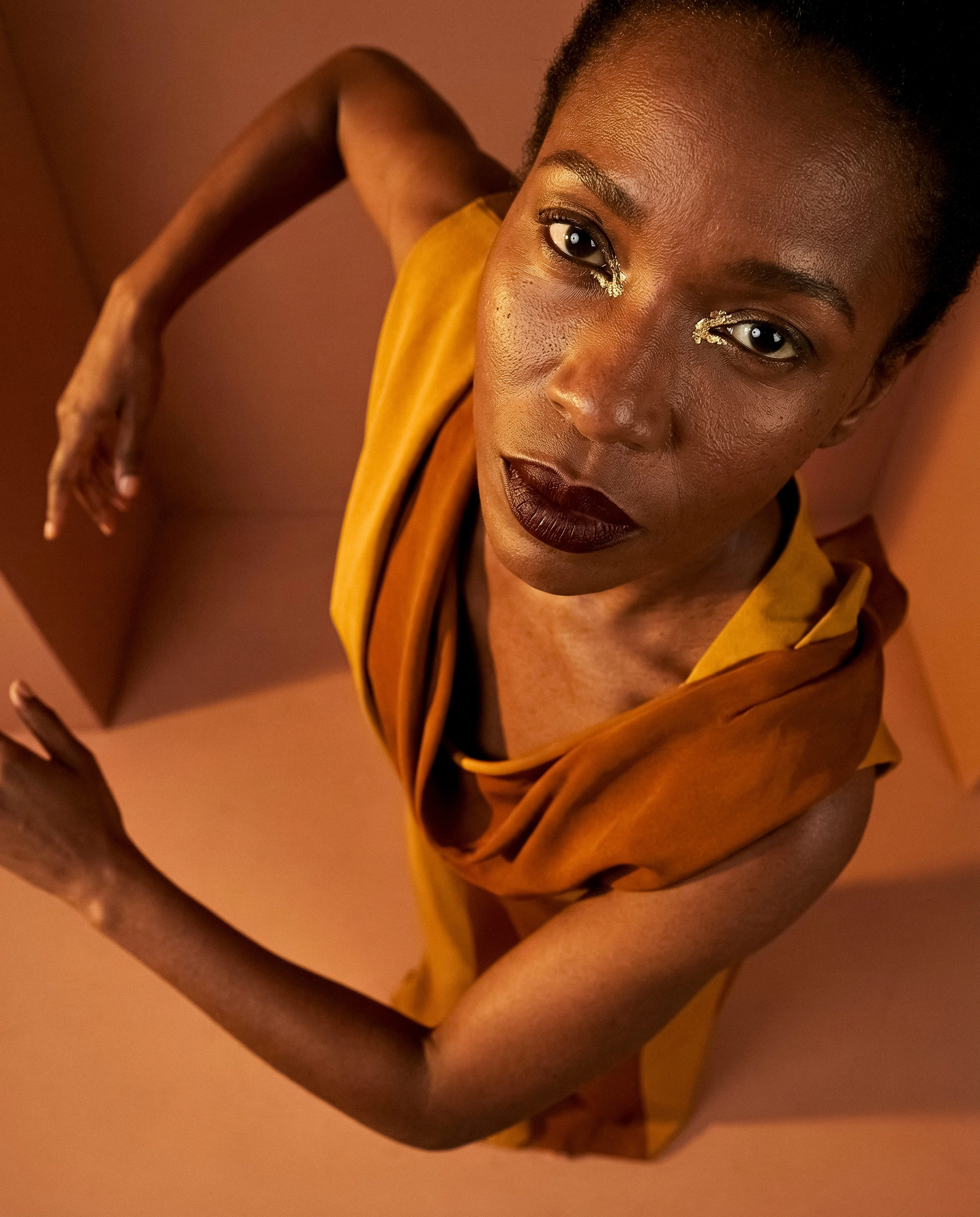
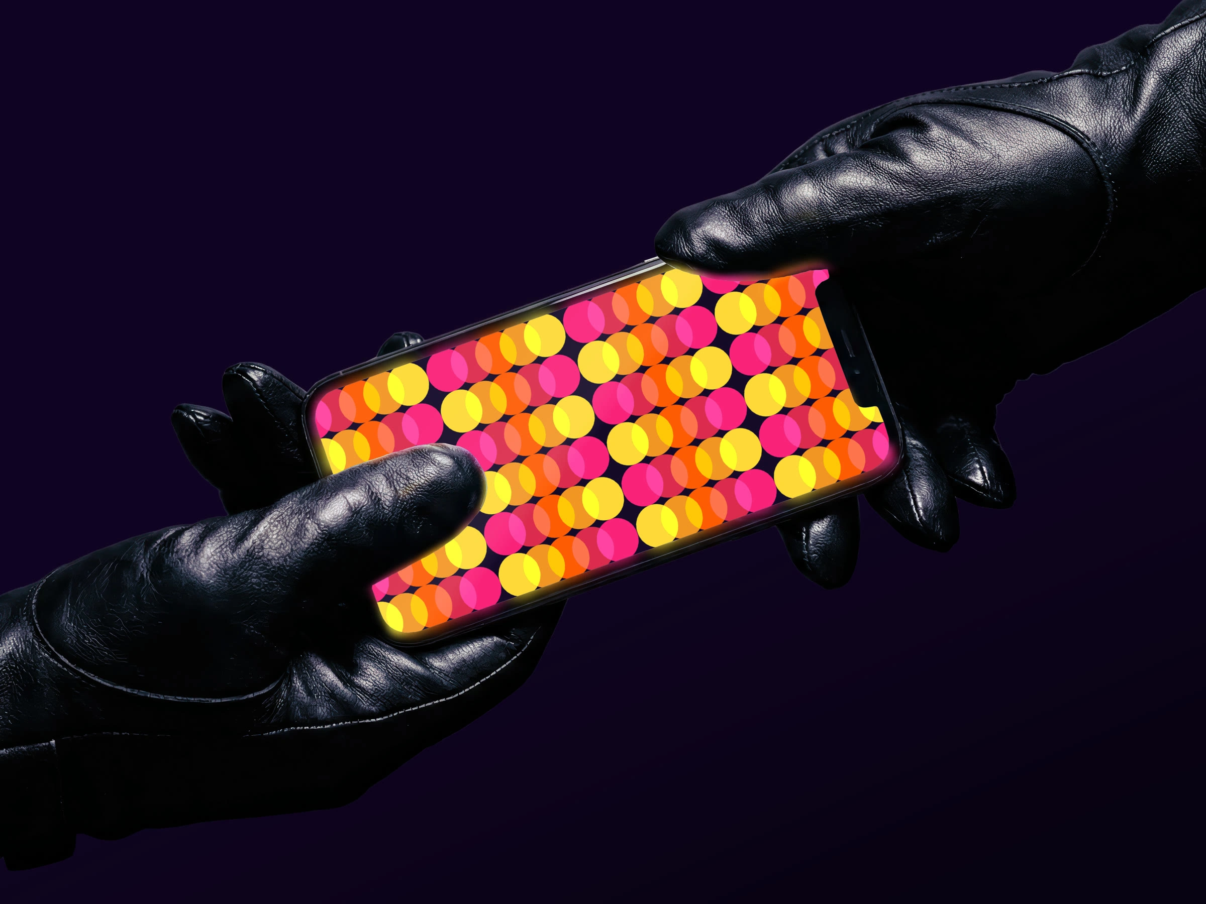
This is the part most healthcare brands flinch from. We didn't. The art direction tells the truth of hospice with dignity: presence over procedure, small human moments, light that feels like late afternoon at home.

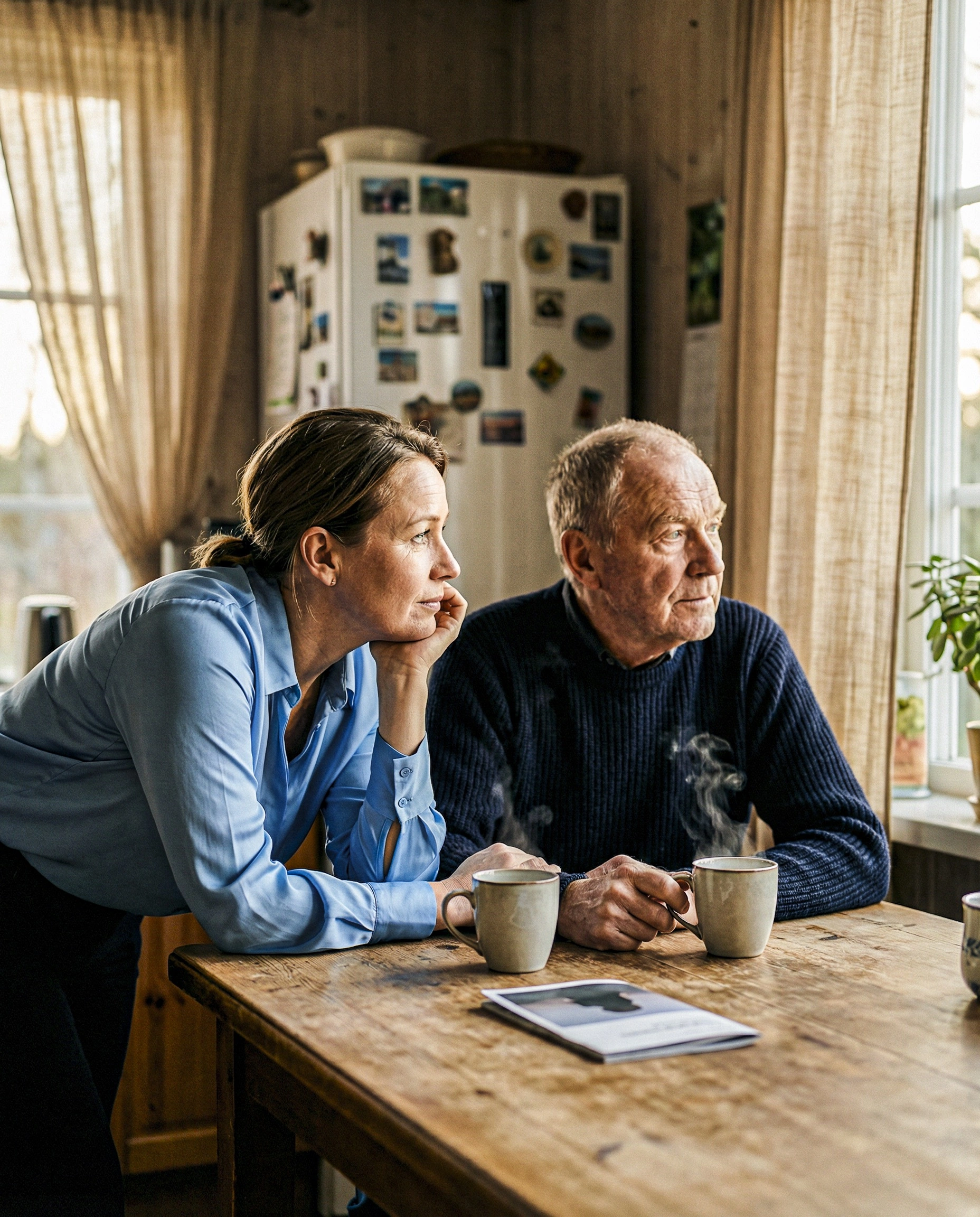
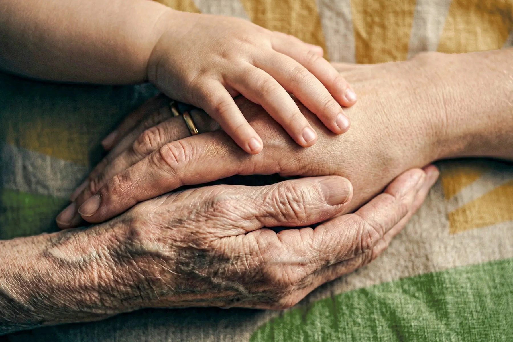
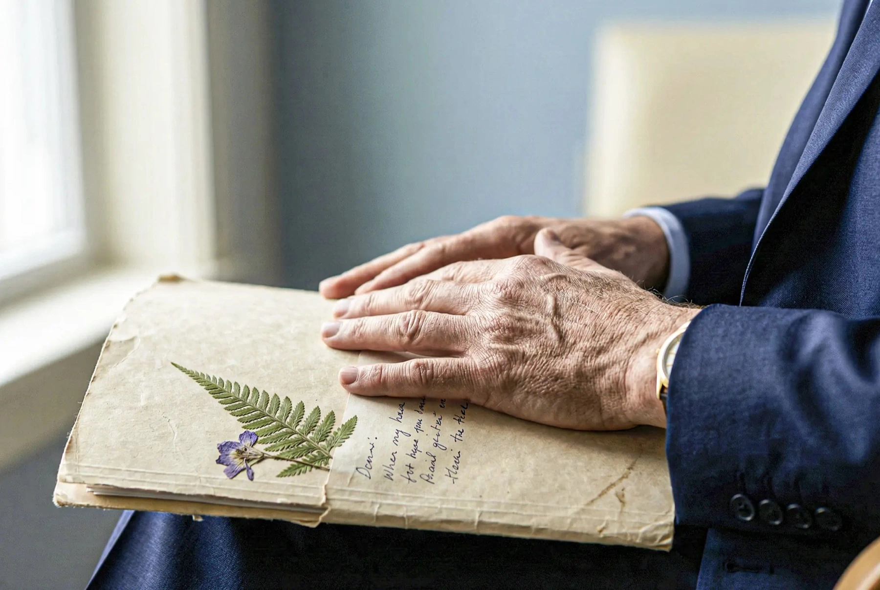
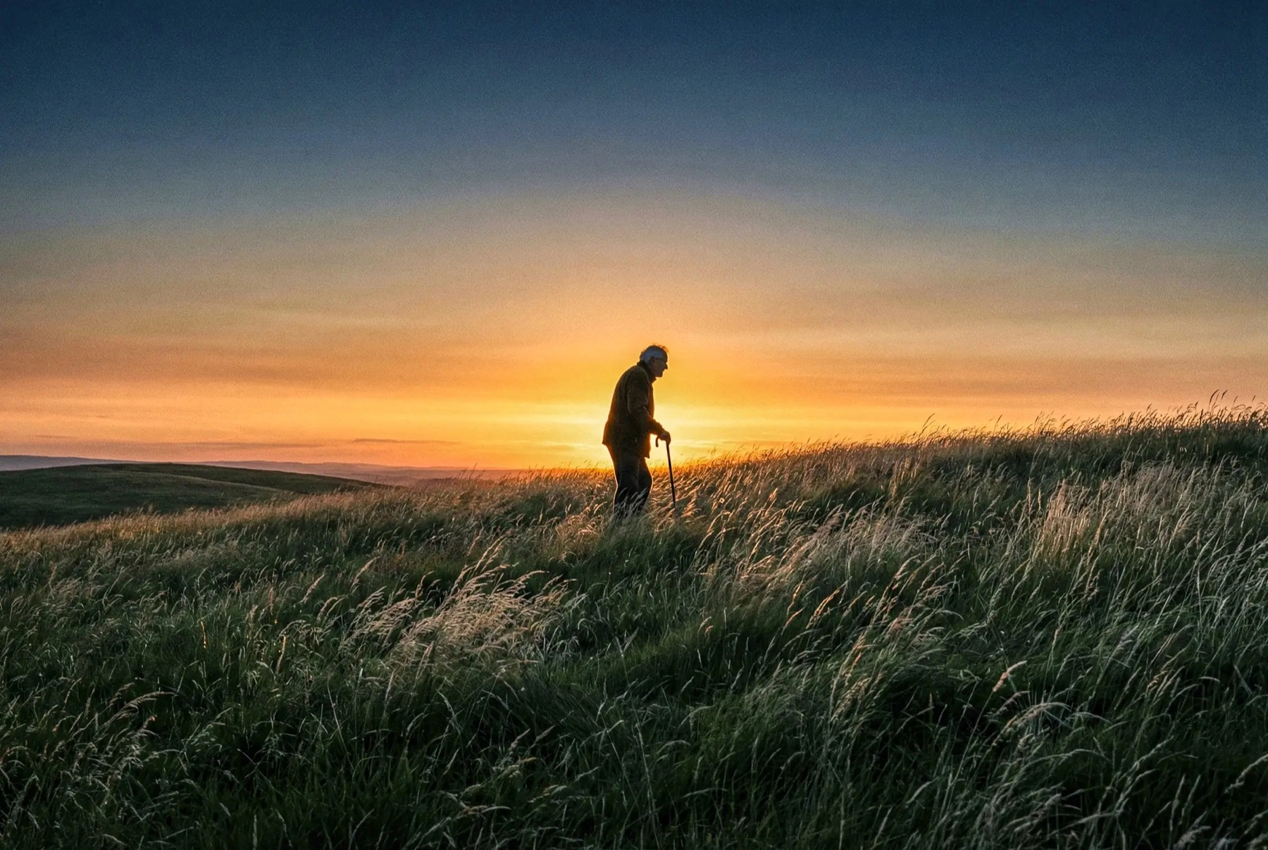
And the campaign let the landscape carry the meaning — the hill as the thing that holds you steady through the hardest climb.
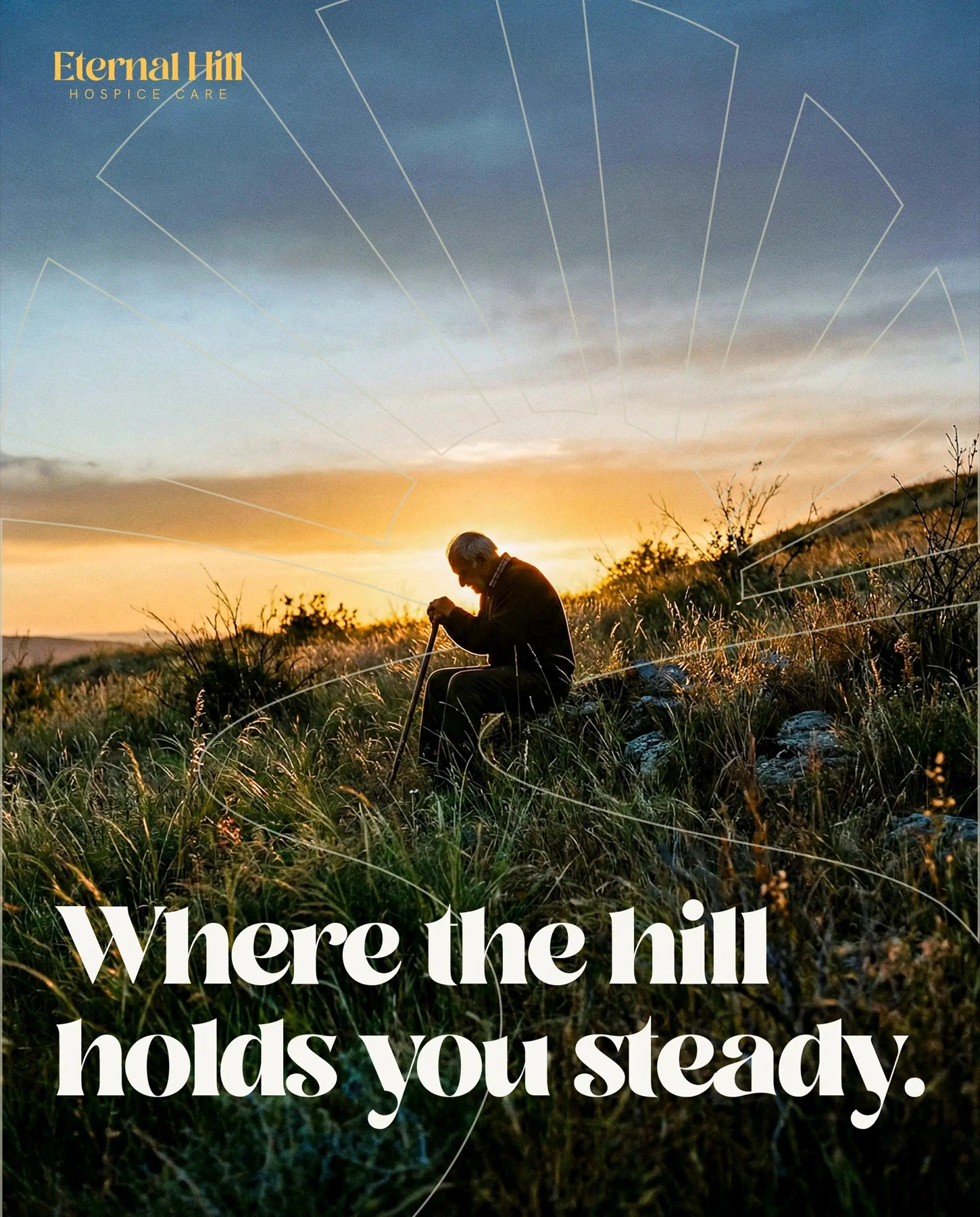
Outcome
Eternal Hill walked away with a complete, emotionally intelligent brand: a distinctive sunrise mark, a warm navy-gold-green system, a documented voice, and a full kit of applications — stationery, signage, apparel, an editorial photography direction, and campaign — all built to make a frightening decision feel a little more human.
Your neighbor in life's hardest moments.← All work