Brand Identity · Art Direction · Visual Systems · Motion
Chariot Defense
A hard-edged identity for a venture-backed defense startup building battlefield power systems — a forward-leaning mark, an animated logo, branded hardware, and a full field kit.
Context
Chariot Defense builds power systems for the modern battlefield — rugged, deployable energy for land forces operating where the grid doesn't reach. It belongs to a new wave of venture-backed defense-tech, which means it has to win two very different rooms: a program officer who needs to trust the hardware, and a Sand Hill Road investor who needs to believe it's the future.
Most defense branding picks one of two tired registers — bland government contractor, or aggressive "tacticool." Chariot needed neither: something serious, fast, and unmistakably modern — a company that looks as engineered as the product inside the case.
Approach
I art-directed the brand at WarpCraft around the name itself — the chariot: speed, force, the original war machine.
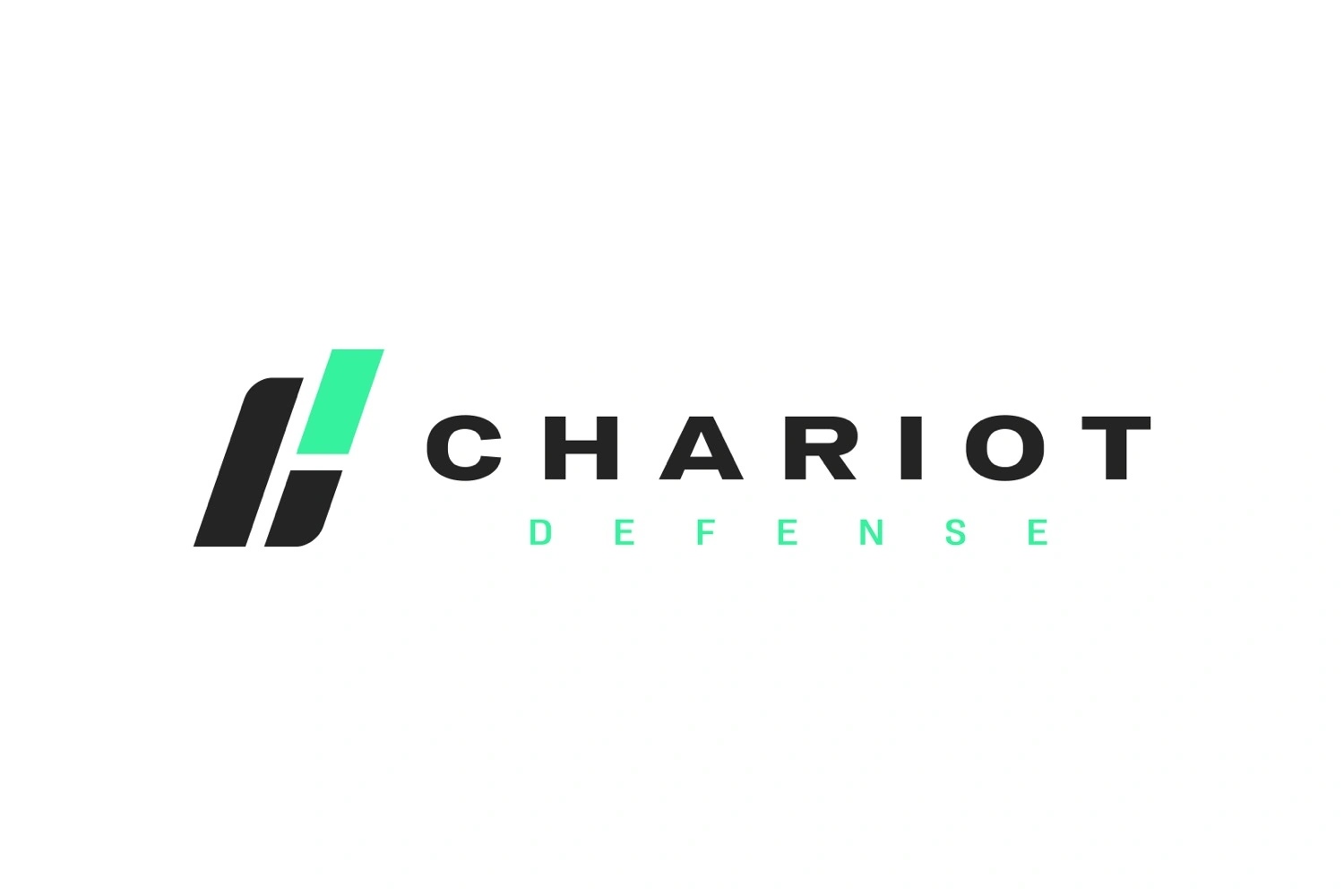
- A mark in motion. Two forward-leaning bars cut into a sheared "H" — a chariot mid-charge, momentum held still. Drawn with the precision of a serialized part, not a mascot.
- Signal green on gunmetal. A near-black base — the colour of equipment — cut by a single charge of electric green: power, "go," the live indicator on a running system. No camo, no eagles.
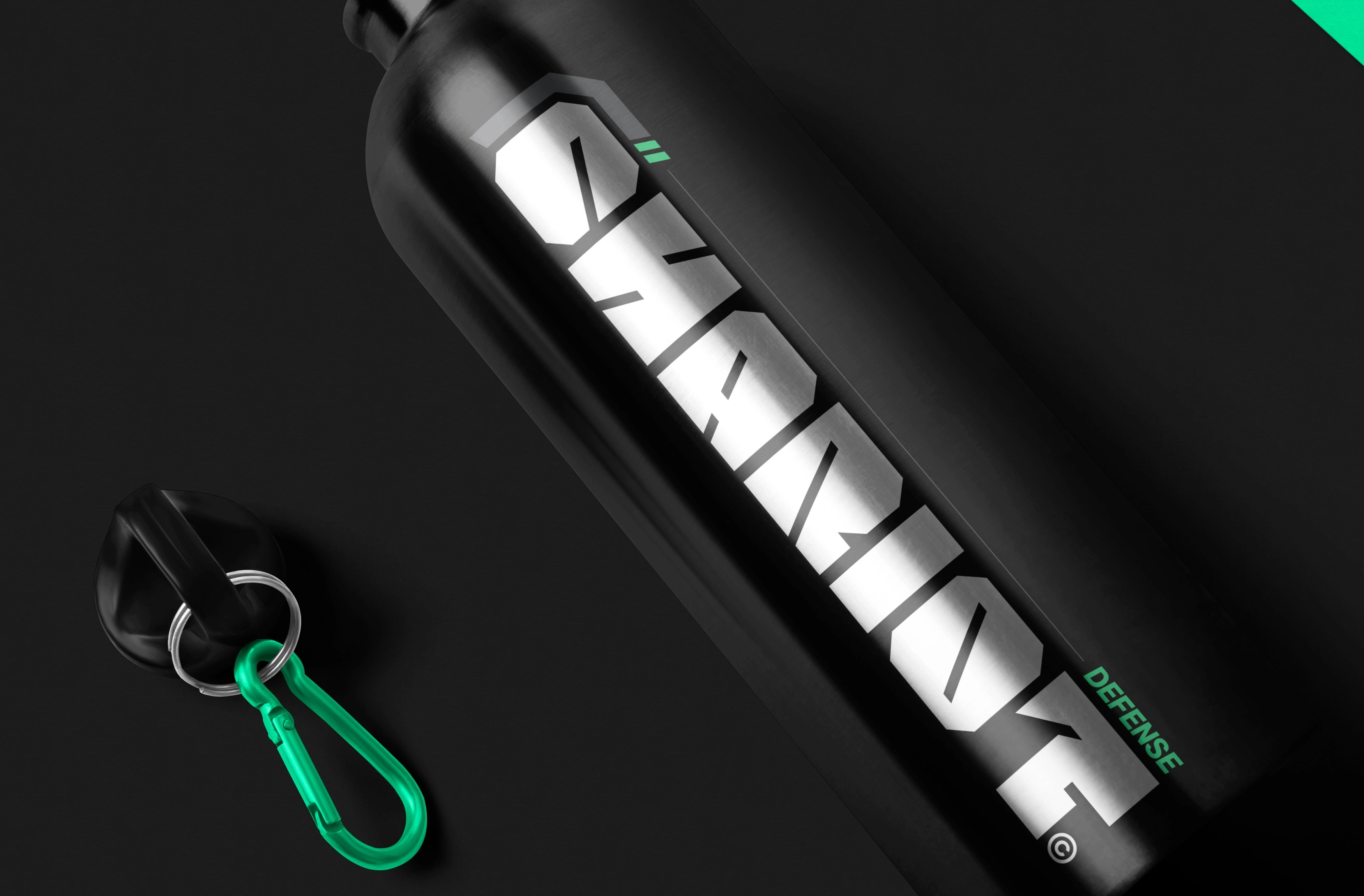
- Materiel, not marketing. The system speaks the language of military hardware — Cairoli Now set tight and technical, HUD overlays, dot-grids, stencil decals and serial numbers — so every touchpoint reads like issued kit.

Solution
The mark, in motion
Built to move — the bars drive in and lock. A logo that behaves like the thing it stands for.
Branding the hardware
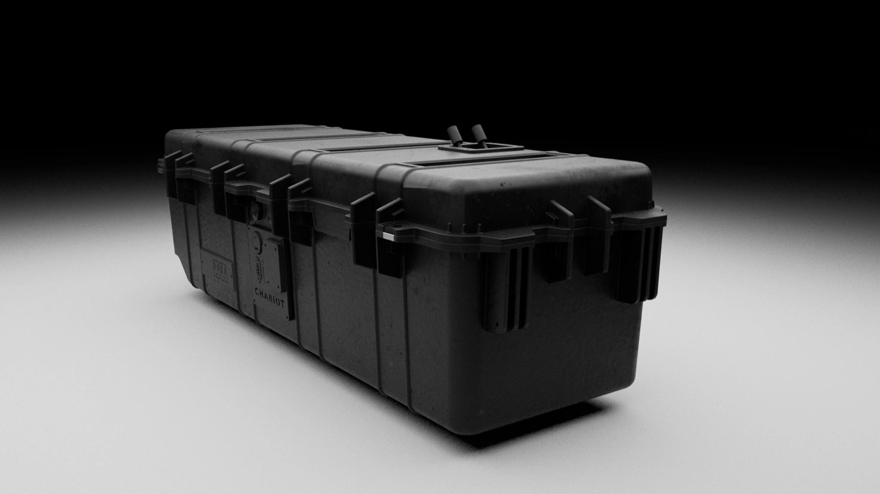
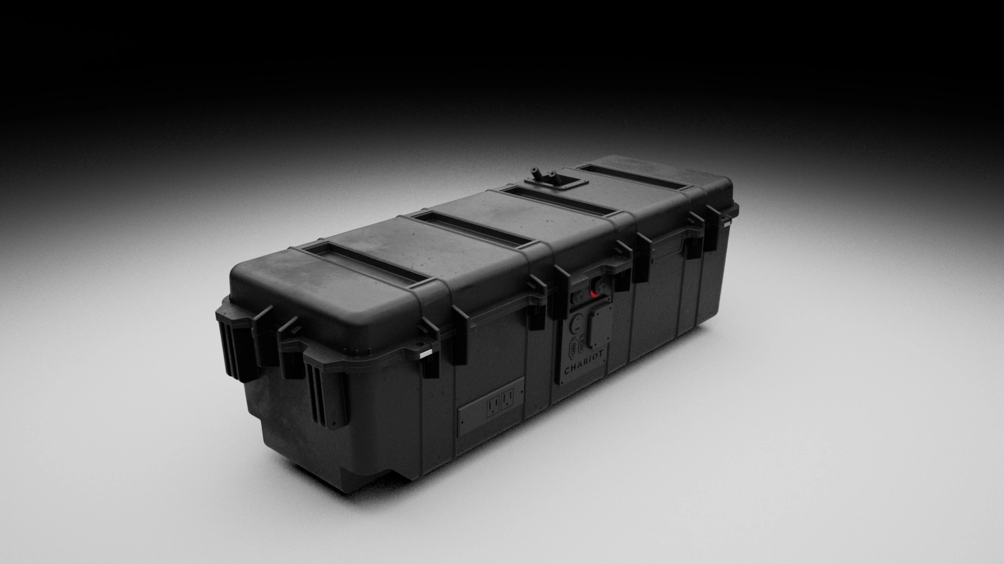
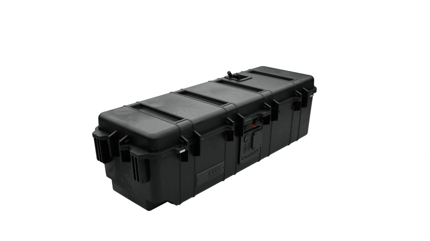
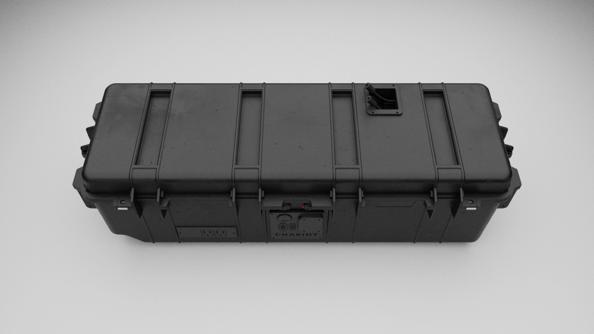
The centrepiece was the product itself — the Amphora, a ruggedized deployable power unit. I carried the identity onto the hardware: embossed mark, outlet and port callouts, serial plates — branding designed to survive a drop test, not just a slide.
In the field
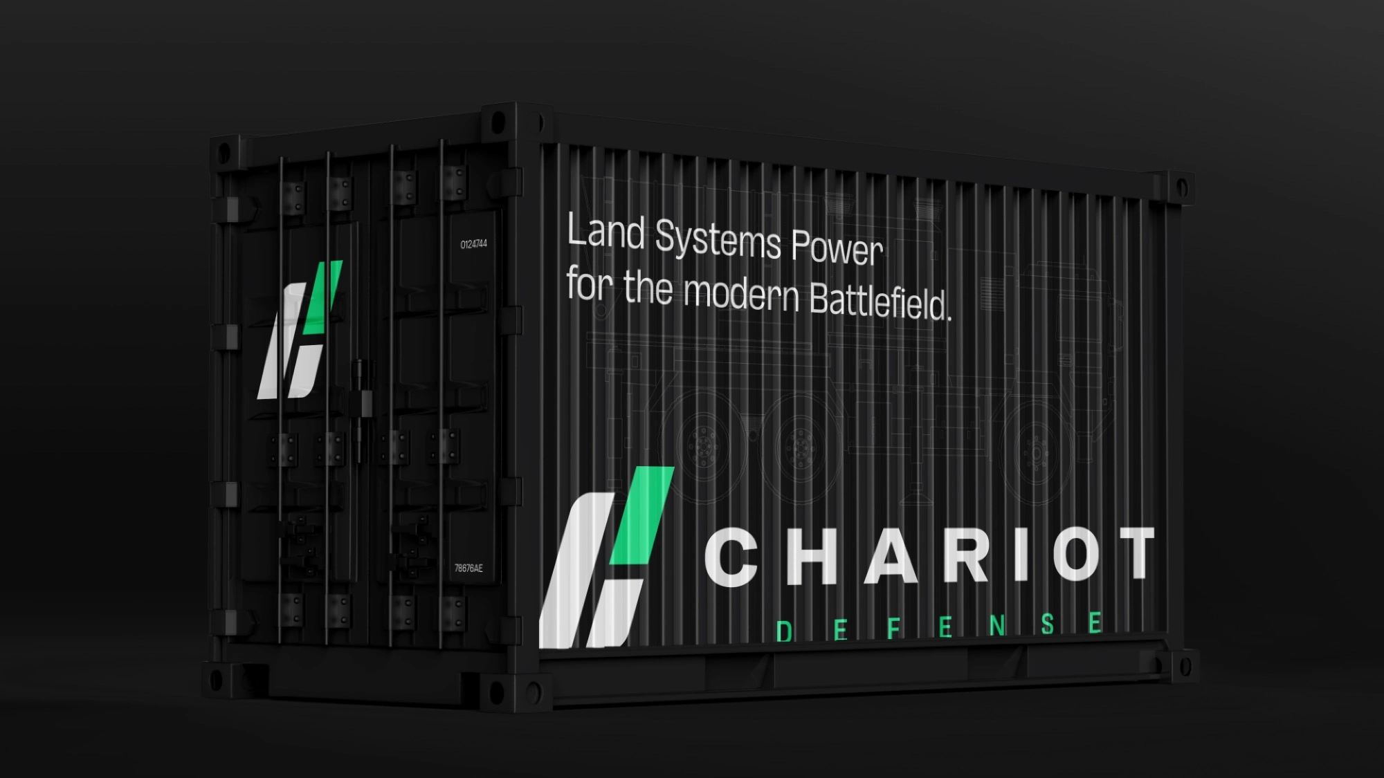
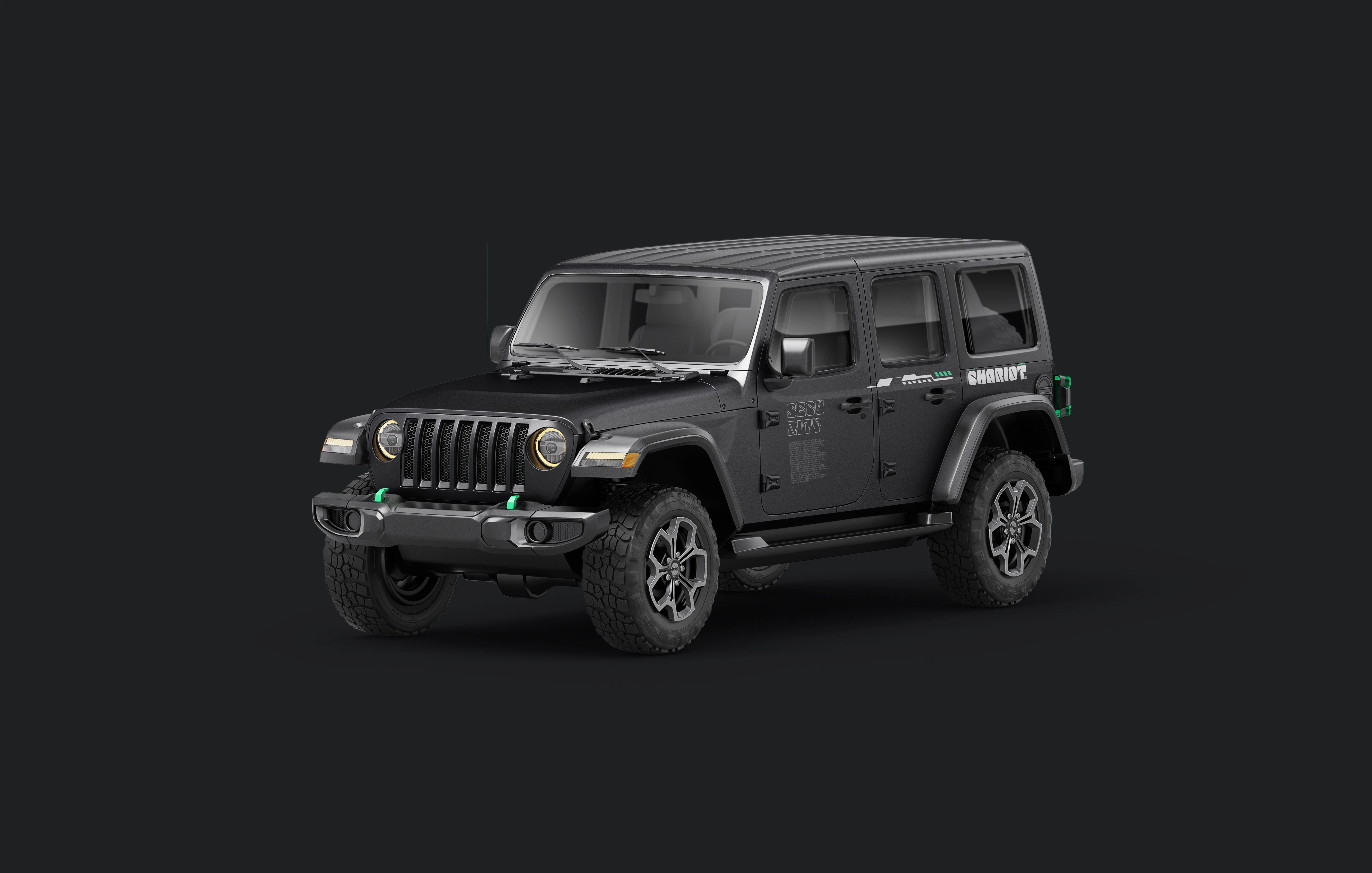
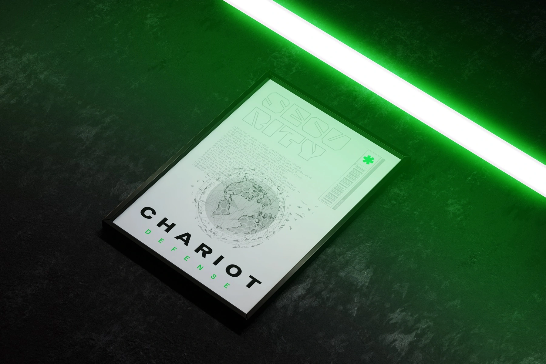
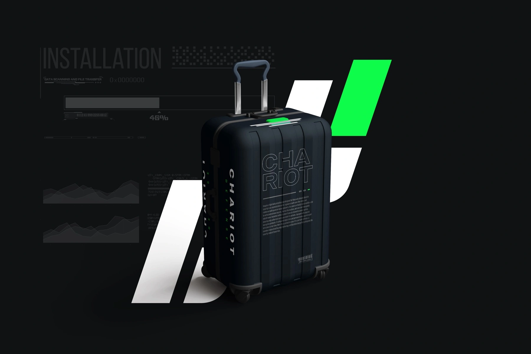
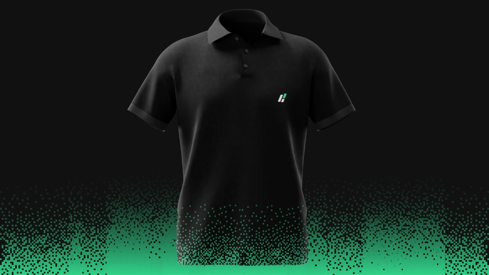
The system extended into a full kit — a branded field vehicle, a recruitment-grade poster, transit cases, drinkware, and team apparel — each piece carrying the gunmetal-and-green palette and the technical HUD language.
Outcome
Chariot Defense launched with a complete, motion-ready identity built for hardware: a forward-leaning mark and animated logo, a gunmetal-and-green system, a technical type-and-HUD language, branded product, and a field kit from poster to apparel — a defense brand that looks as fast and as engineered as what it's selling.
Land Systems Power for the modern Battlefield.← All work