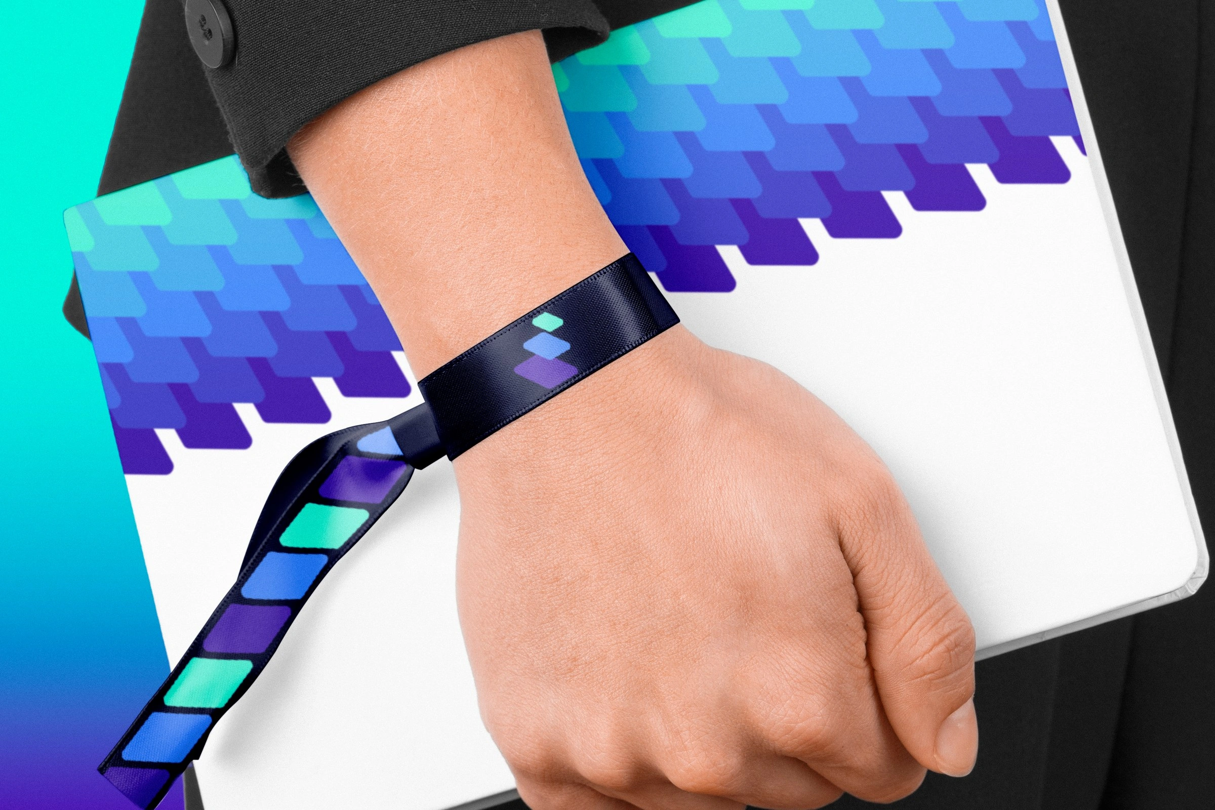
Brand Identity · Art Direction · Brand Strategy & Direction
Common Sense
A deep-tech brand identity and go-to-market system for a civic-AI startup bringing Palantir-grade ambition to local government.

Context
Common Sense builds AI teammates for local government — AI that handles the tedious municipal work (data entry, records retrieval, routing requests) so public-sector staff can get back to serving citizens. It's serious technology: the founder led Palantir Gotham — the system used by U.S. intelligence and disaster-response teams — and the team comes from Palantir, Meta, Stanford, and Carnegie Mellon.
The brand had to sell ambitious AI to one of the most cautious buyers there is: a city manager. So it had to hold two things at once — credible and trustworthy enough for government, modern and optimistic enough to feel like the future — and make one promise unmistakable: this augments public servants, it doesn't replace them. No layoffs, no rip-and-replace.
Approach
I art-directed the brand at WarpCraft, anchoring it to a single idea: AI that layers onto what government already runs.
- A mark about stacking, not replacing. The icon is three offset cards stacking up — intelligence added on top of existing systems, not torn out and swapped. It reads as software, momentum, and a team coming together.
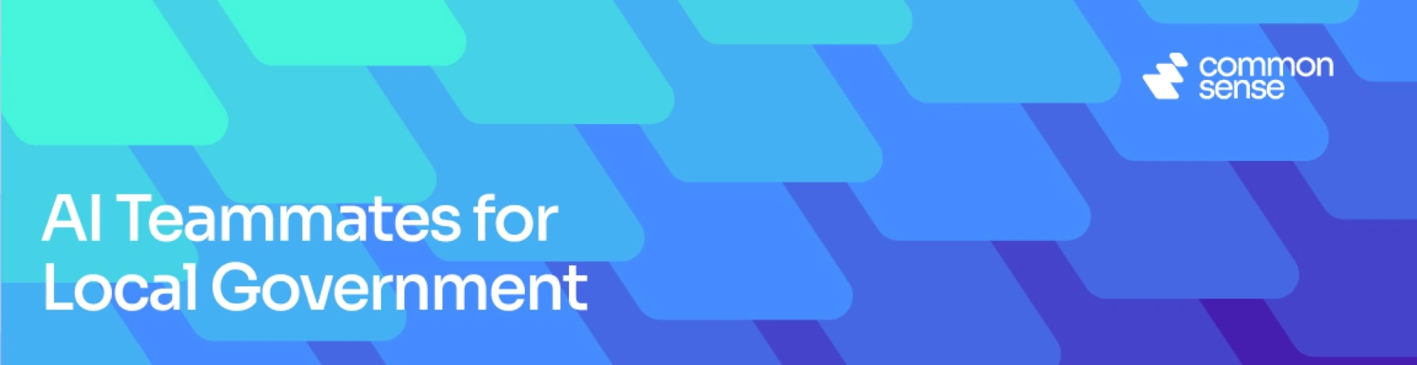
- A system with momentum. That same card shape tessellates into a flowing diagonal gradient — cyan to blue to violet — that turns a dry, beige category warm and forward-moving. Computation you actually want to look at.
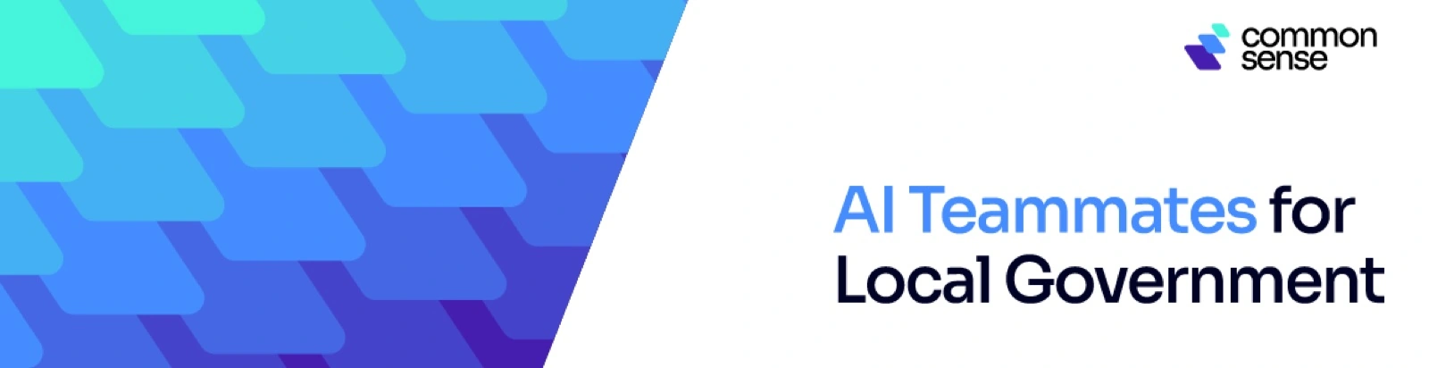
- A plain-spoken voice. Confident, not hypey: AI Teammates for Local Government. Serve more citizens, spend less doing it.

Solution
A system with momentum
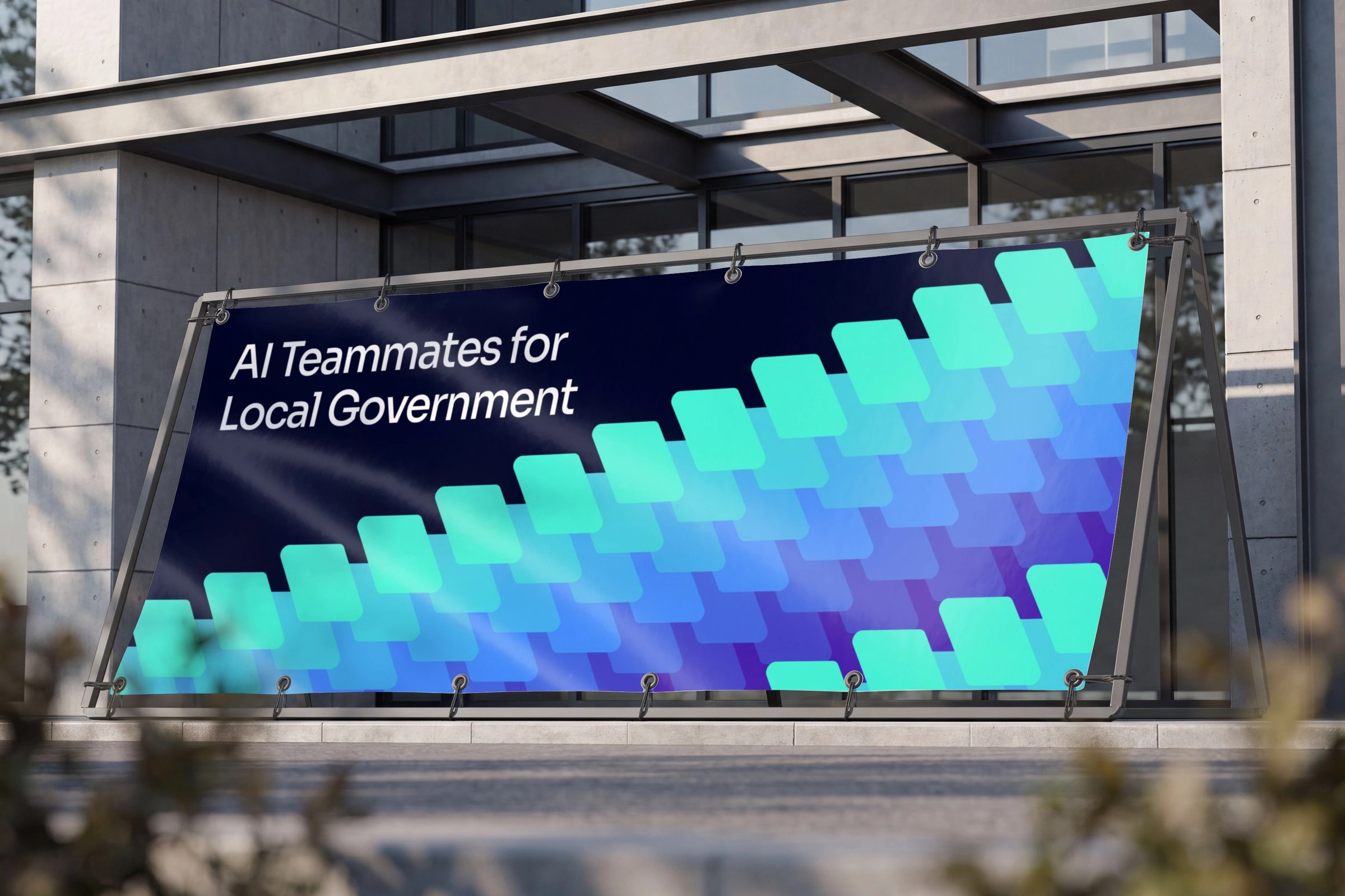
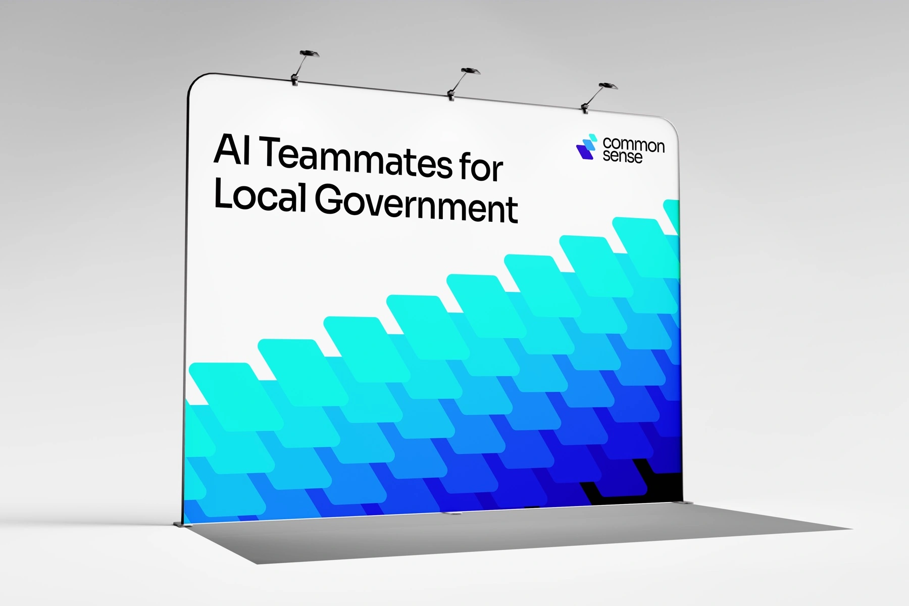
The tessellating gradient became the brand's signature — equal parts circuitry and motion, scaling from a social banner to a twenty-foot trade-show wall without losing energy.
Out in the field
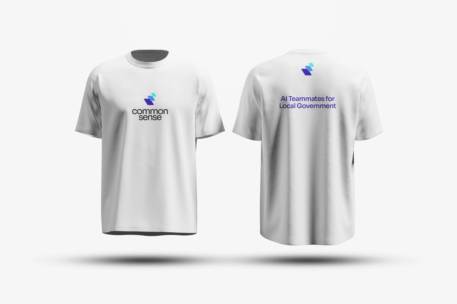
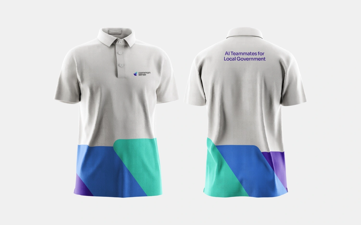
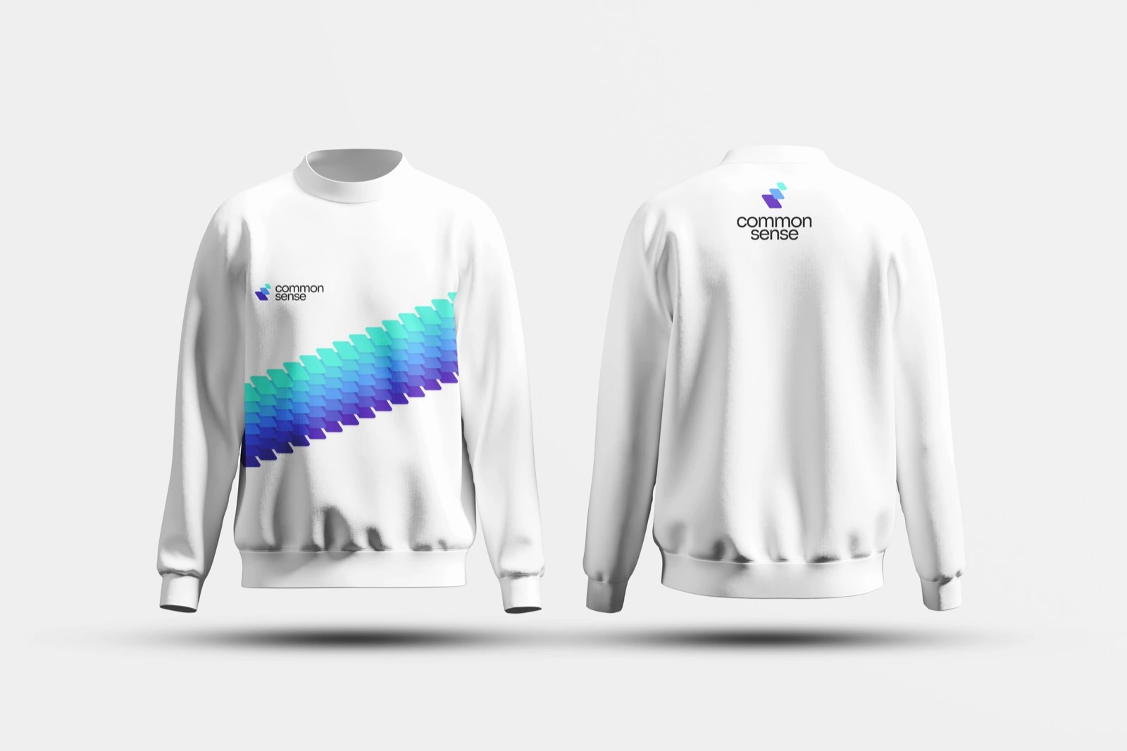
Common Sense sells in person, at GovTech conferences and city halls. The identity was built to own a room — a trade-show system, tablecloth, and team apparel that look like the most advanced company on the floor.
The pitch, in hand
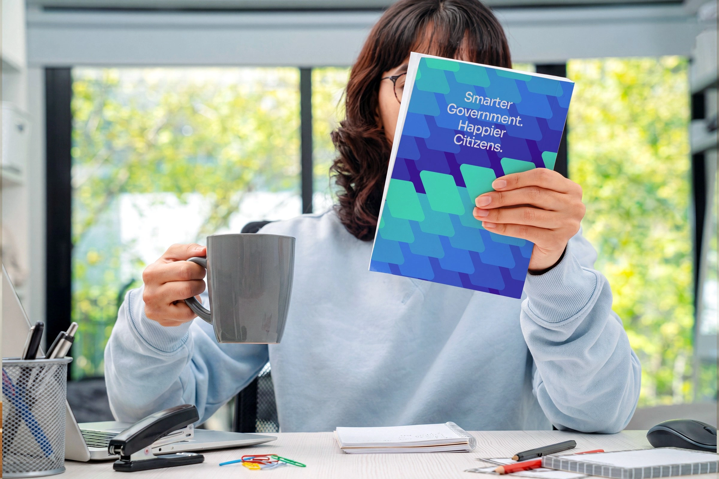
A printed leave-behind for the end of the meeting — the pattern doing the cover work, the promise stated plainly on the front: Smarter Government. Happier Citizens. Something a city manager can carry back to a council that wasn't in the room.
Online
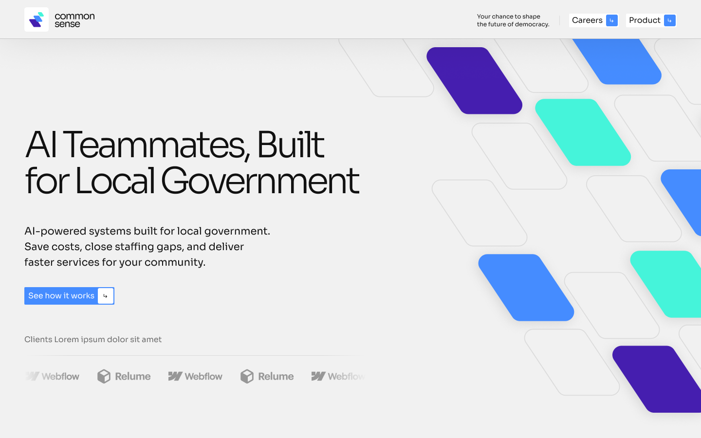
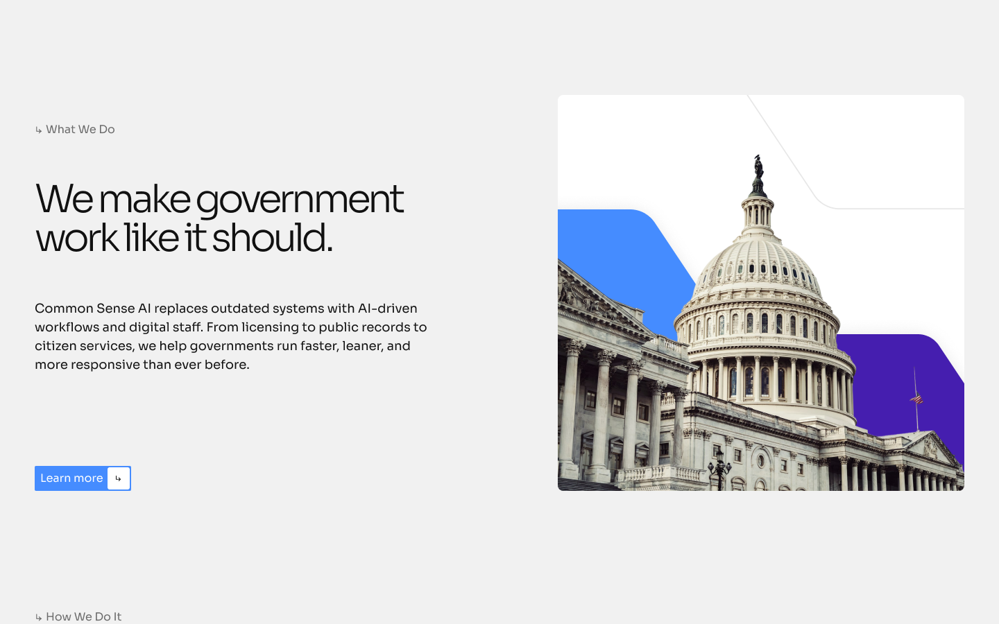
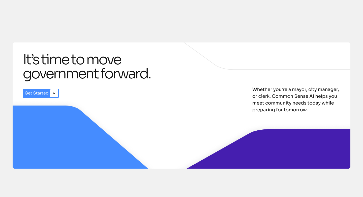
The web direction keeps the system bright and open rather than the near-black default of deep tech — a public-sector buyer should feel civic clarity, not a security console. The tessellating gradient does the heavy lifting: full-strength in the hero, then rationed out as accent so the pages that have to explain something stay quiet enough to read.

Stationery & recruiting
The system carried through to the small, everyday touchpoints too — a business card and a LinkedIn cover built to recruit against Palantir and Meta.
Outcome
Common Sense walked into market with a complete, coherent system: a layered mark and full logo suite, a signature tessellating gradient, a trade-show and apparel kit, field collateral, social, and a web direction — an identity ambitious enough to match a team that built software for the U.S. government, aimed squarely at the people who run your city.
Serve more citizens, spend less doing it.← All work